This can seem intimidating, but it really isn’t too bad.
My suggestion for building a portfolio website is to use a free tool, like https://wordpress.com.
Because WordPress is designed as a modular site builder, you can easily change its appearance as you become more adept at manipulating design.
So, every assignment you receive from me, I would like you to post it to your portfolio, then submit a link to your post in Sakai. When it is a video project, please upload the file first to your YouTube or Vimeo channel, set it to “unlisted” if you don’t want it to appear on your actual YouTube channel, then you can use that link to attach it to your portfolio site.
For images, you can usually upload them to the WordPress site itself if those images are small enough. If I have asked for an image that is too large, simply put it in a file sharing system like OneDrive, Google Drive, iCloud, etc, and share that link with me.
This system has many advantages. One advantage is that you will be able to “tinker” with your portfolio the whole time you are in school. By the time you are finished, you will certainly have a long list of projects and exercises to show potential clients and employers.
The trick to setting up a free site like wordpress.com is that you will need to make certain the site is “published”. If you have trouble;e just contact the instructor, and we’ll figure it out together.
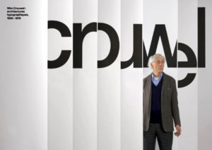
“It was actually quite difficult to avoid Wim Crouwel’s work. In the 1960s the Netherlands was inundated with posters, catalogues, stamps designed by him, even the telephone book.” – Karel Martens
Wim Crouwel : architectures typographiques 1956-1976 An exhibition that ran from February 10th to April 28th, 2007, at Galerie Anatome in Paris. Catalogue and invitation designed by Experimental Jetset.
Wim Crouwel, born in Groningen (the Netherlands) in 1928 is a remarkable and inspiring figure with an inventive spirit and vision, vigorous and always distinguished.
He designed his first poster in 1952. After leaving artschool he became a painter leaning towards Expressionism, but as he designed this first poster he discovered the pleasure of organising visual information in an aesthetical context.
The contrast between Crouwel as a lyrical expressionist painter and objectivating functionalist designer couldn’t be more extreme. As a designer he felt related to the Bauhaus ideas, the swiss-inspired international style. He was fascinated by the rational aspect in Bauhaus typography, which he discovered through Karl Gerstner’s and Gerard Ifert’s work.
Although his ideas were bauhaus-related, unlike many Crouwel was not a dogmatist. He was fascinated by the ideas about serial and mass production, as he stated “we need the machine since we have no time”. But he also believed “the machine cannot replace the precision of the human eye and human feeling”.* Crouwel’s work has always consisted of these two essential elements: the emotional aspect and the rational one.
The task of the designer consists of analysing the design project and solve the problems he distilled in an objective way. The message and the way it should be presented flows out of this process. Graphic design is a wide field in which Crouwel mainly focussed on type. He works quite constructive, constructs type, and works on grids. Crouwel is especially admired for his systematic approach and his creative handling of the shape of letters. His work was influenced by the pre-war Werkmann and post-war Sandberg, an individualistic generation of typographers who dared to juggle with letters.
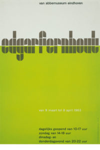
CROUWEL AT THE VAN ABBE MUSEUM
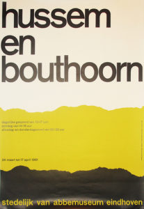
In 1954 Crouwel designed the catalogues and posters for the Van Abbe Museum. He took the position that the design of a catalogue or poster must not be an interpretation of the artist’s ideas. It should merely provide relevant information to the reader, without ornaments or styling as this would only lead to confusion. The catalogue should not refer to the artist as an individual, but to the museum and its range of activities. The development of the programme as a whole is more important than creating the best poster ever for each new project.
Eduard de Wilde, Director of the Van Abbe Museum at the time Crouwel was asked for this task, remembers he found himself in an ambiguous situation. “Crouwels’s position of subjecting highly different appearances of art under the same typographic style would not be acceptable to some artists. But i also had to appreciate that transferring most different artistic trends and tem-peraments into typography might lead to a typographic chaos.”
MODERNIST, FUNCTIONALIST, PURIST
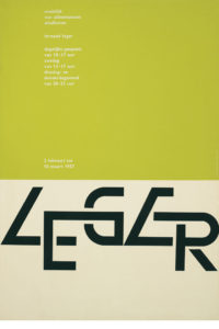
Crouwel is a modernist and impressed by a typeface like Helvetica, which was more neutral than any other typeface. “A face shouldn’t have a meaning in itself, the meaning should be in the content of the text.”* In his work Crouwel chose sans-serif faces that allowed numerous combinations, like Gill (Van Abbe museum) and Universe (Stedelijk). The essential information was set in one returning typeface and the title of the exhibition slightly reflected the feel of the exhibition. He looked at the work of the artist, got an impression and tried to translate it typographically. An example of this way of working is found in the exhibition about Leger. Leger’s work could be recognized by its heavy lines around the images. This influenced him to create the word Leger with thick black lines so it would dominate the poster. Crouwel always searched for the abstract, something that would strike the eye.
As a functionalist Crouwel focussed on the readability of his work. But when he had to make a choice between readability and aesthetics, he chose aesthetics. “When you’re a functionalist you want to make things comprehensible, readable, make your ideas visible. I feel myself being a modernist, a functionalist, but aesthetics always stand in the way.” He says.*
Couwel is a purist as he mainly uses type, but in the course of time non-typographic elements like lines and even reproductions would appear in his work. These slight changes of direction can be explained by his non-dogmatic view. Crouwel takes his customers’ wishes seriously and tries to match them with his own fundamental typographic principles. Often curators have their own opinion concerning the design for their exhibition. Crouwel’s carreer is marked by both his flexibility and his integrity.
TOTAL DESIGN
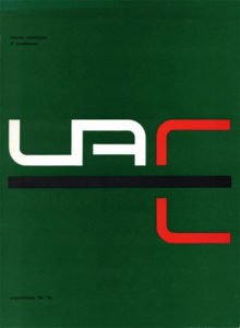
Together with colleagues Benno wissing, Friso Kramer and Dick & Paul Schwartz, Crouwel started a designstudio named Total Design. Total Design was to be the first bureau that managed to accept large and multidisciplinary designtasks for the government, as well as commercial clients.
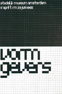
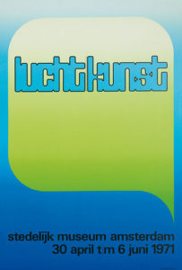
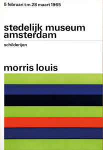
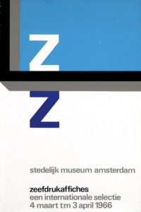
In 1963 Eduard de Wilde succeeded Willem Sandberg as director of the Stedelijk in Amsterdam. Crouwel (and Total Design) moved along with him as he was asked to continue their cooperation. During the next twenty years he designed catalogues, invitations, posters and brochures and created what we now recall the SM-design style: a cool, pragmatic artistry in the variation of normal and semi-bold grotesque faces on a page at once fully utilized, yet open to all sides.
NEW ALPHABET
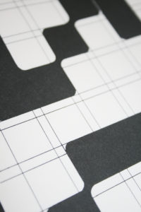
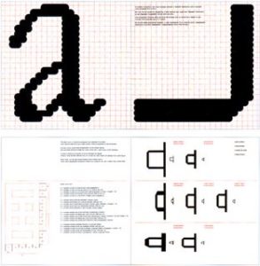
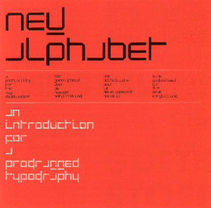
Besides printwork Crouwel has designed several font sets, of which the New Alphabet (1967) is best known. This typefaces was developped after seeing the first digital typesetters at a print exhibition in Germany. The digital production of the Garamond, as presented on this exhibition looked horrible to him. The roundings of several sizes of a typeface were not alike, because of the small amount of pixels used, as you could see when the letters were enlarged.
Crouwel thought it would be better to design a typeface that was suitable for this machine instead of forcing it to use the typefaces we knew. He drew the New Alphabet, a highly abstract font, based on a dot-matrix system. With its straight lines, 90 degree angles and 45 degree roundings, either big or small, it always looked exactly the same. The face was as high as it was wide, thus lining in every way so it would fit in every grid system.
This typeface was merely developped as a theory, a direction of thinking. It wasn’t meant for actual use. Crouwel gave lectures on the subject and gained a lot of response. In the 90’s the New Alphabet showed up in UK pop magazines. Although it was often changed to make it more readable it was undoubtedly inspired by his original drawings. 30 years after his first experiment Crouwel was asked to digitise the original typeface.
Crouwel teached at diverse academies during the 70’s, before the computer period really started and was director of the Museum Boijmans Van Beuningen in Rotterdam In the years 1985-1993.
TODAY
Crouwel still is an active member of the Dutch graphic design scene as an advisor in Total Design. Today known as Total Identity it has more than 150 designers spread among 6 cities. You can find their recent work on http://www.totalidentity.com/
Theo Van Doesburg The Netherlands, Utrecht, 1883 – 1931
“There is an old and a new consciousness of time.
The old is connected with the individual.
The new is connected with the universal.
The struggle of the individual against the universal is revealing itself in the world-war as well as in the art of the present day.”
– Theo Van Doesburg
Manifest I of De Stijl, 1918,
De Stijl, vol. 2, nr. 1
The manifest can be read here.
Christian Küpper, who adopted the pseudonym Theo van Doesburg, was born in Utrecht, the Netherlands, on August 30, 1883. He was a Dutch allround artist, practicing in painting, writing, poetry, typography and architecture, but he had been more successful writing about art than working as an independent artist. Quite adept at making new contacts due to his flamboyant, impulsive personality, he had many useful connections in the art world.
In 1917 he founded the group De Stijl and the periodical of the same name together with architects J. J. P. Oud and Jan Wils, Vilmos Huszár, Piet Mondrian, Bart van der Leck, and Georges Vantongerloo. The periodical propagated the group’s theories.
De Stijl has come to represent their common aims and utopian vision. The essential idea underlying De Stijl’s radical utopian program was the creation of a universal aesthetic language based in part on a rejection of the decorative excesses of Art Nouveau in favor of a simple, logical style that emphasized construction and function, one that would be appropriate for every aspect of modern life.* They simplified visual compositions to the vertical and horizontal directions, and used only primary colors along with black and white.
The first cover design of De Stijl magazine, used from 1917 trough 1920, carried an abstract image by Vilmos Huszar. He probably designed the lettering as well.
An example of the interior pages, which had not been touched by typographers.
The first edition of the De Stijl artmagazine appeared in oktober 1917. The cover contained an abstract woodcut composed of black rectangles, over which the words De Stijl were drawn in fragmented square capitals. In his foreword, Van Doesburg mentions Vilmos Huszar as the designer of the vignette. It is generally assumed that Huszar also drew the lettering.*
The only remarkable piece of design in the magazine was the cover, the inside had not been touched by designers, as texts were delivered to the printer and set in standard typefaces.
De Stijl
1921
Vol. 4, no. 11
Anthologie-Bonset
A collection of visual poetry by I.K. Bonset (pseudonym of Theo van Doesburg)
In 1921 the De Stijl magazine appeared in a new design. The new logo consisted of standard sans-serif type and was designed by Van Doesburg and Mondriaan. The letters N.B. in red stand for “Nieuwe Beelding” (new imaging).
Square Alphabet
1919
Van Doesburg’s alphabet revived as Architype Van Doesburg
Of the artists linked to De Stijl, many drew an alphabet, but it is probably Van Doesburg’s which has been most influential. He drew a sans-serif modular alphabet that is constructed entirely of evenly weighted strokes. Each character is based upon a square divided into a raster of 5×5. This makes some characters, especially the K, R and X, so unconventional that they must have been unreadable to many readers. The earliest version of the alphabet was made up of letterpress ruling pieces. The finished typeface was used in 1919.
La Section d’Or
1920
65 × 62,5 cm
Design for an exhibition poster
arok, Modern
1920
a transcript distributed in Antwerp, Belgium by De Sikkel on the occasion of two lectures by Van Doesburg
Van Doesburg used the alphabet for several design jobs, like the logo for the League of Revolutionary-Socialist Intellectuals. In this logo he plays with the widths of the letters, so the name could form a justified rectangle. A digital revival has been created by Freda Sack and David Quay of The Foundry.
Although De Stijl was made up of many members, Van Doesburg was the ‘ambassador’ of the movement, travelling across Europe for promotion. In 1922 Van Doesburg became briefly involved with Dadaism and traveled on a lecture tour with Kurt Schwitters. At the same time he worked with the constructivists and became interested in the Bauhaus, which had recently been founded in Germany. His geometric style was well received by Walter Gropius and Mies van der Rohe, but still they believed their ideas would not match. Reacting to this disappointment Van Doesburg then installed himself near to the Bauhaus buildings and started to attract Bauhaus students interested in the new ideas of De Stijl.
Around 1924 the original De Stijl group started to fall apart as Van Doesburg introduced these Bauhaus and Dadaist influences.
At the end of his life, he moved to Davos in Switzerland because of his declining health. Theo Van Doesburg died on March 7, 1931, due to heart failure.
These turbulent centuries saw script and images increasingly used by people opposed to the monolithic authorities of church and state. The American Revolution and Declaration of Independence and Bill of Rights, inspired the French Revolution, the successful Haitan revolt against the French and, much later, the Russian Revolution and the Bolivar movement in South and Central America.
The Graphic Artswere absolutely essential to all these developments.
The rapid evolution of printing technology, combined with the mass production and distribution of books, newspapers, flyers, posters and bulletins allowed new ideas to spread and take root at an unprecedented speed and scope.
The 17th century
Was a relatively quiet time for graphic innovation. An abundant stock of ornaments, punches, matrixes and woodblocks were available from the renaissance period , and there was little need for innovation. Works by William Shakespeare and other authors were printed and reached wide distribution.
The oldest surviving newspaper was published in Augsburg, Germany in 1609.
England had its first two page “running news” publications, called ‘corantos’ in 1621.
North America Stephen Daye, a British locksmith, set up the first printery of the North American colonies in Cambridge, Massachusetts in 1639.
The first publication was “The Whole Booke of Psalms”, following the established tradition of publishing religious tracts to ensure sales.
By 1775 there were 50 print shops in the 13 North American colonies.
Copperplate engravings also became very popular, as newspaper- and book illustrations, as handbills and as affordable art for private homes
The Netherlands prospered as a seafaring and mercantile nation during the 17th century. Books printed in Dutch, English, French, German and Latin were printed and exported throughout Europe.
The types designed by the great Dutch designer and punch cutter Christoffel van Dyck at this time were in continues use until 1810.
Rococo style
Louis XIV.( -) ordered a committee of scholars to develop a new type for the Imprimiere Royal, the royal printing office established in 1640 to restore the quality of earlier printing,
The result was a type called Romain de Roi, which could only be used by the royal printery , other use was a capital offence( punishable by death). Rococo was the style which flourished in France between 1720 and 1770.
Florid and intricate it consisted of swirls and curls, pastel colours and lavish gold and white decorations. It found its strongest and most exaggerated expression during the reign of Louis XV and in the graphic designs of Fournier de Jeune, who also produced the first complete standardized design systems for printing. Publications reflected the extravagant, sensuous lifestyles of the wealthy , who were completely oblivious to the misery and militancy of the poverty stricken masses.
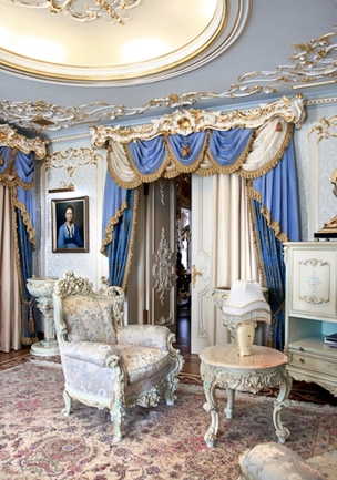
Archbishop’s Palace at Prague Castle, Czech Republic
Features of Rococo architecture
1. Elaborate curves and scrolls
2. Ornaments shaped like shells and plants
3. Intricate patterns
4. Delicate details
5. Complex, asymmetrical shapes
6. Light, pastel colors
Furniture Design
A highly ornamental style of art, furniture, and interior design became popular in France. Rococo, the lavish style combined the delicacy of Frenchrocaille with Italian barocco, or Baroque, details.
This luxurious apartment is located in St.Petersburg, Russia. The author is architect Igor Gremitsky. He created a space that is close to some palaces of this beautiful city. The style chosen was rococo as the owners wanted. They ordered some furniture in this style and the architect had to settle it with the interior. The interior looks amazing: stained-glass windows, overhead paintings, walls upholstered in silk, parquet. The colors are in the traditional range of rococo. The chandeliers are also luxurious and are put into the center of mirror ceiling to enlarge the amount of light produced. Despite of all these things there is everything that a person will need.
Cited from (http://architecture.about.com/od/periodsstyles/ig/Historic-Styles/Rococo.htm)
The French Revolution
The bloody revolt against the monarchy also led to a rejection of its lush designs and to a return to classical ideals. In the forefront of this was Giambattista Bodoni, the son of a poor printer in Northern Italy, who developed a system of interchangeable fonts which heralded mass production and the machine age. It became known as the ‘Modern style”. He published 345 books, mostly new editions of Greek and Roman classics, as well as a two-volume Manual of Type.
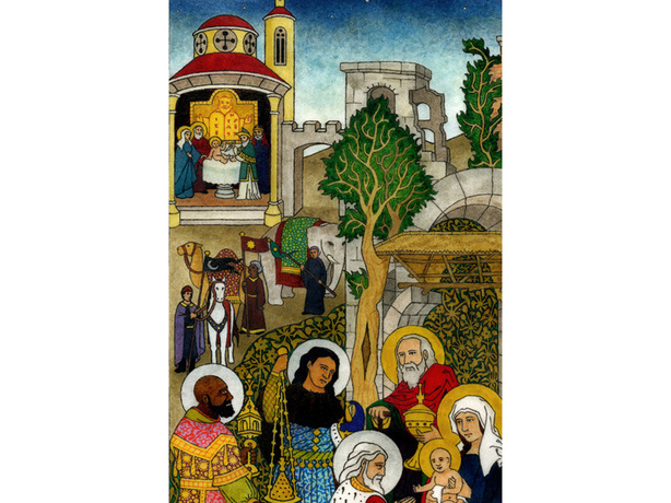
three illustrations/pamphlets/handbills from the French revolution
The origin of Information Graphics
The foundation for information graphics is analytic geometry, developed and first used by Rene Descartes (1596-1650).
Cartesian coordinates were later used by William Playfair to convert statistical data into
symbolic graphics.
His “Commercial and Political Atlas’ was published in 1786,
the Cartesian grid is relevant today in graphic design since it is the base of 3D modellling software, where character design and architecture design is portrayed.
The grid is a well known device in graphic design, mainly in typography, even to this day it is still being used. The grid is a commonly used term in many fields like architecture, mathematics, engineering and design and its meaning varies from guidelines, framework, supporting structure, channel of material flow to network of information flow.
The use of grid for visual layouts is not at all new. In visual art, we can find the inscriptions and the evidences of grid from the medieval period or even before.
The Illuminated printing of William Blake. William Blake, (1757-1827) was an artist, poet and visionary. His integrated letterforms and hand coloured prints influenced 19th century Romanticism, expressionism, Art Noveau and abstract art.
Leonard Doob defines propaganda as the “control of individuals through the use of suggestion…regardless of whether or not the propaganda intends to exercise the control”, which suggests an element of mind engineering that is absent in public diplomacy. The ‘four minute men’ of the US propaganda machine at the Committee on Public Information would deliver inciting speeches to potential volunteers under a poster depicting a stern Uncle Sam pointing his finger at the impressionable young man, pleading: ‘I want YOU for US army’ in 1917.
Cited from (http://guity-novin.blogspot.com/2010/05/chapter-29-propaganda-posters.html).
Additive and subtractive color modes describe how color is created. So before we can dig into additive and subtractive color, it helps to understand a little about how light and color work.
A Bit of Background
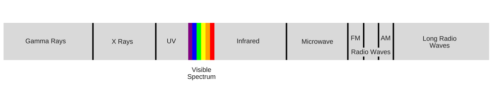
Light is made up of energy waves that are grouped together on a spectrum called the “electromagnetic energy spectrum”. Our eyes can only detect a small portion of this spectrum, which we call the “visible light spectrum”. At one end of the visible light spectrum are shorter electromagnetic waves that we perceive as blue; on the other end of the spectrum are longer waves that we perceive as red. Beyond these visible limits are shorter wavelengths such as ultraviolet light and x-rays, and longer wavelengths like infrared radiation and radio waves.
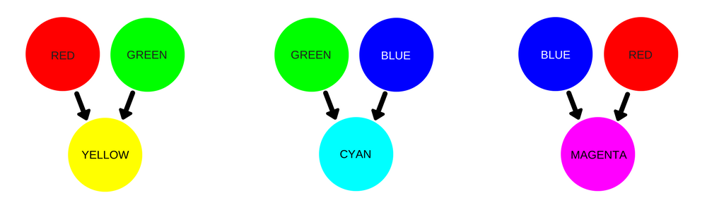
Red, green, and blue are the predominant colors of the visible light spectrum. These primary colors also form the basis of the additive color mode.
Additive vs. Subtractive Color
There are two methods of producing color: additive and subtractive. The additive color mode is primarily used when shades of light are used to create colors, while the subtractive mode is used when white light, such as sunlight, reflects off an object. Confused yet? Let’s jump in.
Additive Color (RGB)
Also known as RGB color, additive colors are created by mixing different amounts of light colors, primarily red, green, and blue (the primary colors of the visible light spectrum). Mixing different amounts of red, green, and blue produces three secondary colors: yellow, cyan, and magenta – the primary colors of the subtractive color mode.
Additive colors begin as black and become white as more red, blue, or green light is added. TVs, computer monitors, and other electronics use additive color – every pixel starts as black, and take on colors that are expressed as percentage values of red, green, and blue (hence “RGB”). So when you create a design on your computer, you’re using the additive RGB color mode.
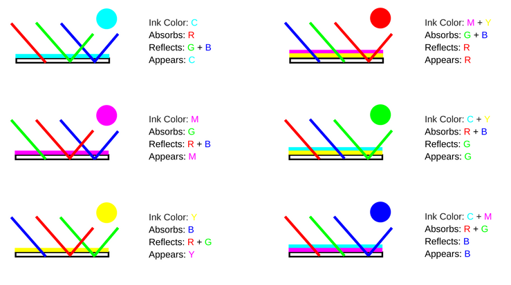
Subtractive Color (CMYK)
Additive colors are created by adding colored light to black. On the other hand, subtractive colors are created by completely or partially absorbing (or subtracting) some light wavelengths and reflecting others.
Subtractive colors begin as white. As you add filters to the white light, such as ink, this white light takes on the appearance of color. Photos, magazines, and any printed material use subtractive color.
The colorful objects we see in everyday life also gain the appearance of color using a subtractive process: an object, such as a flower or a printed sheet of paper, uses colorants such as pigments, dyes, or inks to absorb portions of the white light that illuminates the object, while reflecting other portions that we then perceive as color.
Additive and Subtractive Colors in the Printing Process
The differences between additive and subtractive color may seem subtle and unimportant for your everyday life – after all, color is color, right? Most of the time this is correct, but they are an important consideration when you’re designing for print.
When you design something on your computer, your screen will display your design in an additive RGB color mode, but offset printing methods uses subtractive CMYK color to create colors on the visible spectrum.
A good monitor can display “true” color, or about 16,000,000 shades and tints of every visible color, but the color output for printed materials is limited to a comparatively small portion of the visible light spectrum. When you print your design, the ink acts as a filter to subtract or absorb portions of white light, or allow that light to pass through and reflect off your paper in order to create perceptible colors.
Here’s how primary CMYK colors mix to achieve the full range of hues:
To reduce the risk of improper color rendering and ensure that your printed design appears as you see it on your screen, be sure to convert your design to CMYK color before you submit it to your printer.
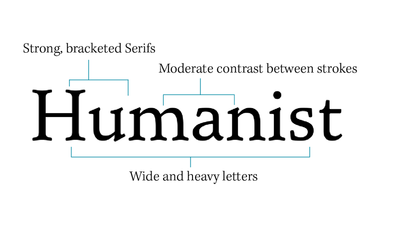
The point of these posts is to familiarize the student with concepts in typography. In addition to anatomy of type, one of the basic ideas is simply understanding the development of typographic forms in western culture over time. As a result we usually begin such discussions with typefaces that are considered “Humanistic” or “Humanism” as type. Humanism as type was the first step in the development of modern/post-renaissance moveable type, it was based on the way humans write.
This explanation for Type as “Humanism” was written by Mark Simonson. You can see the original here.
“Humanism” is generally understood as a stance that values the power of human beings over dogma or superstition. It follows that something labeled as humanist would reflect those values–that the human creation is paramount.
However, while the word itself is certainly related, a “humanist” typeface is something very different. Rather than being named for the contrast of dogmatic belief vs. the paramount status of the individual, “humanist” in this context refers to something very specific–the lettering style that came about in the Renaissance, based upon organic human calligraphy.
The first typefaces that are considered humanist appeared following the invention of movable type. They were based on the handwriting of the medieval scribes of Italy, featuring softly rounded shapes, based upon a lighter, flowing script. They replaced the claustrophobic “Black Letter” forms of writing that were the norm prior to the Renaissance, bringing a lighter organic flow to the writing.
Whether serif or sans, humanist fonts tend to look more like they are done by a human hand, with a natural, organic expanding and contracting of the strokes as if the letters were drawn calligraphically. They tend to have an axis that resembles calligraphy that is drawn at an angle with a pen nib.
Even if you don’t consider yourself an artistic person, chances are you’ve probably encountered situations where you’ve had to select colors for something. This most likely happens every morning when you get dressed (unless, like cartoon characters, you have an entire closet of the same outfit) or when setting up a new room in your home or office.
And though we know that colors are an important part of what makes things look good, not everyone instinctively knows that orange and blue is a perfect combination. If you can’t trust your own judgement, understand and rely on the basics of color theory to always pick the right colors.
Learn the color wheel
This is the basic color wheel and it will guide you in making color choices. You’ve probably seen it in school, but here’s a quick refresher just in case you’ve forgotten.
Red, blue and yellow are primary colors. When you mix red and yellow, you get orange; mix blue and yellow, you get green; mix red and blue, you get violet. Orange, green and violet are hence called secondary colors. Tertiary colors like red-violet and blue-violet are derived by mixing a primary color with a secondary color.
All colors have tints and shades. A tint is the variation of that color when mixed with white; a shade is the variation of that color when mixed with black. But generally, you don’t need to worry about tints and shades for basic color schemes, says Color Wheel Pro:
According to color theory, harmonious color combinations use any two colors opposite each other on the color wheel, any three colors equally spaced around the color wheel forming a triangle, or any four colors forming a rectangle (actually, two pairs of colors opposite each other). The harmonious color combinations are called color schemes – sometimes the term ‘color harmonies’ is also used. Color schemes remain harmonious regardless of the rotation angle.
In the color wheel, there’s yet another separation that you need to be aware of so that you can understand color schemes better: warm and cool colors. Each has its own purpose to convey emotions. Warm colors exhibit energy and joy (best for personal messages), while cool colors convey calmness and peace (best for office use). The wheel itself can be divided easily to get an idea of which colors are warm and which ones cool, as demonstrated by Kissmetrics:
Master the Basic Color Schemes
Based on the wheel, there are a few basic rules to match colors. And they’re actually pretty simple.
Complementary colors are any two colors opposite each other on the wheel. For example, blue and orange, or red and green.
These create a high contrast, so use them when you want something to stand out. Ideally, use one color as background and the other as accents. Alternately, you can use tints and shades here; a lighter tint of blue contrasted against a darker orange, for example.
Split complementary colors use three colors. The scheme takes one color and matches it with the two colors adjacent to its complementary color. For example, blue, yellow-orange and red-orange.
This scheme is ideal for beginners because it is difficult to mess up. That’s because you get contrasting colors, but they aren’t as diametrically opposite as complementary colors, says Tiger Color.
Analogous colors are any three colors next to each other on the wheel. For example, orange, yellow-orange, and yellow.
With analogous colors, it’s best to avoid hues as they can be jarring. Instead, focus on tints of analogous colors. Another tip Color Wheel Pro shares is to avoid combining warm and cool colors in this scheme.
Triadic colors are any three colors that are equally apart on the color wheel. For example, red, yellow and blue.
The Triadic scheme is also high-contrast, but more balanced than complementary colors. The trick here, Decor Love says, is to let one color dominate and accent with the other two.
Tetradic or double complementary colors uses four colors together, in the form of two sets of complementary colors. For example, blue and orange is paired with yellow and violet.
It offers more color variety than any other scheme (but) if all four colors are used in equal amounts, the scheme may look unbalanced, so you should choose a color to be dominant or subdue the colors. Avoid using pure colors in equal amounts.
Understand black and white with monotones
After you know the basic color schemes, you can step it up a notch with tints and shades. As we have already discussed, tints come from adding white to hues while shades come from adding black to hues. And this goes on till you get pure white or pure black. Apart from tints and shades, there are also tones, which is mixing the hue with grey.
Blacks and whites are used for “monochromatic color schemes,” which are further divided into monotone chromatic and monotone achromatic. Colors On The Web has a great explanation of what this means:
Monotone chromatic
A monotone color scheme is just one single hue and its variations in terms of tints, shades and saturation. Using saturation and tint/shade variations of a color is always good. However, in most cases I would advise against using a fully monochromatic scheme, as there is a risk of monotony. Using it with pure white or black can be efficient, though.
Monotone achromatic
A monotone achromatic color scheme is a special instance of the monotone scheme which consists of only neutral colors ranging from black to white. A scheme like this can be efficient, but it can very easily look boring. Using an achromatic scheme with just one bright color for highlight can be very effectful.
Use popular color palettes and apps
While the basics of color combinations are now clear to you, that doesn’t mean you will always nail it. But like with anything, there’s an easy way out!
Though it’s not exactly the same, ColorSnap is a good option for iPhones. You need to take a photo and the app then identifies various colors in it. Tap one and you’ll see a palette of matching colors from paints company Sherwin Williams, which made the app. You can ignore that part and just use the palette for reference. Paint companies seem to have the market cornered on this type of app, with others like Color Smart (Behr), Color Capture (Benjamin Moore) and Pick-a-Paint (Valspar).
Finally, Color Matters says you needn’t always rely on the color wheel and take inspiration from nature, or other elements around you:
Nature provides a perfect departure point for color harmony. In the illustration above, red yellow and green create a harmonious design, regardless of whether this combination fits into a technical formula for color harmony.
Apply color theory in everyday life
Now you have a basic idea of color theory, but what does that mean for your daily life? Essentially, these concepts help you figure out how to make things look better.
A common application is in the clothes you wear. Some people always seem to be able to dress well, while others wear clothes that clash or don’t match. Print out the color wheel and stick it to your wardrobe’s door. The next time you pick out one clothing item, just refer to the chart to see what colors in your closet will best complement it; and use the basics of warm and cool colors to convey the emotion you want to project. Of course, colors areonly a part of learning to dress better. Style blog Kinowear has a few tips on how to use colors in clothing:
As a general rule of thumb you don’t want to have more than three colors in your outfit. Use the right colors for your skin tone and coloration. Try different colors against your skin and learn which palettes look best on you. Also, get a second opinion. Never use holiday colors like red and green unless it is close to that holiday. Avoid matching gray colors with bright colors such as yellow.
Similarly, color theory can help you out in the office, whether it’s jazzing up your resume for a job hunt or making your presentation and slides pop out. Again, the general rule of thumb is to restrict yourself to three colors or less. You should also check this color psychology chart to figure out what vibes your chosen colors will give out. And remember, it’s going to be on a digital projector, so your colors need to be safe for that, as Holman points out:
Usually I look for bright colors that go well on projectors. That means colors with a lot of contrast. For example, choose a dark, a light, and an accent. That way you can layer the dark on the light and still read it from in the way back of the room you’re giving the talk.
And of course, color theory is super useful when you are looking to paint your house or any major item in it. There are plenty of websites and plenty of professionals who will help you pick the right colors, but these three tips from Apartment Therapy are worth remembering at all times:
Three Rules To Keep in Mind:
• More than one color in a room can look great, but if you go in that direction, keep it to three colors maximum. If you are going with two bold colors, the third should be a neutral to give your eye a break.
• When choosing your colors start by choosing your boldest color, and then choose the others with the first color in mind.
• Don’t be scared! Paint is not permanent and you can always change it.
The Spruce also has some great tips for choosing the right colors, including pulling a color from a print that you love and looking to historical color schemes for inspiration.
Of course, these aren’t the only uses for color theory. Colors and their combinations come up in life quite often and knowing these basics will serve you in picking a scheme that looks good to you as well as everyone else.