The Senate Subcommittee Hearings on Juvenile Delinquency took place between April 21-22, 1954.
American Psychologist Fredrick Wortham had been going around speaking about the problem of comics as he saw it since 1948. Two days before the hearings he published a book that compiled his ideas from these talks. The book was called “Seduction of the Innocent”. It claimed comic books, and specifically, horror, sci-fi, crime, and romance comics were to blame for the troubles American parents had raising misbehaving children. The term used for this was “juvenile delinquency”. Super Heroes were not totally innocent either. There are sections of the book devoted to proving Batman and Robin were in a homosexual relationship, as well as a section devoted to explaining that due to her power Wonder Woman must be a lesbian. At the time homosexuality was viewed as a mental disorder. His book also claimed Superman was un-American and fascist. More than this, it claimed that these comic books functioned as an instruction manual to teach children how to commit crimes.
There was a news program that built up tension about the comic book industry. I couldn’t find it, but I did find a piece someone put together that has excerpts from that program:
When the senate subcommittee hearings actually took place they called on Wortham, Walt Kelly, Milton Caniff, and The final witness of the day was Bill Gaines, from EC Comics. His testimony did not go well.
As a response to the hearings, the comic book industry tried to police itself by creating the comics code authority.
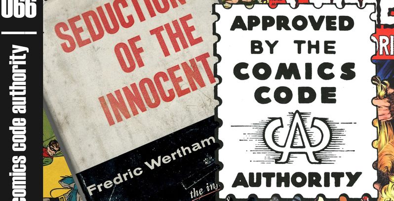
There is a good article at CBR detailing the rules the authority laid out.
EC Comics had a tough time with the rules. They were designed by all the publishers who were both envious of EC’S success, but also fearful there would get shut down by the government if they didn’t do something. This was the age of McCarthyism.
To make matters worse an editorial appeared in the Chicago Daily News called “A National Disgrace” written by Sterling North. It was reprinted all over America.
There was an outbreak of anti-comic hysteria.
By the 1960s only 6 of the twenty comic publishers survived.
Dell Comics (went out of business in 1974)
DC Comics
Archie Comics
Timely aka Atlas aka Marvel Comics
Harvey Comics (went out of business in 1994)
Charlton Comics (went out of business in 1986)
Gaines’ last attempt to comply with the code was a story called “Judgment Day”
After that story failed to pass code, Gaines discontinued all comics publishing. He converted Mad to a “Magazine” to make it clear it was not intended for children, and going forth that was how he approached most everything.
EC Comics
EC comics (First “Educational Comics” then later “Entertaining Comics”) was the biggest publisher of comics between 1950-1955. They published comics in genres like horror, war, romance, fantasy, funny animal, and satire. Max Gaines, who was a co-publisher of All Star Comics in the 40s, founded EC comics in 1944 when that company merged with DC comics. After his death in 1947, his son, Bill Gaines took over. Bill transformed the company into a pioneer of horror, science fiction, and satire comics. While you may not have heard of “EC Comics”, you probably have heard of “Tales from the Crypt“, “Weird Science“, and “Mad Magazine“, for example.
When Max started the company he began by producing a line of Picture Stories from the Bible.
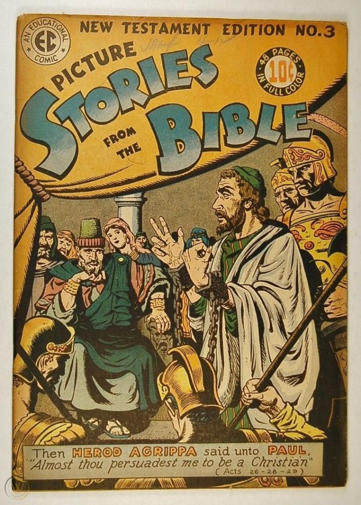
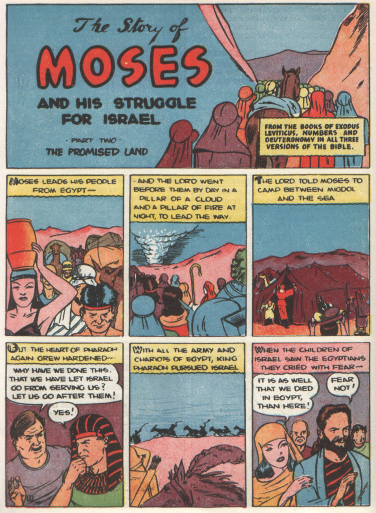
He also published Picture Stories from Science
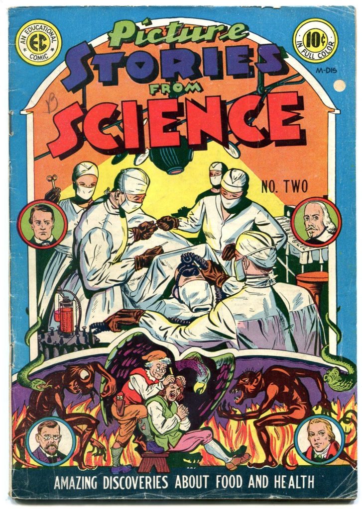
…and Picture Stories from American History/
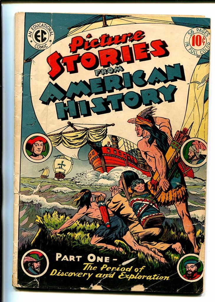
Which are all exactly what you think they are.
The company was approximately $100,000 in debt when he died in a boating accident.
His son, Bill Gaines, a chemistry student and aspiring teacher, was left in charge of the company.
Bill changed the name from Educational Comics to Entertaining Comics and decided to try and capitalize of the popular genres of the day. His first publications were character driven like the comics that preceded EC in the 40s.
In 1950, Al Feldstein became the editor of the company. He and Gaines decided to take the books in a completely new direction.
Most of their books were anthology comics, meaning, they did not feature a main character, but rather, sought to tell a variety of stories in the genre specified by each magazine’s genre. These stories would often be 4-8 pages long. The reason many comics are presented in 4 page units (you will often hear about 4 page, 8 page, 12, page, 16 page, 20 page, 24 page, etc comics is because when comic magazines are printed they are printed in 4 page signatures.
We will begin by discussing their main contributors:
Al Feldstein
Al was an illustrator, but began writing comics at EC. He eventually stopped drawing interiors to focus on writing and cover art. He would often write a 4-8 page story for 7 magazines in the EC line every month.
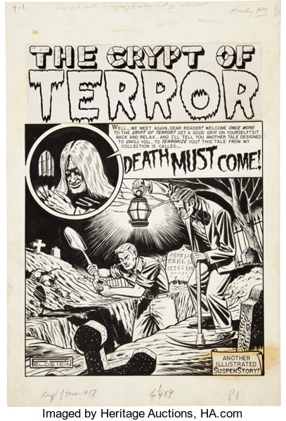
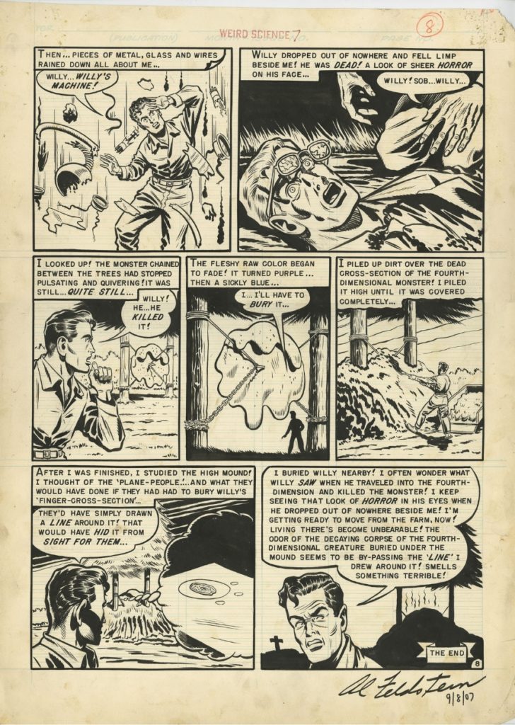
Wally Wood
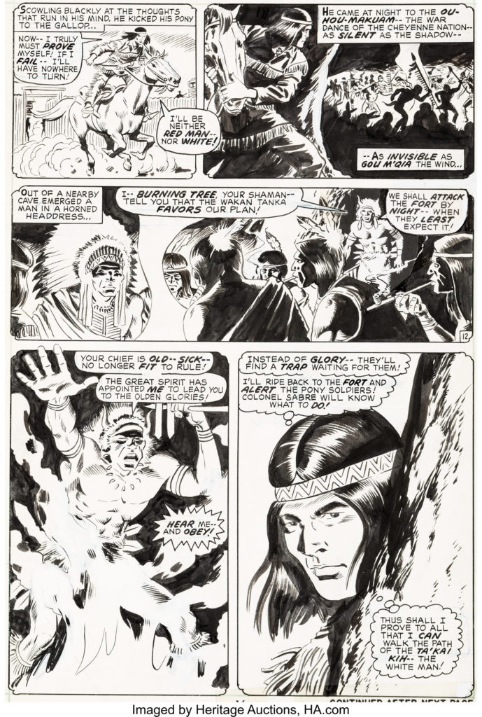
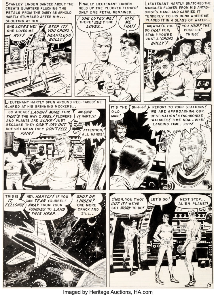
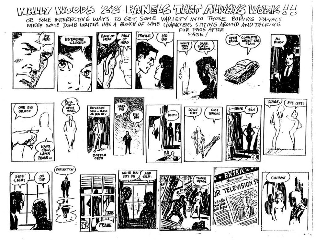
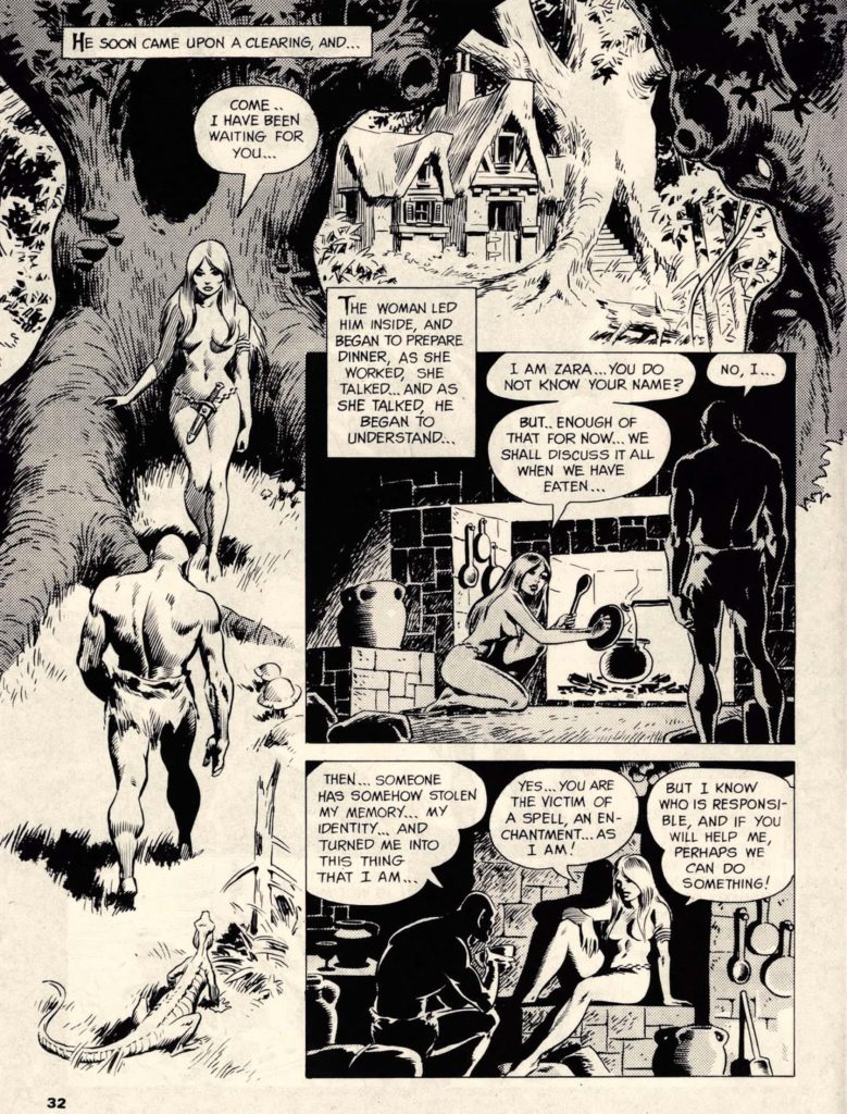
was the super star artist of the EC line. He became primarily known for his Sci-Fi comics, but the real secret behind the success for the EC line was the fact that he and Feldstein weren’t scared to get a little smutty with their depictions of romantic relationships.
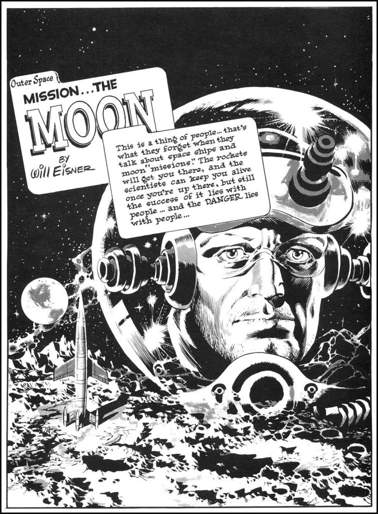
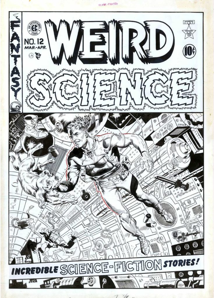
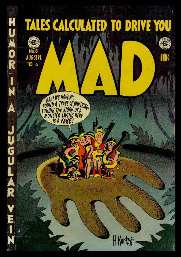
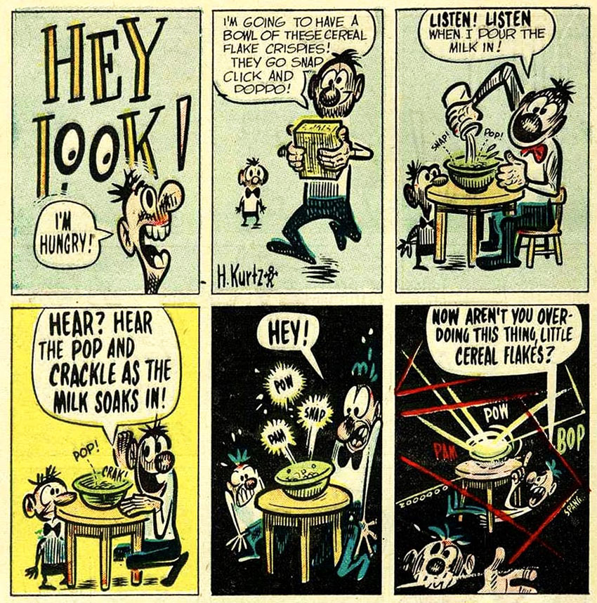
Harvey Kurtzman
He wrote and edited theTwo-Fisted Tales and Frontline Combat war comic books, where he also drew many of the carefully researched stories, before he created his most-remembered comic book, Mad, in 1952 which was a humor and satire book.
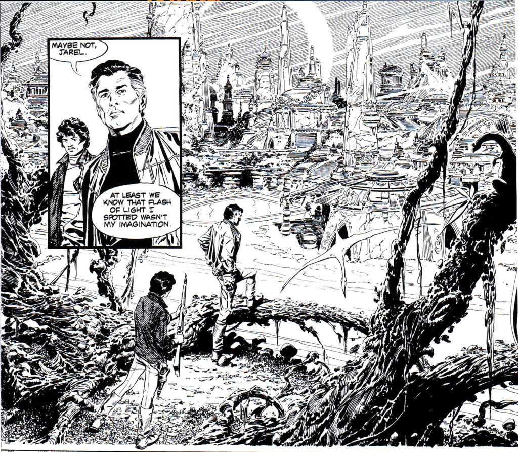
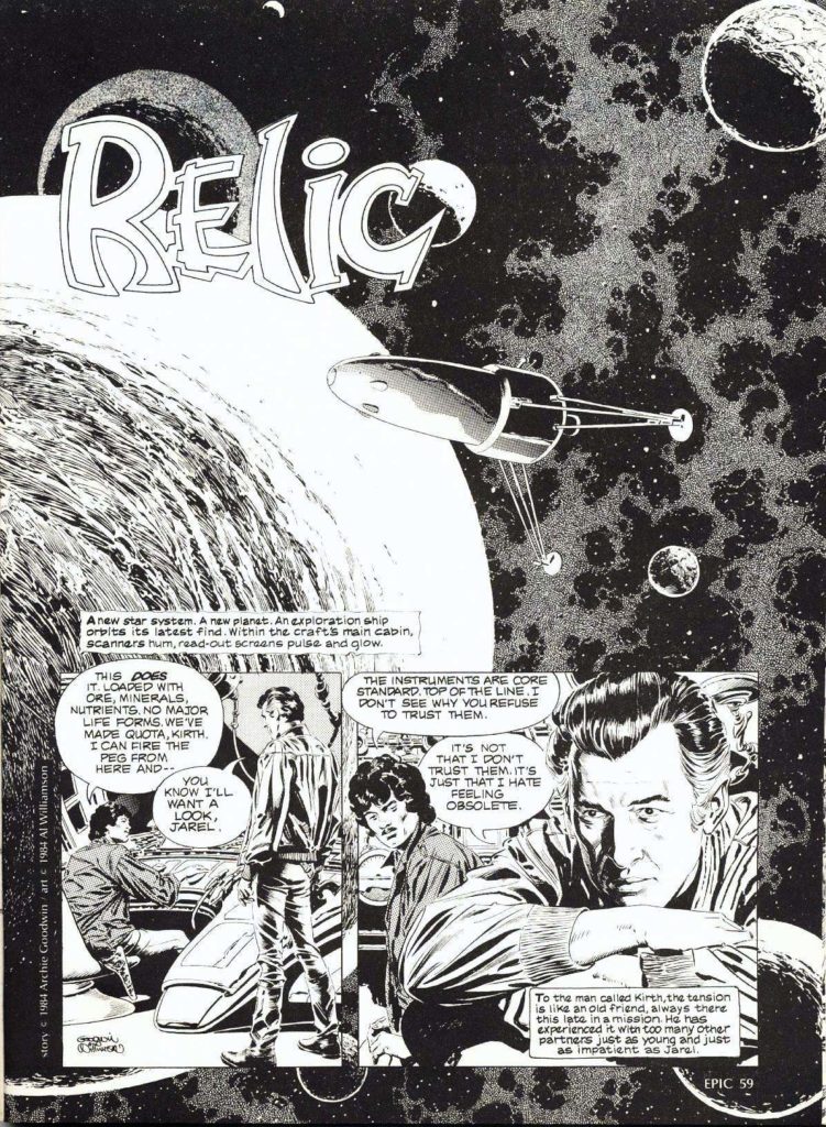
Al Williamson
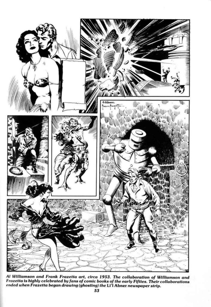
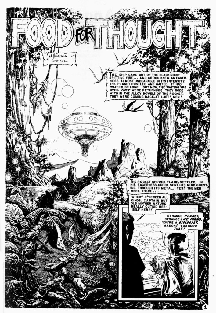
He took art classes at Burne Hogarth‘s Cartoonists and Illustrators School, there befriending future cartoonists Wally Wood and Roy Krenkel, who introduced him to the work of illustrators who had influenced adventure strips. Before long, he was working professionally in the comics industry. His most notable works include his science-fiction/heroic-fantasy art for EC Comics in the 1950s, on titles including Weird Science and Weird Fantasy.
Reed Crandall
Crandall drew for comic books from 1939 until 1973. His first work appears in comics from publisher Quality Comics, for which he drew stories starring such superheroes as the Ray (in Smash Comics, beginning in 1941 and initially under the playful pseudonym E. Lectron)[12] and Doll Man (first in Feature Comics in 1941, then in the character’s own solo title). His earliest confirmed cover art is for Fiction House‘s Fight Comics #12 (April 1941) at the Grand Comics Database.[13] Other early work includes inking the pencil art of future industry legend Jack Kirby on two of the earliest Captain America stories, “The Ageless Orientals That Wouldn’t Die”, in Captain America Comics #2 (April 1941),[14] and “The Queer Case of the Murdering Butterfly and the Ancient Mummies” in #3 (May 1941).[15]
With S.M. “Jerry” Iger credited as writer, Crandall co-created the superhero the Firebrand in Quality’s Police Comics #1 (Aug. 1941) and began his long run as artist of his signature series, the World War II aviator-team strip “Blackhawk“, in Military Comics #12-22 (Oct. 1942 – Sept. 1943) and, after his WWII service in the Army Air Force,[8] in Blackhawk and in Modern Comics. During this time he also drew the adventures of Captain Triumph in Quality’s Crack Comics. His final “Blackhawk” work was a seven-page story, plus the cover, for Blackhawk #67 (Aug. 1953).
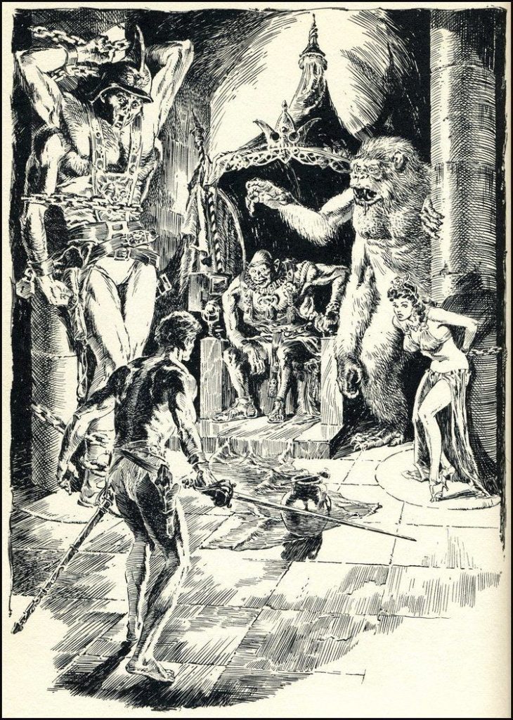
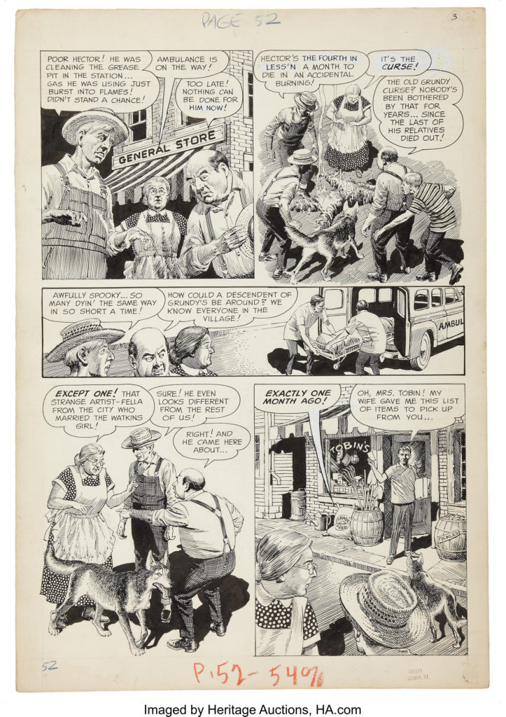
Crandall went on to become a mainstay of EC Comics, whose line of hit horror and science fiction titles would become as influential to future generations of comics creators as they were controversial in their own time due to their often graphic nature and mature themes. Joining a group that included artists Johnny Craig, Jack Davis, Will Elder, Frank Frazetta, Graham Ingels, Jack Kamen, Bernard Krigstein and Wally Wood, Crandall made his debut there with the six-page story “Bloody Sure”, written by Al Feldstein, in The Haunt of Fear #20 (August 1953).
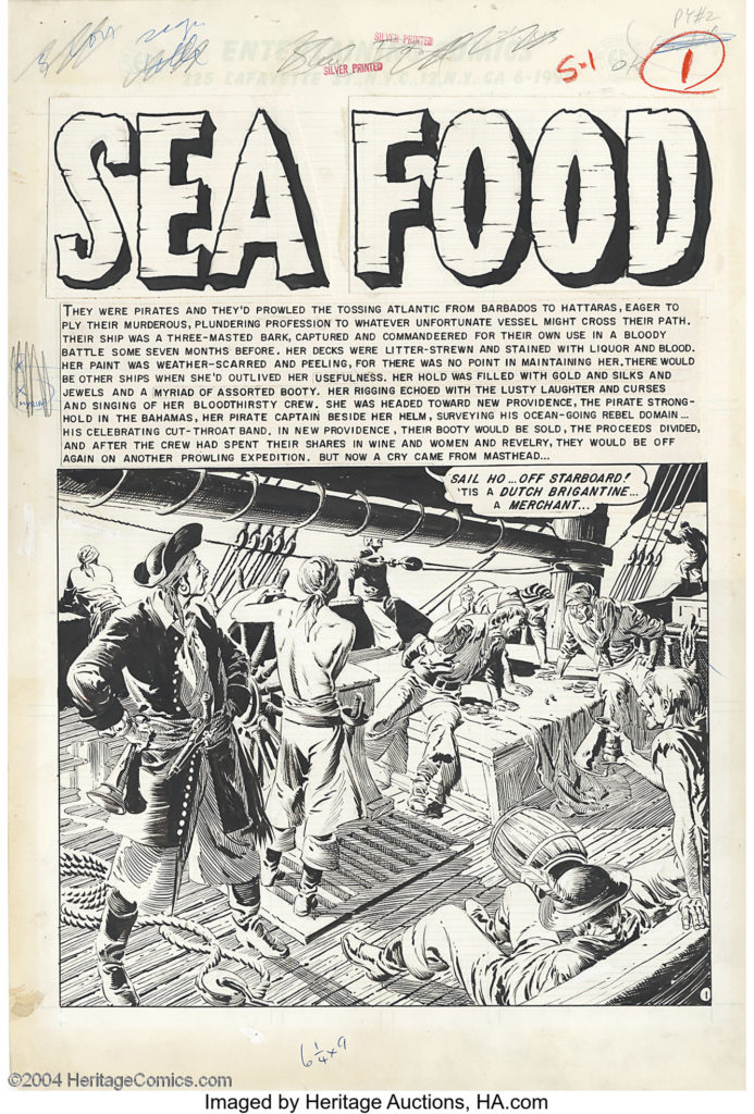
He drew dozens of stories across a variety of genres for the EC anthologies Crime SuspenStories, Shock SuspenStories, Tales from the Crypt, Two-Fisted Tales, The Vault of Horror, Extra!, Impact, Piracy, and Weird Fantasy and its sequel series, Weird Science-Fantasy.
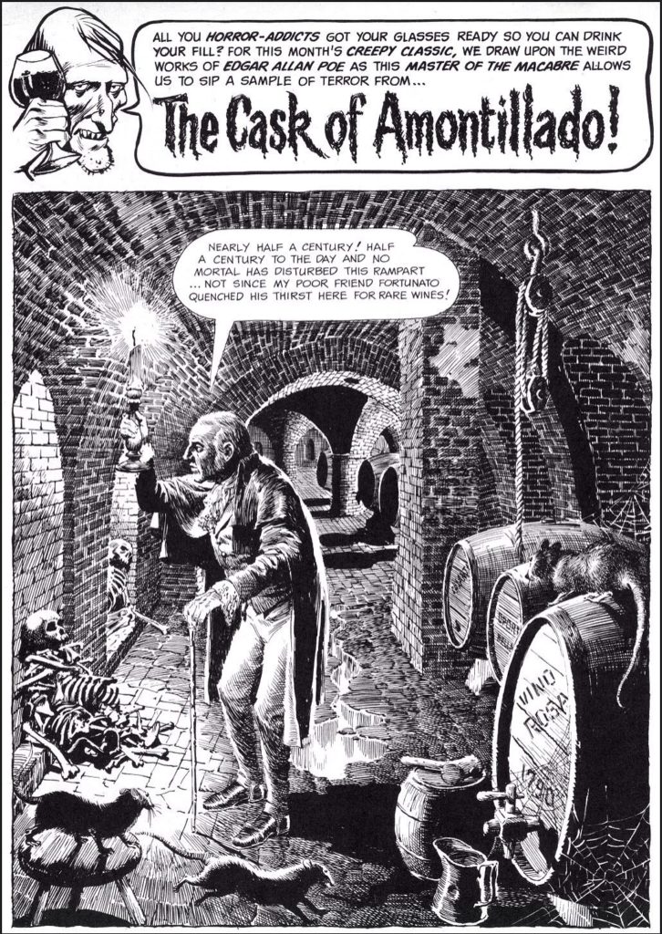
Severin was working on Wall Streetwhen her brother John, then an artist for EC Comics, needed a colorist for his work there. Marie Severin’s earliest recorded comic-book work is coloring EC Comics’ A Moon, a Girl … Romance #9 (Oct. 1949). In a 2001 interview, she recalled she broke in as a colorist… for all the war books at EC with [Harvey] Kurtzman. I went on to color all their books, they were happy with it, and I learned a lot about production color and how everything worked. … I believe the color chart for the printed pages had a range of up to 48 colors. I had the full range; I would mix colors — golds, greens, blues, and so on — and you would intensify them so that the separators could see the difference. … What they liked is that I really studied which colors looked best and sharper next to one another, the subtleties of it. I would also proofread the colors.She would contribute coloring across the company’s line, including itswar comic and its celebrated but notoriously graphic horrorcomics, and also worked on the comics’ production end, as well as “doing little touch ups and stuff” on the art.
The First Comic Book Magazines
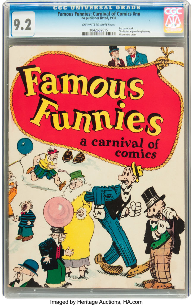
The first comic book appeared in 1933
Famous Funnies was a collection of comic strips printed together in one magazine.
 However, the first comic magazine to feature all original material was published by DC comics in 1935.
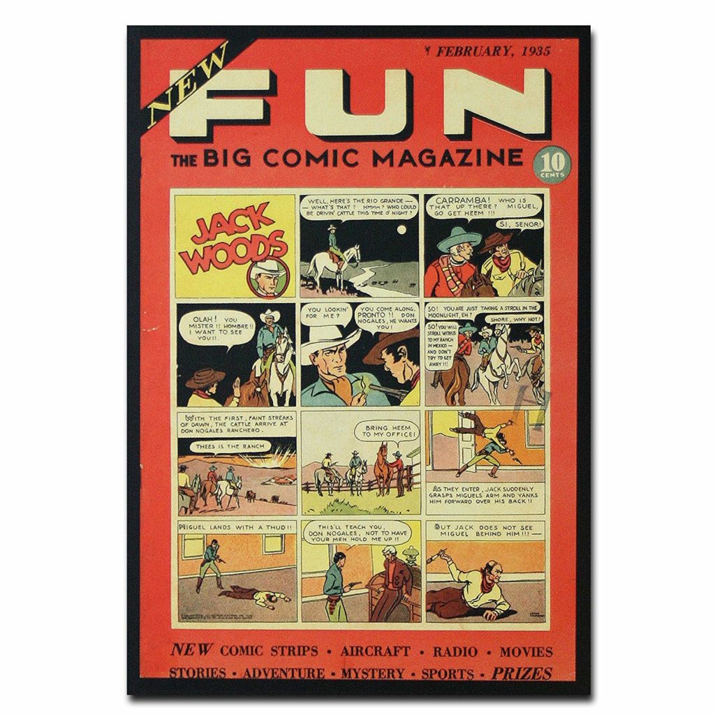 It was an anthology comic.
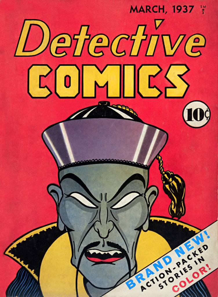
Detective Comics No 1 appeared in 1937. It is the longest running comic book title (still being published today), and we’ll come back to discuss it many times. DC comics derives their name from this book.
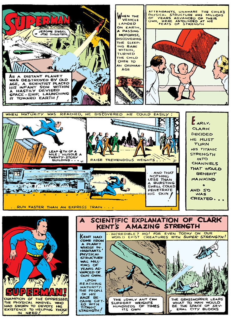
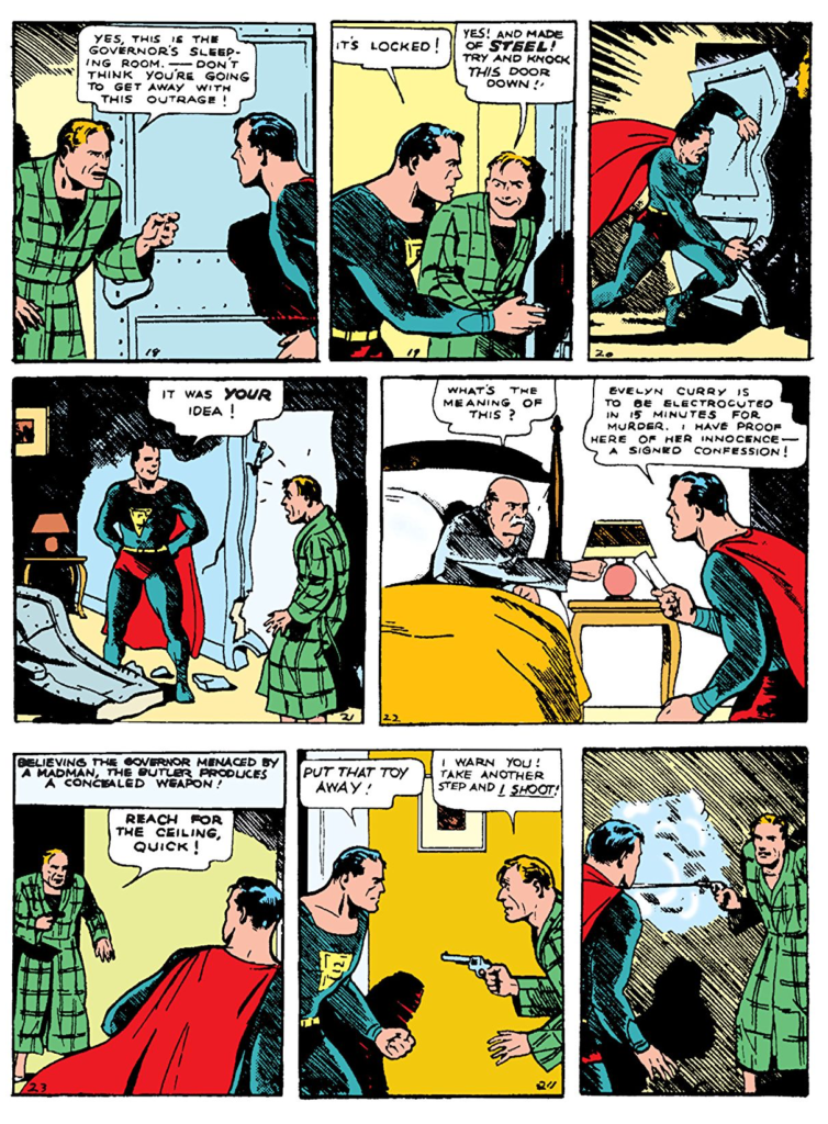
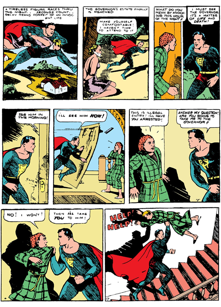
Superman
The “Golden Age” of Comics officially begins with Action Comics no 1 also published by DC.
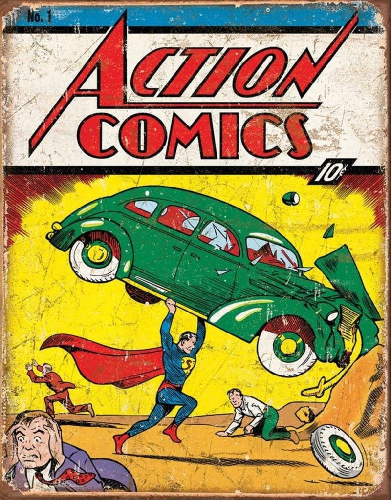
There is a lot to say about Superman. Much of it has already been said. Here are what I believe to be the key points:
- Superman is essentially a “Moses Myth” created by a couple Jewish kids from Cleveland. One of whom lost his father in a burglary. We can imagine why he imagined a bullet proof hero.
- At the time the pulps and the adventure comic strips were very popular. It isn’t hard to understand why this would have caught on with young male readers.
- Superman was originally envisioned as a villain, but the design for that version eventually became the basis of design for Lex Luthor.
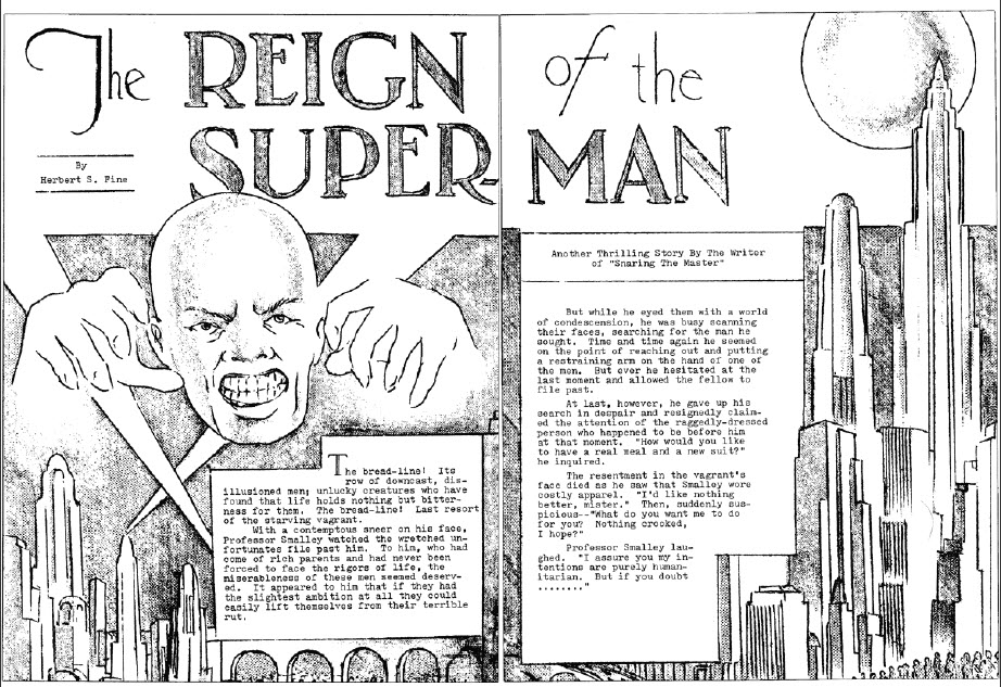
- “A couple of months after I published this story, it occurred to me that a Superman as a hero rather than a villain might make a great comic strip character in the vein of Tarzan, only more super and sensational than that great character. Joe and I drew it up as a comic book – this was in early 1933. We interested a publisher in putting it out, but then he changed his mind, and that was the end of that particular version of Superman – called The Superman. Practically all of it was torn up, by the way. Joe got very upset and tore up and threw away most of it.” – Jerry Siegel
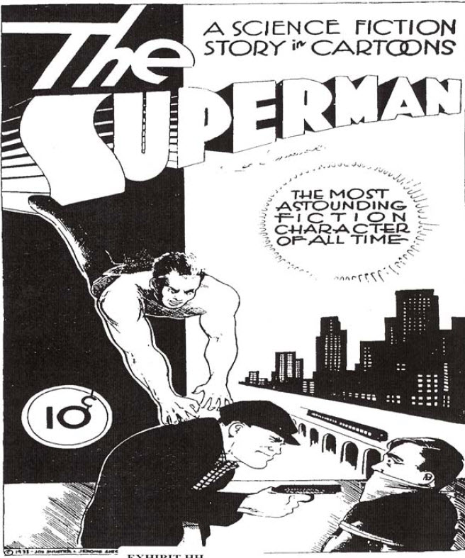
- “We saved the cover. The rest of the drawings were a crude version of Superman. It wasn’t really Superman: that was before he evolved into a costumed figure. He was simply wearing a T-shirt and pants; he was more like Slam Bradley than anything else – just a man of action. But we called him The Superman. That was the second time we used the name, but the first time it was used for a character of goodwill. I’m a perfectionist, and I think the fact that the drawings had been turned down made me want to tear them up. I simply destroyed them. I said, ‘If we ever do it again, I’m going to redo it properly.’ It was a very low period for us.” – Joe Shuster
- “Siegel and Shuster earned fairly high salaries writing and illustrating Superman comics. But they received no royalties. They signed away all rights to their character for $130. “Our company has very little to gain in a monetary sense from the syndication of this material,” DC Comics’ publisher disingenuously told Siegel in 1938 in response to one of his many requests for more cash. “Also bear in mind … that we can at any time replace you.” Siegel and Shuster were then fired in 1947 after filing a lawsuit against DC. A financially struggling Siegel returned to the company in 1959, accepting standard pay and no byline. He left again in 1965 and lodged a second, equally unsuccessful suit that dragged on for years. When a Superman movie began production in the 1970s, Siegel put a curse on it as part of a public relations campaign. The shaming strategy worked, as DC’s parent company agreed to give him and Shuster pensions of $20,000 a year, a sum that later went up. Furthermore, DC once more began crediting them as Superman’s creators. Following their deaths in the 1990s, Siegel’s and Shuster’s heirs brought additional copyright litigation that remains ongoing.” – JESSE GREENSPAN
- Jesse Greenspan brings up an interesting point here, but he neglects to mention the large role several artists had in helping Siegle and Shuster with their case in the 1970s, most notably: Neil Adams, who we’ll discuss later.
Batman
A few months after Action Comics No 1 Detective Comics No 27 was published featuring the first appearance of Batman
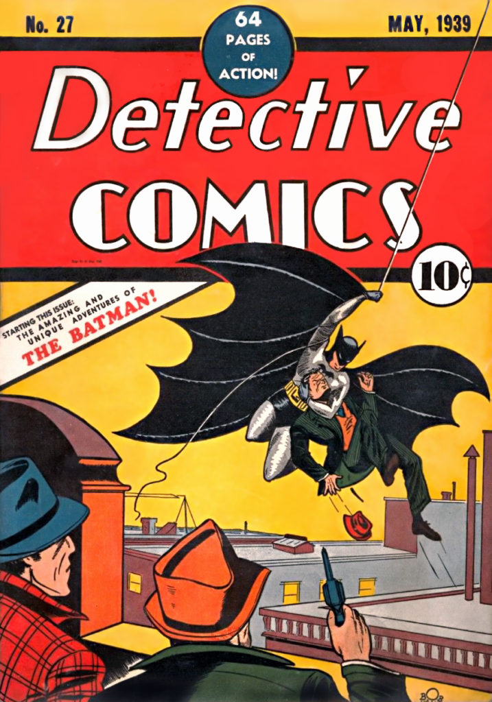
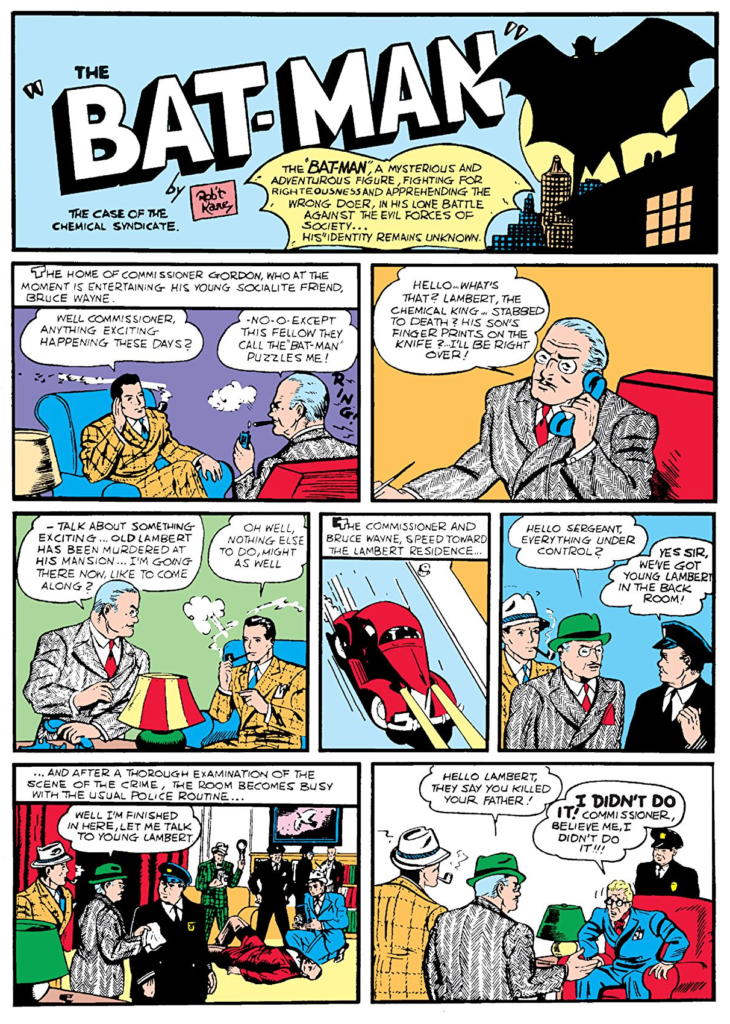
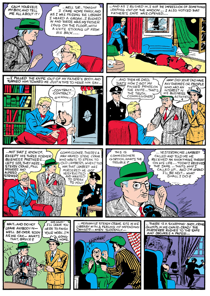
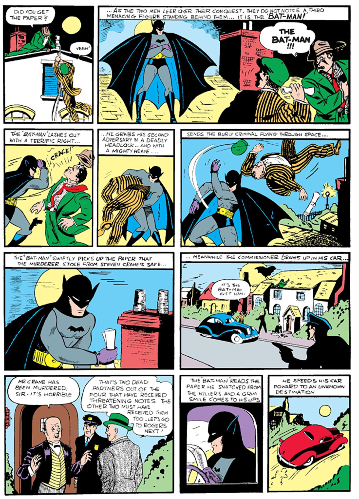
Legally, Bob Kane created Batman. the controversy surrounding this is that his collaborator, Bill Finger was probably more responsible for Batman’s success.
“After Superman debuted in 1938 and became an instant hit, DC editor Vince Sullivan asked Bob Kane to come up with a superhero, which he did with Batman…During that process, he went to a friend, Bill Finger, who gave him some tips on costume adjustments. For example, Bob initially drew bat wings on Batman. Bill suggested a scalloped cape. After Batman became a hit in May, 1939, Bob brought in more people throughout the year.
Bill was an amazing writer, who wrote for Batman for more than 30 years and came up with a lot of great stories, but so did others. Gardner Fox wrote a lot of the stories that inspired the TV series in 1966. Christopher Nolan credits Batman editor Denny O’Neil and writer Alan Moore with influencing him in Batman Begins. Kane, Finger, and Kane’s art assistant, Jerry Robinson, all claimed to have collectively come up with the Joker and Robin…both Finger and Fox laid claim to origin story, which appeared in Detective Comics #33 in November, 1939,” he adds. “We credit Gardner Fox, but I do know that some folks have given credit to Bill Finger over the years, so I guess it’s one of those stories where no one knows for sure.” -Steve Korté
I don’t pretend to be an expert about the origin of Batman, but I have read things to suggest that Kane was pretty well-off, and his father secured a good lawyer for him, so he nailed down the copyright for Batman with the DC comics editors before getting started. As I understand it, the name, the idea he was a detective, and the idea that he was a millionaire masquerading as Batman. This means Kane was riffing on a popular pulp character of the day called “The Shadow”. The difference was that Batman would be a comic book character who looked like a Bat. All the additional concepts, the outfit, the gadgets, the car, the butler, the Joker, etc. are believed to have come from Bill Finger.
The Origins of Marvel Comics
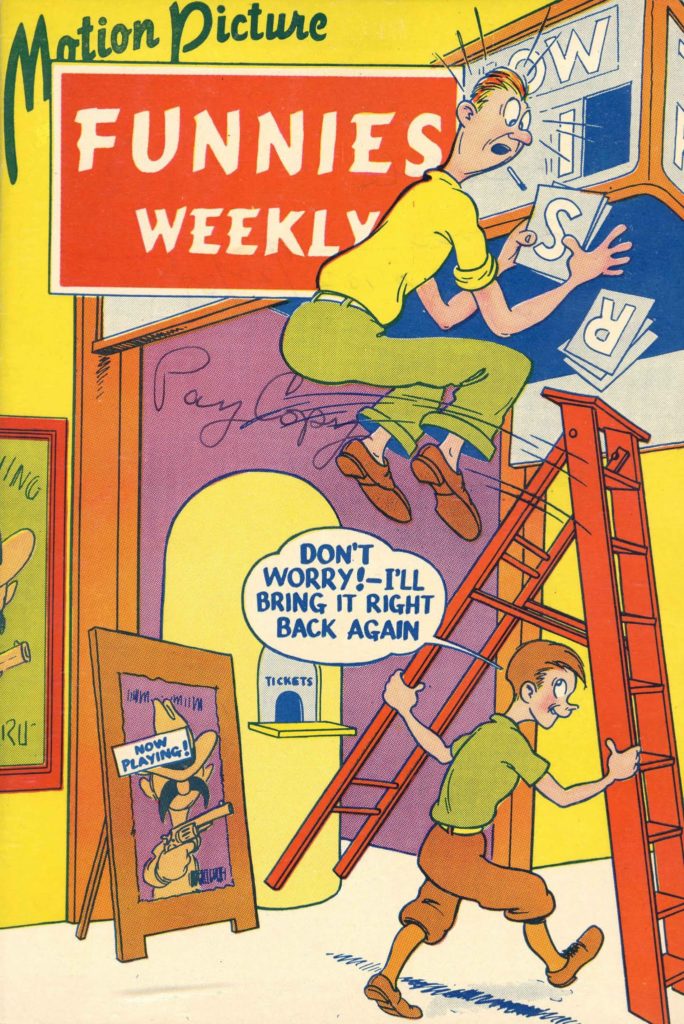
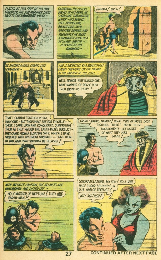
The same month Batman appeared, another “Super Hero” appeared in a comic magazine called “Motion Pictures Funnies Weekly” No 1. The character in that magazine was called “The Sub Mariner” and he was to become the first Marvel super hero, though Marvel didn’t have that publishing name yet. They were about to become known as “Timely Comics” What differentiated the Sub Mariner was that he was an anti-hero.
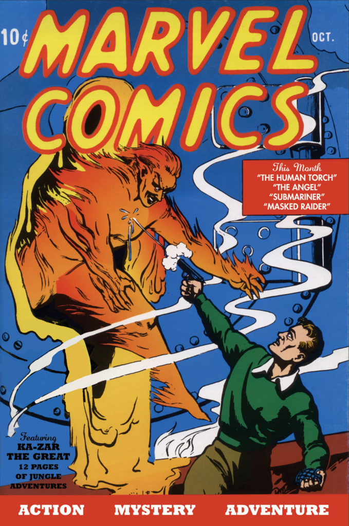
November of 1939 Timely introduced its second character. A flaming android called the Human Torch.
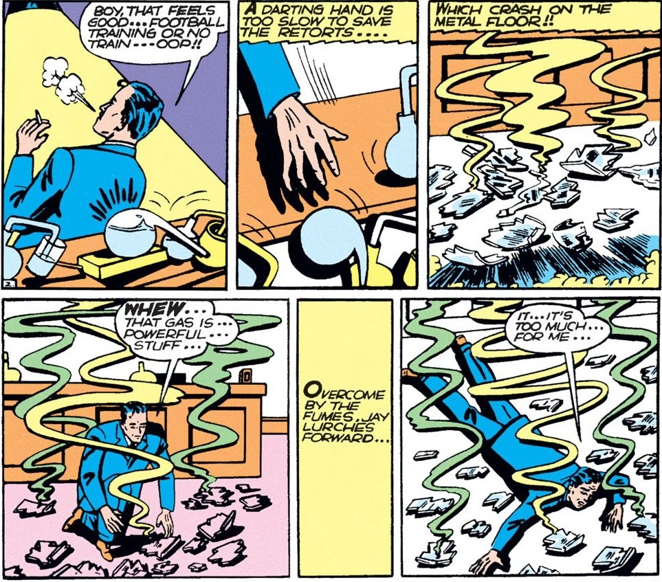
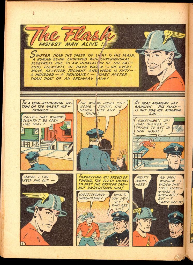
In 1940 the original Flash appeared in an All Star comics publication called “Flash Comics”, All Star Comics would eventually merge with DC.
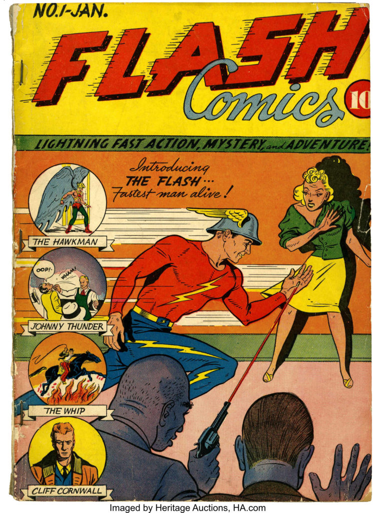
The Flash was the creation of writer Gardner Fox and artist Harry Lampert.
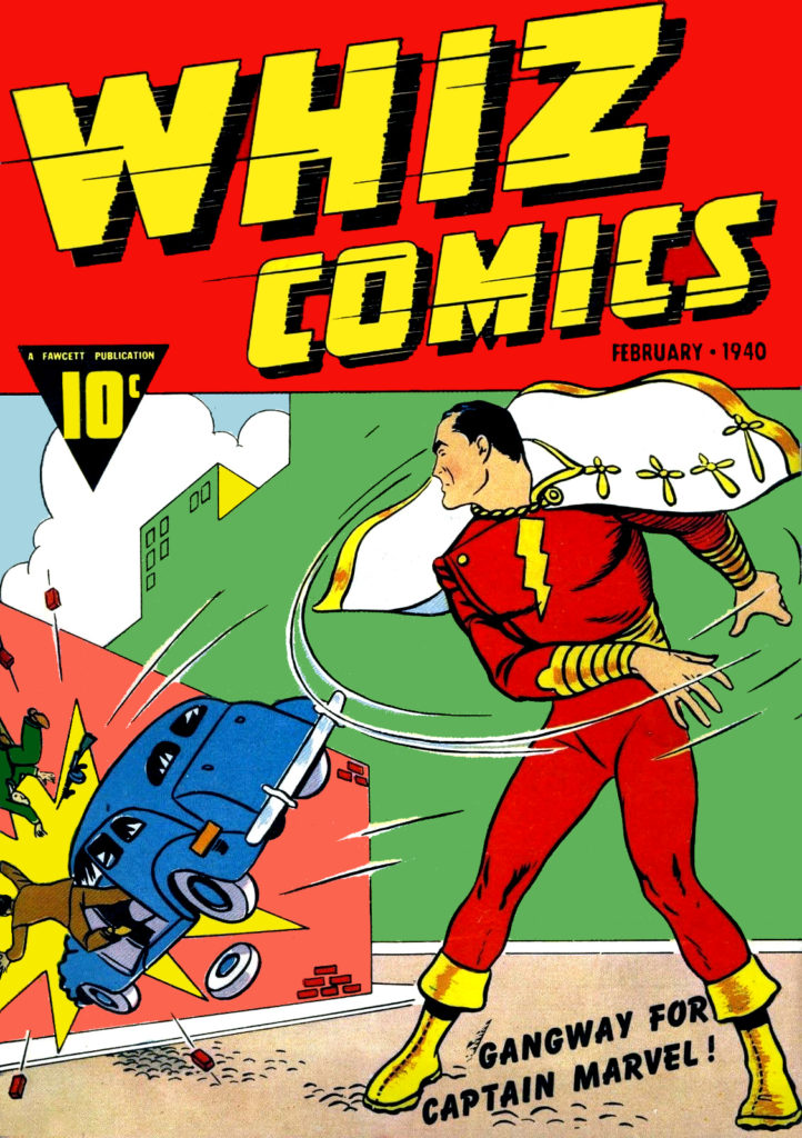
The following month Captan Marvel made his debut in Whiz Comics, published by Fawcett Comics. Written by Bill Parker, and drawn by C.C. Beck. The original name for Captain Marvel was going to be Captain Thunder, but Fawcett’s general manager suggested the change. The original idea was to create a group of characters that all had one special ability, but that idea was rejected. So he created one character with all the special abilities he’d envisioned: Solomon’s wisdom, Hercules’ strength, Atlas’ stamina, Zeus’ power, Achilles’ courage, and Mercury’s speed.
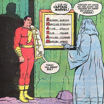
Captain Marvel and the Marvel family were incredibly popular, outselling Superman. DC later sued Fawcett claiming that Captain Marvel was too similar to Superman, and they won!
“The studio behind the film Republic Pictures was originally working with DC, or National Comics Publications at the time, to make a “Superman” picture, but they already had an existing cartoon deal with Paramount Pictures, which prohibited them from signing another. So Republic Pictures chose “Captain Marvel” instead. DC was obviously not pleased. Fawcett had already published “Master Man,” an obvious copy of “Superman” that they stopped publishing after DC had threatened with lawsuit. They believed “Captain Marvel” was just another imitation as well.
In June 1941, National Comics finally sued Fawcett for copyright infringement. This began National Comics Publications versus Fawcett Publications, one of the longest-running legal battles in the history of comic books, lasting over 12 years. Here’s what happened.
DC’s argument was simple, that Captain Marvel’s main powers and characteristics were too similar to Superman and therefore infringed on its copyright. Fawcett argued that although these two characters were similar, it wasn’t to the point of infringement and that similar feats have already been performed by other fictional characters like Popeye or Tarzan.
To prove their point, National Comics prepared a binder over 150 pages in length with panels from their comics of “Superman” juxtaposed with similar panels of “Captain Marvel.” Everything was in close scrutiny, from their costumes, boots, capes, the ability to leap great distances, the ability to fly, extraordinary strength and speed, invincibility to bullets, shells, explosives, and their secret identity. They went as far as to include that they both had clean-cut faces.
The verdict was clear, the judge eventually ruled that “Captain Marvel” was indeed a copy of “Superman,” but it was Fawcett who won the trial. It was all because of one tiny mistake, a mistake that looked like this. This was the copyright symbol used back in the 1950s. The lawyers from Fawcett discovered that McClure Syndicate, the newspaper company that published the “Superman” comics, had forgotten to place these symbols on several of their strips and argued that DC had no copyright to “Superman,” and the court agreed.
This was devastating news for DC. It meant that it did not own Superman and that anyone could publish Superman’s stories without legal repercussions. This lasted over two years. Out of 160 strips of “Superman,” published from January 1939 to April 1950, less than half of them were from Detective Comics.
DC immediately appealed, and despite the damage, the decision was reversed. The judge of the case, Learned Hand, declared “Captain Marvel” a deliberate and unabashed duplicate of “Superman” and told Fawcett to cease all of its publications and pay DC for the damage it owes. Fawcett settled.
By 1950, the Golden Age of Comic Books had come to an end. Sales were slumping to all-time lows, and Fawcett simply decided that it wasn’t worth fighting. They paid $400,000 in damages, almost $4 million by today’s standards, and with its last issue, it seemed like the end for “Captain Marvel.” As you well know, it was not.” – Nathaniel Lee.
A story for later on, but Fawcett reimagined Captain Marvel in the 50s as a character called “MarvelMan”, published later in America as “Miracle Man”, and that is an incredibly fascinating comic, as well as a fascinating story about publishing rights. We’ll discuss it at length when we get to the 90s.
Last thought about Captain Marvel: those comics created the action/comedy model that is the most popular tone for Super Hero properties to this day. It created the idea of the boy super hero, later utilized by Spider Man, and the Teen Titans, and it created the family of super heroes with their own magazines. Mary Marvel and Captain Marvel Jr were both popular enough to get their own books. Elvis famously based his rhinestone outfits on the look of Captain Marvel Jr.
Robin
In April of 1940 Robin debuted in Detective Comics #38. He was the first of the kid sidekicks. Created by Bob Kane, Bill Finger , and Jerry Robinson.

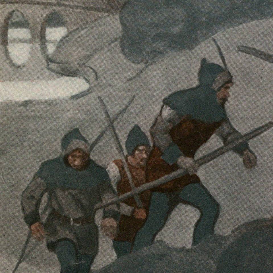
His look was inspired by the concept for the look of “Robin Hood” that was popular at the time. Here’s an illustration of Robin Hood by NC Wyeth
“Robin was an outgrowth of a conversation I had with Bob. As I said, Batman was a combination of Douglas Fairbanks and Sherlock Holmes. Holmes had his Watson. The thing that bothered me was that Batman didn’t have anyone to talk to, and it got a little tiresome always having him thinking. I found that as I went along Batman needed a Watson to talk to. That’s how Robin came to be. Bob called me over and said he was going to put a boy in the strip to identify with Batman. I thought it was a great idea.” – Bill Finger
Green Lantern
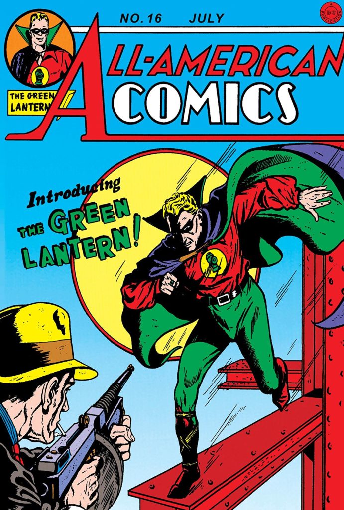
Published in All Star Comics no 16 (All Star Comics would later merge with DC), Martin Nodell created Green Lantern, a man with a magic ring, that could create and/or effect anything he imagined, but could not effect wood. He had to charge the ring every 24 hours by touching it to a battery shaped like a lantern.
Captain America
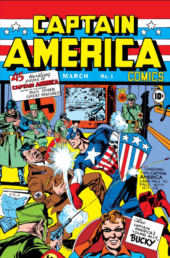
Captain America was pretty popular for a very short time in the 1940s, created by Joe Simon and Jack Kirby. We’ll talk about Jack a LOT in the 60s, 70s, and early 80s. Not the first, but the most popular of all the patriotic heroes that emerged at this time. Captain America would become more significant when revitalized by Kirby and Stan Lee in the 1960s, but even in the 40s he does demonstrate the popular conception of a comic book hero of the day: strong man dressed in bright colors with a teenage sidekick.
Super Hero Team Up
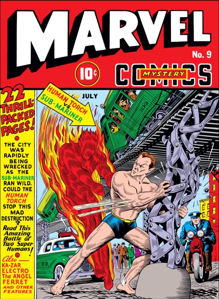
A way in which Timely comics were changing the game of super hero comics in the 40s was by introducing the idea of the super hero team up that begins with a battle between heroes. The first time characters from different books appeared together in one book was Marvel Comics no 9.
Later that year, All Star Comics developed the idea by introducing the Justice Society of America. The first Super Hero Team.
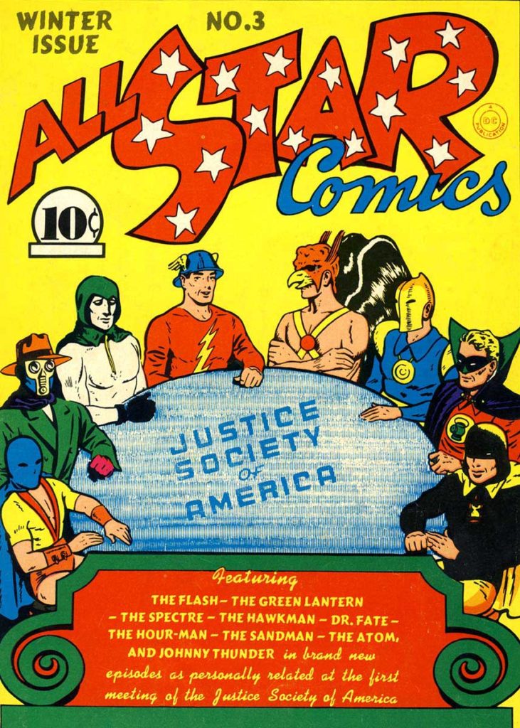
Briefly, the characters shown here from left to right are:
The Atom: a short guy who was a great boxer.
The Sandman: a crimefighter with a gas gun.
The Specter: another Jerry Siegle (of Superman fame) creation, the specter is a cop who died, and was brought back by the literal spirit of vengeance from the Bible. He avenges those who are wronged in godly ways.
The Flash: who we already mentioned.
Hawkman: Carter Hall is the reincarnation of Egyptian prince Khufu who discovered the ninth metal (later changed to nth metal) with gravity defying properties that allowed him to fly. As an archeologist, he used ancient weapons from the museum he curated.
Dr Fate: Without the helmet, Kent Nelson is an ordinary guy. With the helmet, he is possessed by the Egyptian sorcerer Nabu.
Green Lantern: we’ve already discussed.
HourMan: Rex Tyler, chemist, developed a pill that can give him great strength for an hour.
Wonder Woman
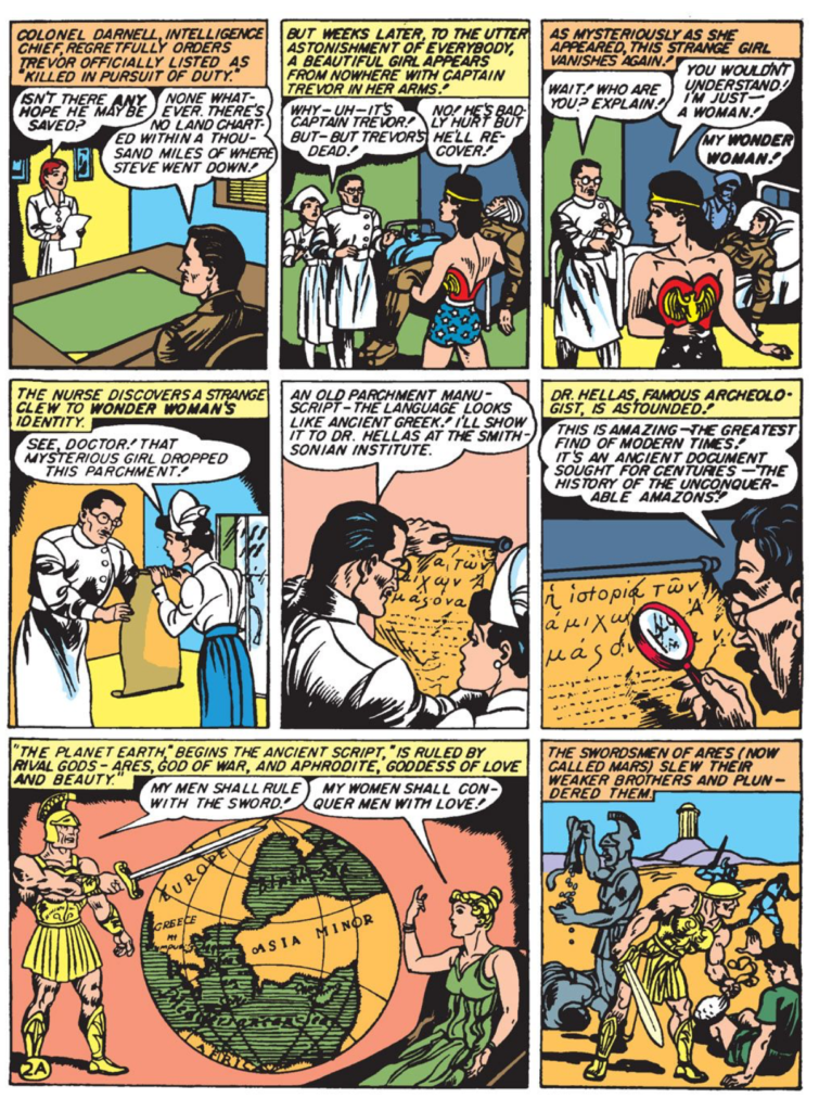
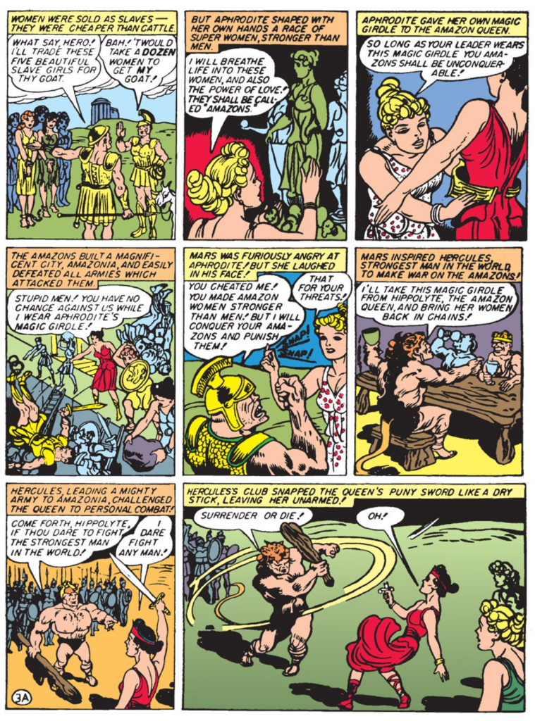
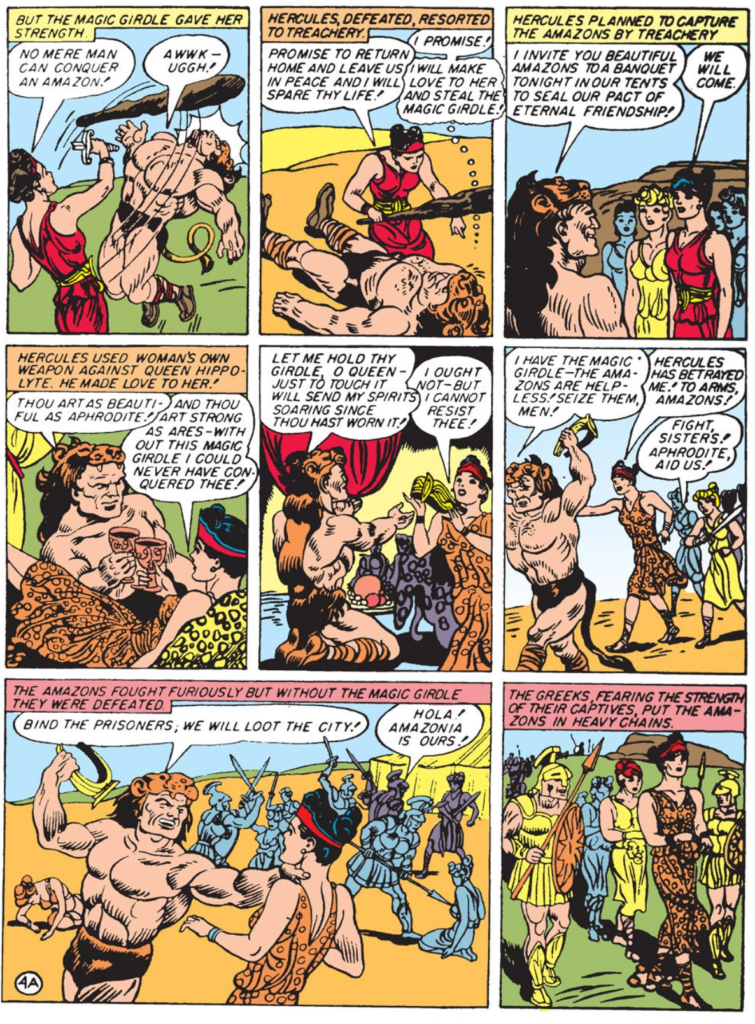
Though Fantomah was the first female super hero with powers to appear in a comic book, Wonder Woman Created in 1942 by William Moulton Marsden and H.G. Peter was the first popular female super hero.
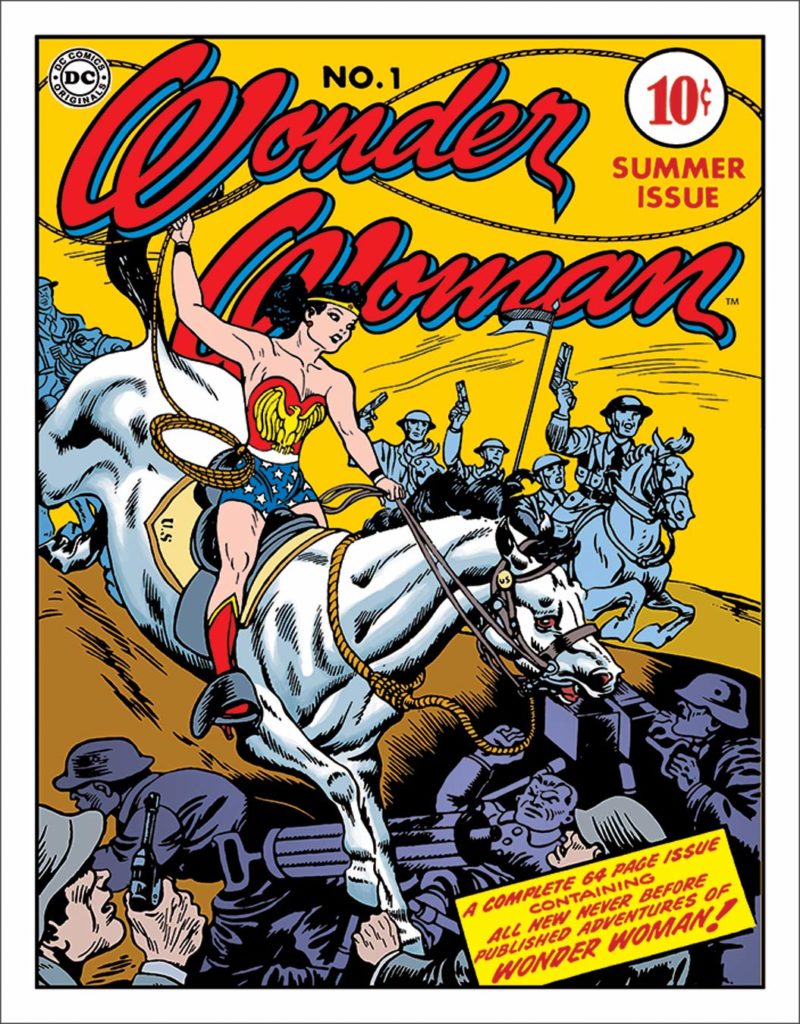
There is a lot to say about Wonder Woman, but I’ll try to condense it to the important points.
- Marsden was famous for having invented the technology that led to the invention of the polygraph. In an interview he mentioned his feelings that the comic book medium could go further.
- Max Gaines, a published at All American Comics, read the interview and immediately contacted Marsden to discuss his creating a comic book character.
- Marsden and his wife discussed the idea and felt the character should be a woman.
- “Not even girls want to be girls so long as our feminine archetype lacks force, strength, and power. Not wanting to be girls, they don’t want to be tender, submissive, peace-loving as good women are. Women’s strong qualities have become despised because of their weakness. The obvious remedy is to create a feminine character with all the strength of Superman plus all the allure of a good and beautiful woman.” — William Moulton Marston
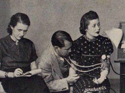
- This is where it gets tricky. Marsden was a swinger who was into bondage. He and his wife had a woman who lived with them named Olive Byrne, and it’s pretty well documented that the three of them coexisted in all the ways you think I’m implying.
- Wonder Woman, as conceived by Marsden, was an amazon (to connect her to mythology), but he gave her 2 tools I want to mention first: a lasso of truth (whenever she puts it around someone they are compelled to tell the truth) and bullet proof bracelets. However, while the bracelets give her the power to deflect bullets they also rob her of her power if they are bound by a man. I think the metaphor is clear when you see this photo featuring Marsden’s wife hooked up to a lie detector, and Olivia taking notes as she wears he bracelets that were likely used for other activities behind closed doors.
Decline of Super Hero Comics
After World War II super hero comics felt trite. Nearly all ceased publication by 1949. The ones that remained were Batman, Superman and Wonder Woman.
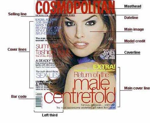
Magazine Cover ANATOMY
Dateline: Month and date of the publication, often with the price underneath
Main image: This is where the main image of the model is shown
Model Credit: It is rarely seen on normal magazines but it is done sometimes on fashion magazines.
Coverline: From the 1950s, greater competition on the newsstands resulted in more cover lines
Main Cover Line: This is very large – taking up almost a quarter of the magazine cover – and comes in three layers, each with a different colour.
Left Third: The left third of the magazine cover is vital for sales in shops where the magazine is not shown full-frontage.
Bar Code: Standard bar code used by retailers, displayed on UK magazines since 1988.
Cover lines: They may be tweaked to exploit new printing techniques; switch from full face to a body shot; use illustration rather than photography; move the target readership age up or down; or simply to freshen things up.
Cover Lines
Cover lines are exclusively the domain of periodicals. The content, use and placement of cover lines are up to the designer, but placement in the newsstand is a high determining factor.
Tag Line is a line under the logo or a slogan that helps the reader understand what the periodical is about and helps identify target market.
Headline is a line that tells the reader something about the main story in the publication, can also be attributed to every story in the periodical as a title for each story. This headline helps inform the reader what they are about to read should they purchase the periodical. Many periodicals misuse the headline, generating interest with a misleading phrase or quote. This practice is known as “yellow journalism”.
Kicker is the copy appearing after the headline that sets up the thesis of the article, sets the tone, etc.
Pull-Quotes are a design tool for breaking up the copy and drawing the reader’s attention to material in the article the designer feels is important, or eye catching.
Sub heads or subheadings also known as cross heads are another way to break up the copy and help a reader find a specific section in an article, or just break up dense copy so that it is more legible.
Bylines and Credits tell us who wrote the article, and possible who contributed photos or illustrations to the story.
Body Copy this is the actual substance of the articles in the publication.
Panels, box copy, sidebars, and infographics these all function as a way to add insight to the larger idea without actually interrupting the body copy.
Captions used to clarify images or provide a bridge between image and body copy.
Folios page number, publication title, sometimes a section or chapter title, this helps the reader navigate the publication if the publication is designed so that they can skip around.
For every printing need there is a specific type of paper that will suit the job perfectly.
However, with so many different sheet types and sizes available on the market, it can be difficult to determine which ones can be used with your printer and which ones are right for a particular job.
Even when you’ve got to grips with the range of paper types and sizes, there are also different coatings and weights to choose from.
Printing paper types
Printing paper comes in many different types, each with different uses and benefits. Here are some of the most popular types of printing paper:
Inkjet Printer Paper
This type of paper is designed for specific use with inkjet printers. There are different forms of inkjet paper which work well with inkjet ink, including photo, glossy, business card, and greeting card variants.
Laser Printer Paper
Laser paper is best used with a laser printer. This is used more in business environments for tasks such as printing documents, cheques, and mailing labels.
Matte
This paper is one of the most frequently used, as it is suitable for all everyday printing tasks. Matte paper is finished with a white coating which helps the ink to dry faster than on other paper types, and means it is suitable for a document that is needed quickly.
Bright White
Bright white paper sheets are much smoother and are non-textured, which makes them ideal for high-quality, presentable double-sided printing. The brightness of the paper ensures that both sides can be printed on without the ink showing through on the other side.
Glossy
This paper type is traditionally used when printing images or photographs rather than text, as it has the ability to produce brilliant colours and sharp images. The glossy surface absorbs the ink, creating much higher clarity images than you could expect from matte paper.
Card Stock
This strong, sturdy paper type is most often used for scrapbooking or to print business cards and postcards. As it is significantly thicker than other types of printer paper, it is much more durable and can be carried and passed around without becoming tattered.
Resume
Slightly heavier than traditional paper, and with an off-white appearance, this type of paper is unique from other forms of printer paper. Resume paper features an ivory or cream tone and is commonly used for CVs or other important documents, to indicate that printed information is of high importance.

Paper sizes
A size
Most printer users are probably already aware of ‘A size’ paper. These are the most widely used, and easily distinguishable paper sizes. These paper sizes are simple to understand, as they increase and decrease in successive order, with A1 being the biggest paper size and A10 the smallest.
| Paper Size | Width x Height (mm) | Width x height (inches) |
| A1 | 594 x 841 mm | 23.4 x 33.1 in |
| A2 | 420 x 594 mm | 16.5 x 23.4 in |
| A3 | 297 x 420 mm | 11.7 x 16.5 in |
| A4 | 210 x 297 mm | 8.3 x 11.7 in |
| A5 | 148 x 210 mm | 5.8 x 8.3 in |
| A6 | 105 x 148 mm | 4.1 x 5.8 in |
| A7 | 74 x 105 mm | 2.9 x 4.1 in |
| A8 | 52 x 74 mm | 2.0 x 2.9 in |
| A9 | 37 x 52 mm | 1.5 x 2.0 in |
| A10 | 26 x 37 mm | 1.0 x 1.5 in |
A4
A4 paper is the most commonly-used for printing and measures 210mm x 297mm. This paper comes in many different weights and with several different coatings, meaning there is an A4 paper that is suitable for any printing job. This paper size is not only suitable for everyday tasks but can usually fit special purposes too.
A3
A3 paper sizes measures 297mm x 420mm, which is twice the size of A4 paper. This larger sheet allows you to print documents that need to make more of a visual impact, including large graphic pieces or high-resolution images. Large format A3 printers are extremely versatile as they have the ability to print in both A3 and A4, along with having faster print engines.
Other A sizes
Smaller A sizes such as A5 and A6 are also available, which are great paper options for printing flyers or other small media. There are also larger options like A2 and A1 which allow you to print posters and banners.
SRA
The SRA paper, or the ‘supplementary raw format A’ range is produced slightly more oversized than A size paper. Due to this it’s mainly used for commercial printing, as it allows room for bleeding, gripping and trimming. The most common size in this range is SRA3 paper, which can be used in many digital print machines.
C size
C size paper is a range of paper used exclusively for envelopes. The sizes vary from C1 to C10, and mainly correspond to their similar sizes in the A range of paper, although by design they are slightly bigger. This marginal difference in size allows the similar A size sheet to fit inside the envelope.
| Size | Width x Height (mm) | Width x Height (in) |
| C1 | 648 x 917 mm | 25.5 x 36.1 in |
| C2 | 458 x 648 mm | 18.0 x 25.5 in |
| C3 | 324 x 458 mm | 12.8 x 18.0 in |
| C4 | 229 x 324 mm | 9.0 x 12.8 in |
| C5 | 162 x 229 mm | 6.4 x 9.0 in |
| C6 | 114 x 162 mm | 4.5 x 6.4 in |
| C7 | 81 x 114 mm | 3.2 x 4.5 in |
| C8 | 57 x 81 mm | 2.2 x 3.2 in |
| C9 | 40 x 57 mm | 1.6 x 2.2 in |
| C10 | 28 x 40 mm | 1.1 x 1.6 in |
Paper weights
Image Credit: iStockPhoto.com / johnnyscriv (Via Custard Online Marketing)
As well as a range of paper sizes, there are various weights available for different uses.
Paper weight is generally measured in GSM. This stands for ‘Grams per Square Metre’ and is a measurement of paper thickness or density, which directly relates to the quality of the media.
The higher the GSM value of the paper, the thicker it is. As the description suggests, it indicates how much a 1 metre x 1 metre square piece of the paper would weigh in grams.
Generally, the thicker the paper, the more durable the sheet will be. Therefore, different paper weights have different uses, with thicker paper being used for more industrial purposes.
Common printer paper weights
| 300GSM+ | Good quality business card, or heavy card media |
| 180GSM – 250GSM | Middle market magazine cover |
| 130GSM – 170GSM | Promotional posters |
| 80GSM | Standard issue day-to-day office matte white paper |
| 35GSM – 55GSM | Most everyday newspapers |
Paper coating types
Printing paper can also be found with many different coatings, which will give the sheet a specific finish and thereby determine its suitability for a certain job.
Some of the most common paper coatings are as follows:
Varnish
These coatings can be found in either gloss, satin or dull finishes, and can be tinted in certain colours.
They are an incredibly affordable choice of coating, but have a lower level of protection compared to other laminates. Varnish coatings are useful for adding a gloss to a photo, giving a professional appearance.
UV
This coating offers a much higher level of protection to printed sheets and will enhance the printed colours.
It is applied as a liquid before being hardened under ultraviolet light, and can therefore vary in thickness. This coating can be applied either matte or gloss, along with specialised glitter or tinted finishes.
Aqueous
These coatings protect prints from fingerprints and other markings or damages.
Aqueous coating is fast to dry as it is water-based. Its major plus point is that these coatings are more environmentally-friendly than alternative options.
Paper opacity
Another thing to consider when purchasing printer paper is the opacity of the sheets. This refers to how transparent or opaque they are, or how much light they let through.
The weight of paper generally influences the opacity of the paper, with heavier paper usually being more opaque.
The opacity of a sheet of paper is measured on a scale of 0 to 100. A sheet which measures as 0 is a transparent sheet, while 100 would be a completely opaque sheet.
Different opacities will have different uses, for example, extremely transparent sheets can be used for tracing paper.
There you have it, a definitive, in-depth look at the different types of paper available on the market. This guide should clear up any questions or hesitations you have about which paper you need for your print job.
However, if you need any more assistance or have further questions regarding your printer, feel free to contact our team of experts who will be more than happy to help.
Any publication needs to be broken into its components to maximize design/artistry. There are several issues to consider. We will discuss physical considerations in another post, but this post will focus on content specific ideas.
Book Specific Issues
The Cover (Front Cover, Back Cover, and Spine)
The End pages
Front Matter (preliminary pages) often comprising the title, author name, publisher, and sometimes an image. Sometimes the image is on an additional page. On a separate page there is often a copyright statement. Often a dedication will appear here or around the title page.
Title Page often includes the same info: the title, author name, publisher, year of publication, and sometimes an image
Contents Page if included this will help a reader find sections within the book, assuming it is divided thusly.
Preface a short statement about the book’s thesis, goals, origin, and perhaps additional author notes.
Forward similar to a preface, but usually written by someone other than the author
Content the material written by the author.
Bibliography and Recommended Reading will appear in an academic work or a work that has used citations. It may also appear in fiction if the author wants to point people toward sources of inspiration fiction and non-fiction alike.
Index may appear in a reference volume of any type. May also appear in an illustrated volume. This may also be an alternate position for a dedication.
Magazine Specific Issues
Magazines usually break down into 3 areas:
- The News-led first section: generally this contains contents, letters, editorials, contemporary news specific to the subject of the magazine/newspaper. Uses a variety of font sizes to help organize the elements of the page, but also to provide energy
- The middle section housing “features” or “The Feature Well”: contains celebrity interviews, or in-depth analysis of something happening in the industry specific to the magazine. The designer may employ white space, illustrations, photographs, or a wide variety of typographic ideas in order to differentiate the publication and/or grab attention.
- A back section called (shockingly) “the back of the book” that houses information-based content.
Comics Specific Issues
Comics and Graphic Novels often borrow from book design and magazine design as those publications are sort of a cross between the two. The biggest thing to know about comics is that left/right facing pages matter more than in most other publications. Many comic storytellers build their “reveals” (the moment where something really interesting happens) into the material one would first see as they turn a page. The big comic specific problem is that art work that is really eye catching can spoil a story point if a reader gets to it before the artist intended as a result of glancing over too soon.
When one creates a new publication standard practice is to visually establish the brand message. This is also known as the identity, or how the publication feels emotionally to its intended audience.
Traditionally, this is created by the editor and designer working to create this “brand” for the client. However, in recent years, these roles are merging. Often the client will deal directly with the designer. In this instance the designer and the client take on the roles once held by the editor.
The challenge to creating this identity is that the designer must look at established norms for the intended audience, then determine how to communicate with that audience in a way that feels relevant. The term “relevant” in-and-of-itself has become “irrelevant” due to overuse, but the idea is that the design needs to be fresh without alienating the established customer base. Sci-fi novels, for example, have a look that is unlike a “Dummy’s Guide”, and “Dummy’s Guide’s” have a look that is unlike literary fiction.
The cover should help the target audience understand at a glance that this is a publication that might appeal to them.
There are several ways to accomplish this goal without having to stick to established current norms.
Look to the past. What has worked in this market before?
Look adjacently. Is there a trend in this market in another medium, like TV, movies, games, the internet, etc. where the designer might pull ideas?
Look at closely related publications to see if there are developing trends. For example: a sci-fi novel may have roots in comic books, fantasy novels, or the tech market.
Remember to take care of basics. For example: a publication for young readers might want you to design with a larger than normal font size to help younger readers read. Likewise, a book for younger readers will typically use a wider range of colors than a publication for teens and adults. Conversely, a publication aimed at an elderly market may also use large type, but utilize a more limited color palette. An “indie” publication should take more risks with design, because they will need those risks in order to stand out, and appeal to a customer base that is looking for something different.
Often, publishers will make use of a “dummy”, sometimes called a “pilot” (just like a tv show). The idea is to make the publication using self-publishing techniques, so one can look at the completed finished product in a physical form before sending it to a printing office. I have seen a publication go through 5 to 10 variations before a final version is achieved. I have heard of people producing many more than that, especially in the magazine industry. In comics (my primary medium) I am constantly surprised by my own inability to see drawing errors till “the next day”.
In some industries the “dummy” will be used in order to experiment with typefaces, paper stock, grid systems, and anything else that might be up for debate.
Typically, as one achieves knowledge of the brand’s “standards” those standards will be written down in some format easily accessible by a wide range of freelancers who might need the information. If it is a publisher who is producing a wide range of publications, but they want some elements to be consistent across their line they will often collect that data in an online format for freelancers to access. Trade dress, typefaces, logos, are all stored in this way.
Psychology can be utilized in designing a publication. Hard data to suggest that many, or any, of the norms established over the last century are real, but if you work in publishing, you will encounter people who have very specific “taste” opinions about what is and is not good. I know an editor who thinks gradients are passé. I know an editor who won’t publish the product unless there is a minority on the cover. I know an editor who won’t publish the product unless a blonde woman is on the cover. Some think red sells, and green does not. Yellow is typically avoided by most magazine publishers.
I would say that these people are right, until they are wrong. In other words, there is a ton of anecdotal evidence to suggest that what editors think makes something work is not what makes something work.
So, what makes a publication work?
Who knows?
I think it is good content that people know about. I heard a great story in comics once. There was an artist named Jack Kirby. In the 60s he was doing the best work of his life. He was in his late 40s/early 50s. His co-creator was a writer named Stan Lee. It has been argued that Stan did very little of the work in creating their comics. Stan would call up Jack, talk through an idea, then Jack would go turn it into a story. Then Stan would look at the drawings, and add words.
The question becomes: who wrote the story? Many of Kirby’s fans say he did, and I tend to agree with them. Having an idea for a story is not writing a story. The person who sits down and fleshes it out, and figures out the structure, and the emotional beats wrote the thing. It is pretty well documented that was Jack!
However, Jack had been drawing comics by this time for over twenty years. he never enjoyed the success he had with Stan before or after their collaboration. It could just as easily be argued that if it weren’t for Stan’s final polish, and if it weren’t for Stan cheering Jack on publicly, letting all interested parties know they should look at Jack’s work, no one would have known about it.
Stan and Jack created the Avengers, Iron Man, the Hulk, Ant-Man, the Fantastic Four, Black Panther, and a host of other amazing characters.
My point is that for something to be remarkable content it has to both be exceptionally crafted as well as exceptionally marketed.
Branding, as presented in this article is the beginning of that marketing. There are other applications for the term “branding” we will discuss shortly, and in some ways it’s the last thing a marketer should worry about.
One of the best ways to create vector graphics is to trace them. We can do this with the pen tool, but sometimes we want trace something more complicated, and it makes more sense to let the software handle it.
I will show you two examples of this:
- I have a drawing I need to blow up really big.
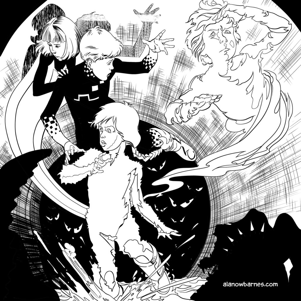
So, this is a drawing I made to celebrate a friend’s birthday. My friend, June Brigman, is a very accomplished comic book artist. This is my recreation of one of her most celebrated covers. Imagine that I need to put this image on a 36″ poster. That would be a pixilation problem, because I drew it at 6″. So, the only real solution I have here is to scan it at a really high DPI (in this case the scanner I had maxed out at 1200 DPI). It I simply turned this into a 300 DPI image (minimum requirement for printing) I could print it at 24″ effortlessly, because it is already that scale. However, to get all the way to 36″ without pixilation problems, the easiest thing to do is to drop it into adobe illustrator, and do a “trace and expand”
I’ve opened it up in Illustrator
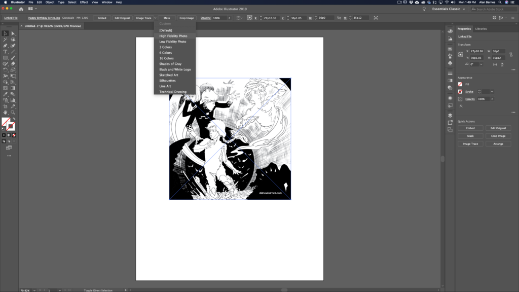
As you can see, one of the first options is “Trace”. This option only appears when you open a raster image in illustrator. There is a dropdown menu. You can chose the option that’s right for you, but in this case I’m choosing “High Fidelity Photo”.
The next step is to “expand”, meaning to convert the tracing into “paths” as you might create with the shape tool or the pen tool.
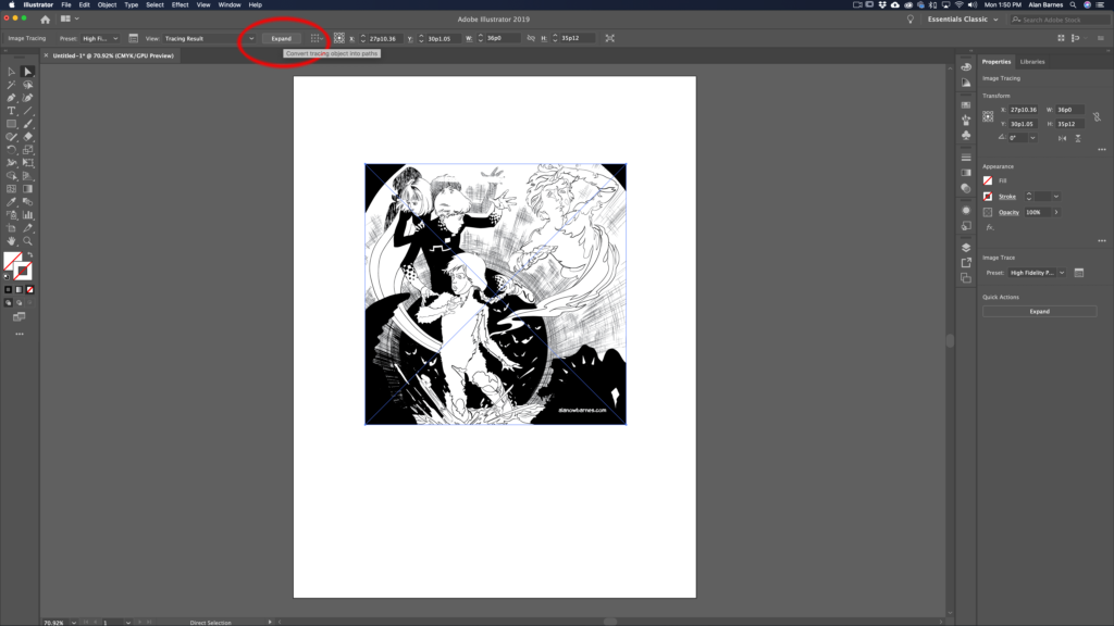
Now the image is essentially a series of paths and you can expand the image or output the image as much as you’d like without pixilation.
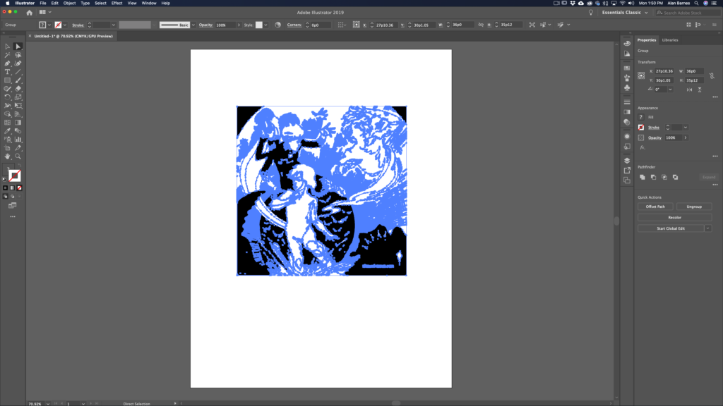 There are some “gotchas” related to this technique. For example: you will loose some of the fine detail intrinsic to drawing on paper. Brush details, and drawing effects will be lost.
Also, you may need to “clean up” the image by removing white bits. This happens with more complete drawings. It’s easy to do. Put a colored shape behind the drawing so you can see what you need to see. Then, using the magic wand tool, select white, then delete that white you’ve selected. In all honesty converting line art like this to a vector graphic works best when the image comes in as a 2-bit file (white and black only…no gray marks).
2. The second reason you may want to use something like this is if you need to recreate an icon quickly.
Here’s an icon I made for a book a while back.
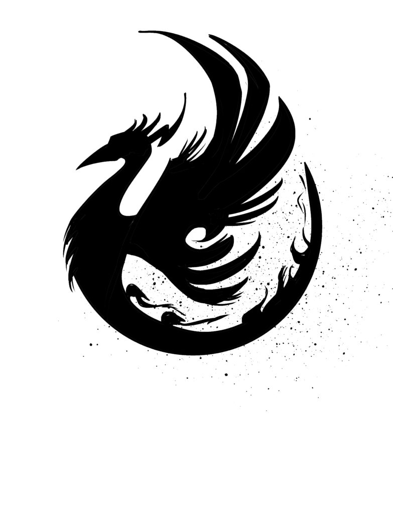
I drew this. So now I want to make it a vector graphic.
First I might “clean it up by removing my ink spatter, and convert it to a 2-bit file.
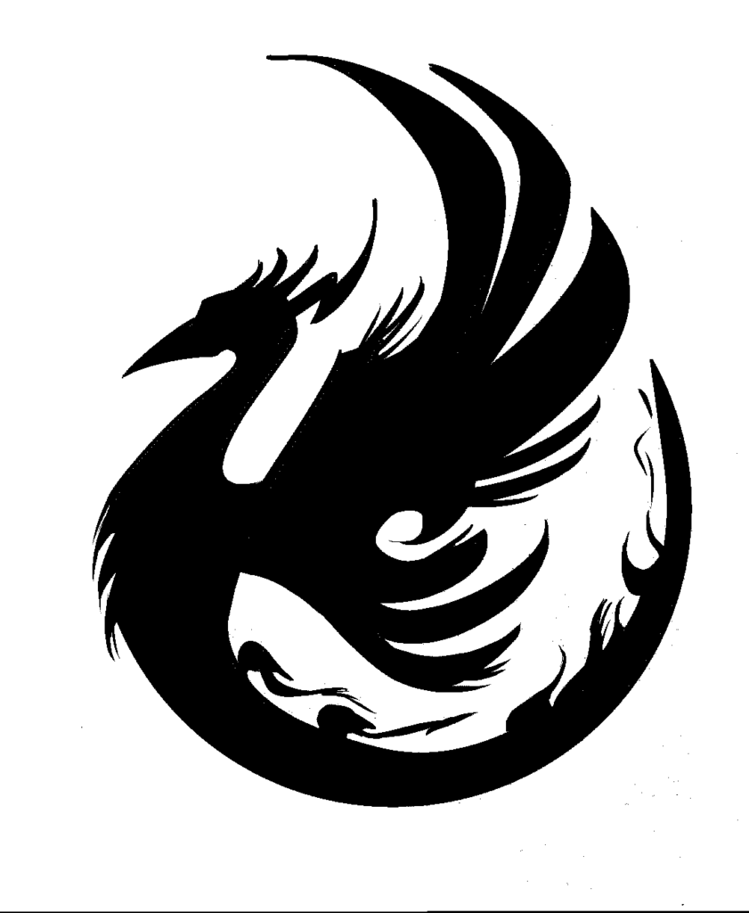
Then take it in to illustrator and do a trace and expand.
In this case I did it as a “Black and White Logo”
Then I did a “simplify” in order to clean up the marks even more.
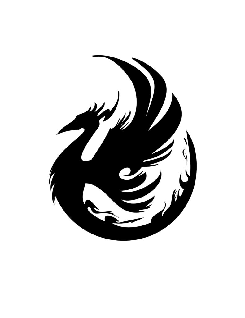
An added reason to do this is that it would make it really easy to change the color of the icon or add a stroke, or whatever!

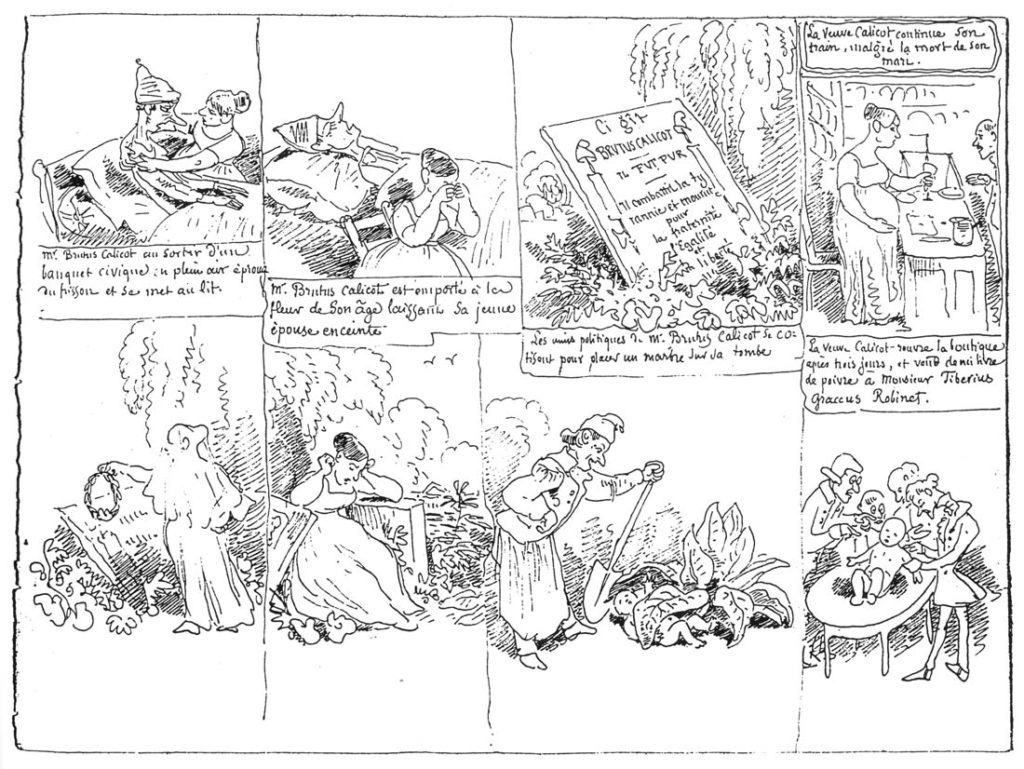
Rudolphe Töpffer – Primitive comic book creator. His books were known as “Graphic Literature”. He developed the concept of the cartoon face more than anyone previous.
William Randolph Hearst – Publisher in the late 19th and early 20th centuries. He is best remembered as a progenitor of “yellow journalism” (today we call it “fake news”). He was one of the two major publishers of comic strips as they developed.
Joseph Pulitzer – Publisher in the late 19th and early 20th centuries. He is best remembered today as the man for whom the “Pulitzer Prize” is named, but he was also famously involved in “Yellow Journalism“, and was Hearst’s biggest rival. The two of them developed a way of conveying news stories through sensational exaggeration related to sex, crime, and graphic horrors. He was the other major publisher of comic strips as they developed.
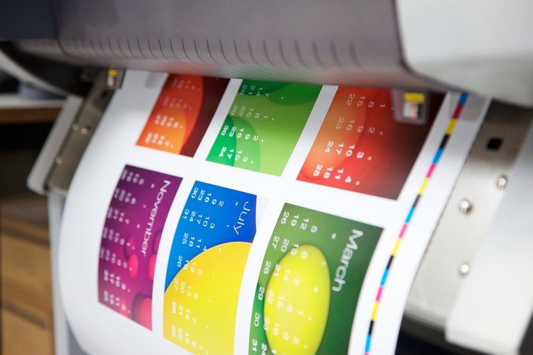
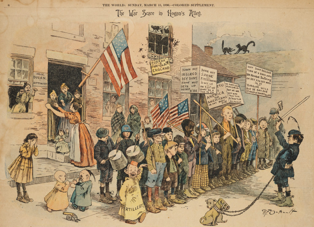
Richard F Outcault – The first comic strip “super star”. Created a strip called Hogan’s Alley. Later also known as the Yellow Kid (The term “Yellow Journalism” was coined by journalists trying to describe the war between Hearst and Pulitzer who both published Hogan’s Alley, and The Yellow kid separately. It became a symbol of their rivalry. The over sensationalized reporting techniques they employed were first known as “Yellow Kid Journalism…later the term was shortened). It was published under one title by Hearst, and under the other title by Pulitzer. The character the Yellow Kid was the fist published comic strip to utilize the device of “the word balloon“. It was also the first strip to utilize modern printing techniques for color. Specifically, it was the first time a CMYK color printing press was utilized for a newspaper in regular circulation.
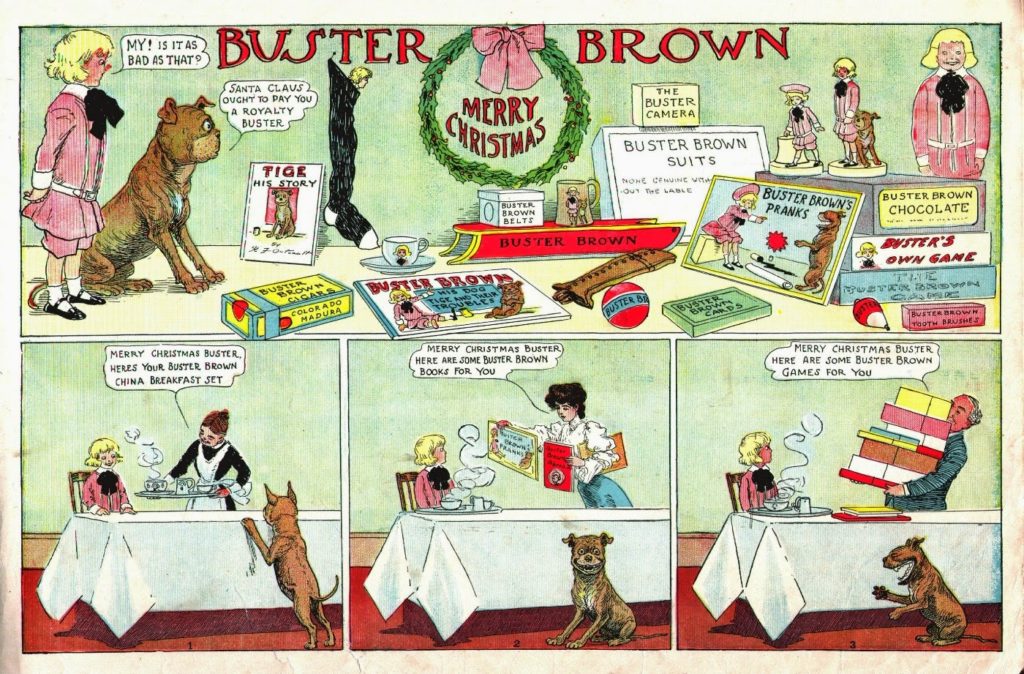
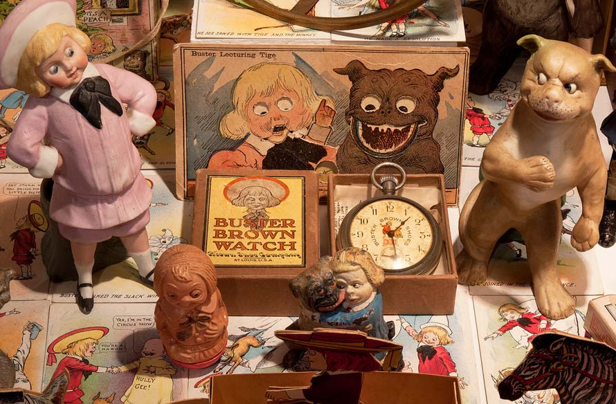
Later, after a series of legal battles, Outcault abandoned that property and created Buster Brown, which was the first comic strip to utilize marketing gimmicks later employed by people like George Lucas, though this is leaping ahead in time a decade or so. Buster Brown first appeared in 1902. Hogan’s Alley first appeared in 1889.
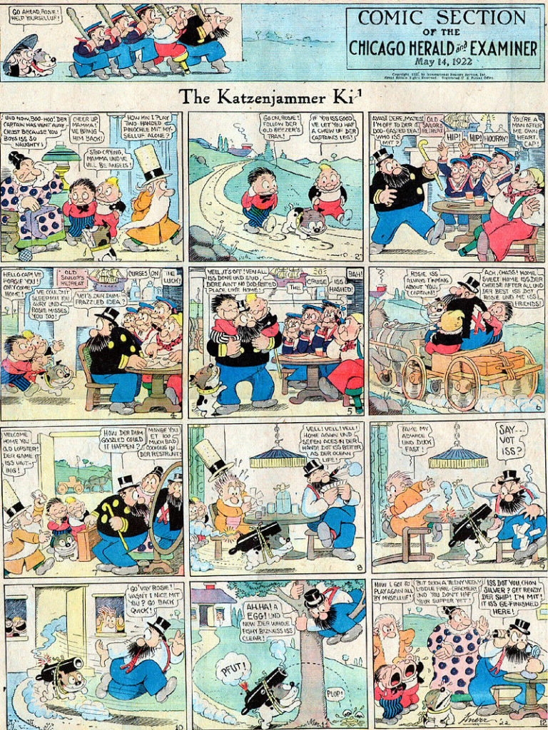
Rudolph Dirks – Creator of the Katzenjammer Kids 1897. First strip to regularly employ word balloons. The Katzenjammer Kids were like an early version of South Park.
The defining theme of the strip was Hans and Fritz pranking der Captain, der Inspector, Mama, or all three, for which the boys were often spanked, but sometimes shifted the blame to others.
The strip was immensely popular, but I think it is really remarkable because it is an early example of a legal case involving creator rights. Dirks took a break from the strip in 1913, or he tried to leave Hearst for Pulitzer. I’ve seen the story presented both ways. Hearst continued publishing it with an alternate artist named Harold Knerr. Dirks sued. In a highly unusual court decision, Hearst retained the rights to the name “Katzenjammer Kids”, while creator Dirks retained the rights to the characters. Hearst continued hiring Harold Knerr to draw his own version of the strip. Dirks renamed his version Hans and Fritz (later, The Captain and the Kids). Thus, two versions distributed by rival syndicates graced the comics pages for decades. Dirks’ version, eventually distributed by United Feature Syndicate, ran until 1979.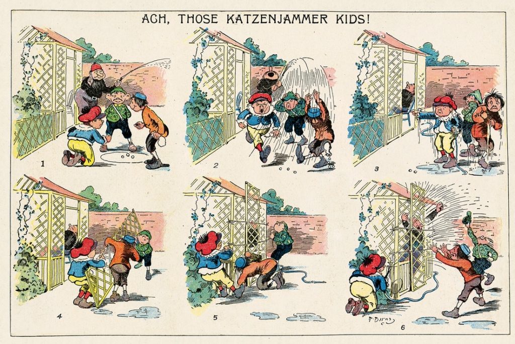
Winsor McKay – Little Nemo in Slumberland – Amazing draftsman. He is also a significant figure in early animation.
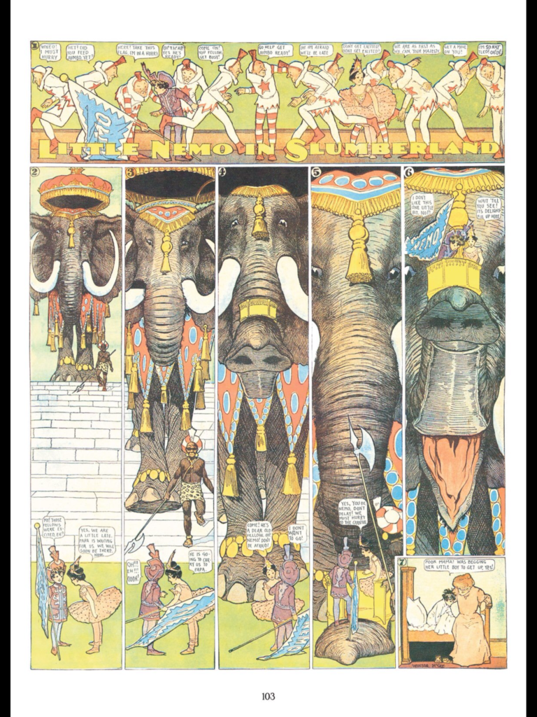
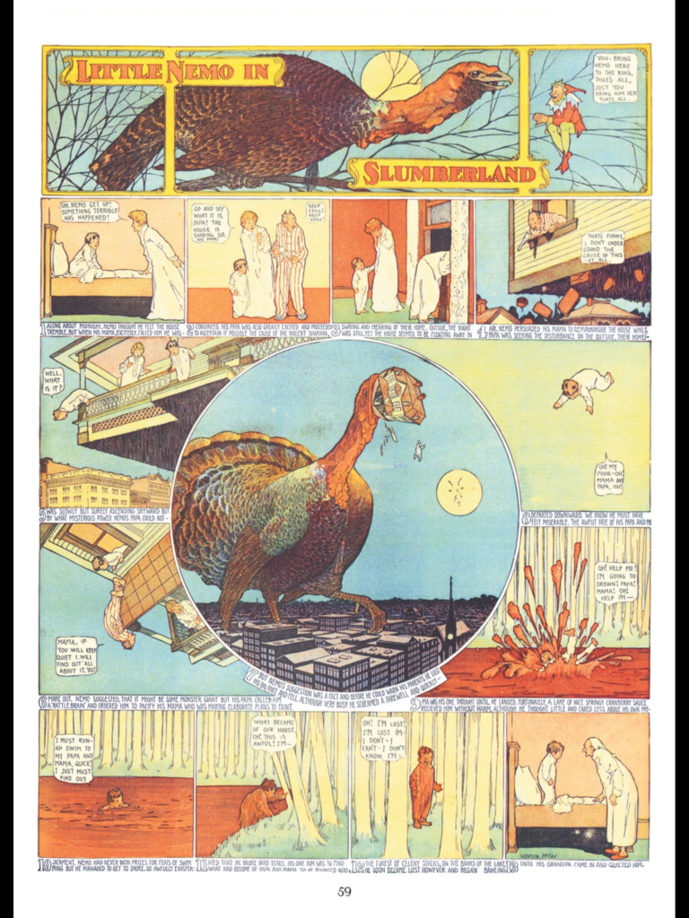
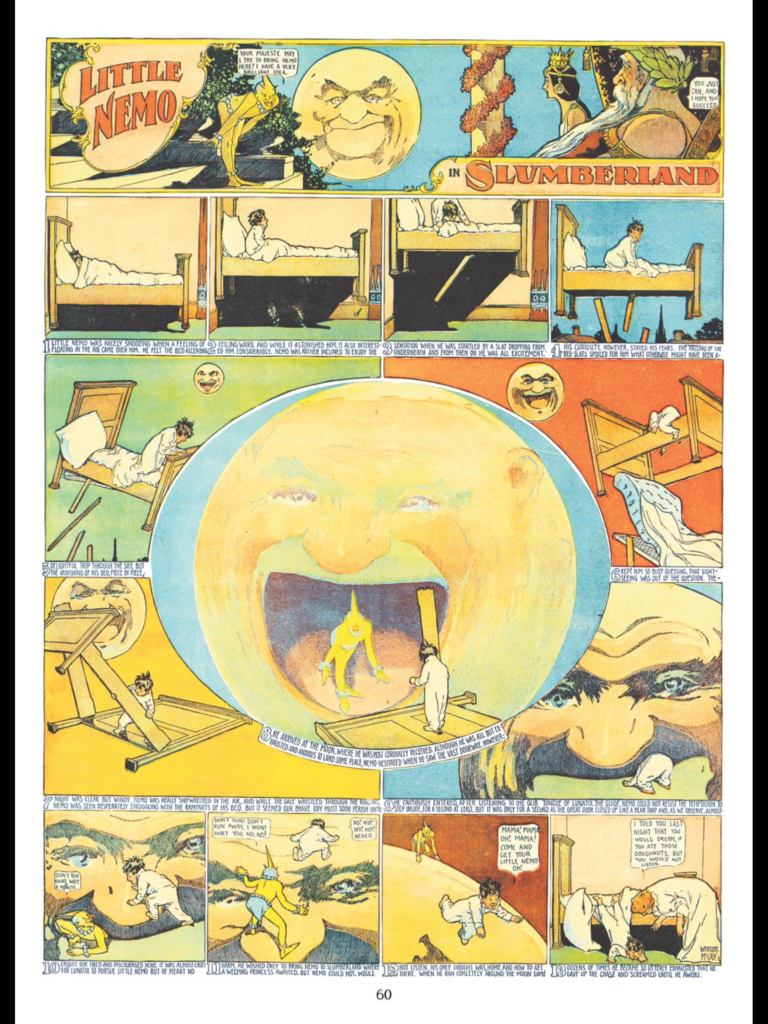
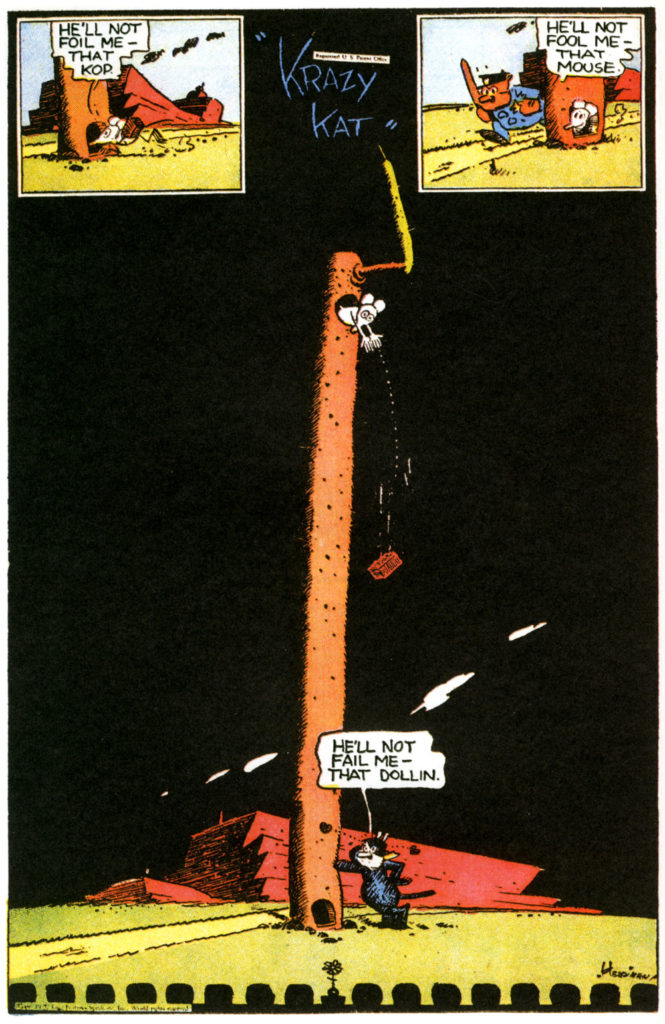
George Herriman – Krazy Kat – Often considered the most “literary” of the early comic strips. Here’s a great article about it. When looking at Crazy Ket pay special attention to the layout as well as use of language. Gilbert Seldes, author of the 7 Lively Arts, argued that it helped break down the high vs low art barrier. Never a popular comic strip, but the intellectuals loved it. There was even a Krazy Kat Ballet.
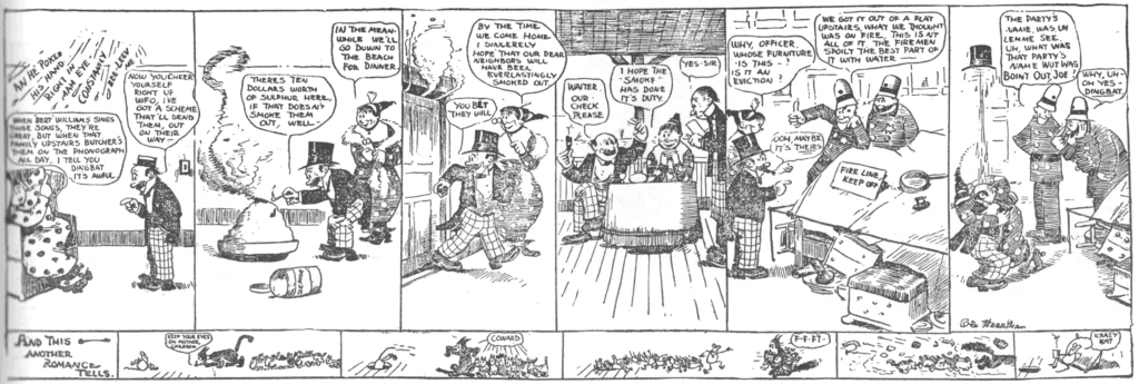

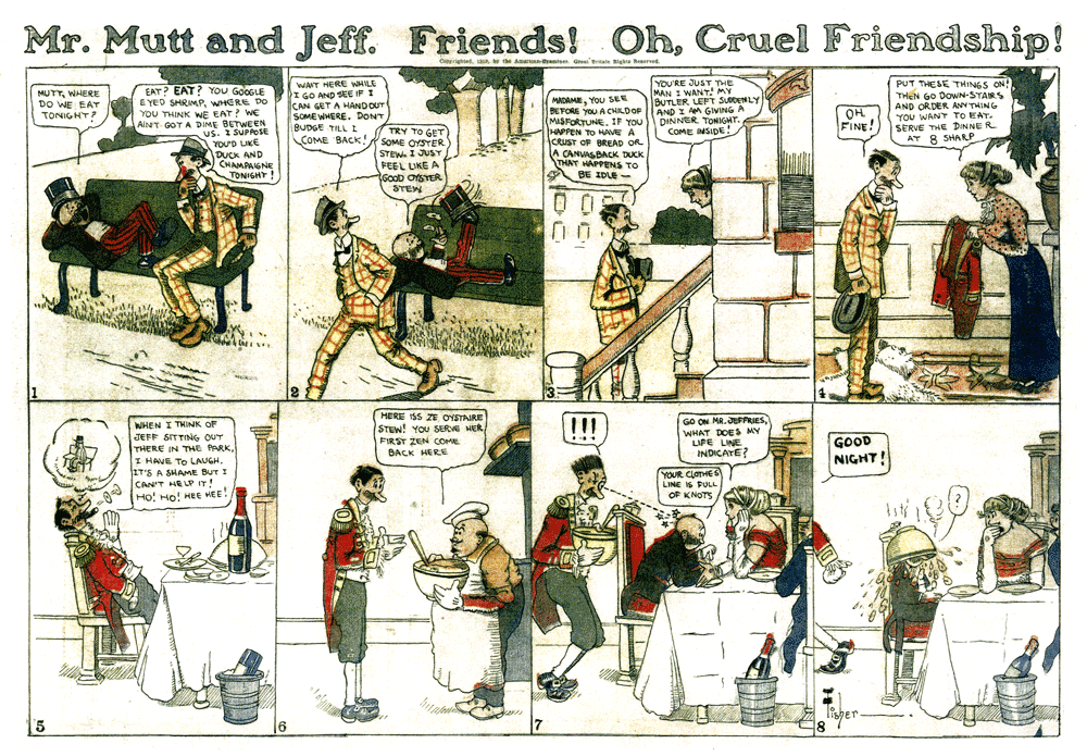
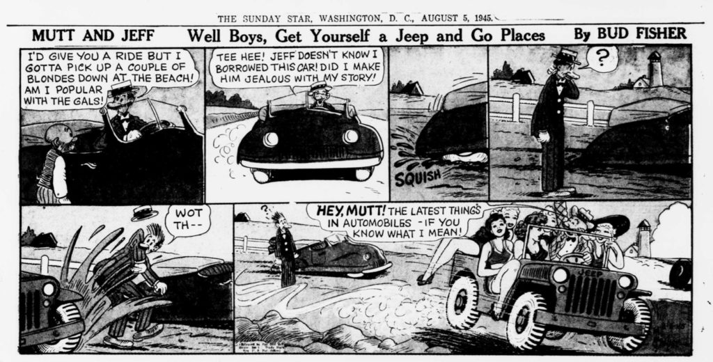
Bud Fisher – Mutt and Jeff – first successful daily strip. Creating a 4-panel comic strip produced 6 days per week had not happened successfully before. There were attempts, but they were short lived. Mutt and Jeff is the origin of the Odd Couple archetype. The pairing of tall and skinny with short and stout. It debuted in 1907.
In 1908 it moved to the sports page of the San Francisco Chronicle, where it became a national hit. “A 1908 sequence about Mutt’s trial featured a parade of thinly-disguised caricatures of specific San Francisco political figures, many of whom were being prosecuted for graft.” (from the wikipedia article)
Fisher had taken the precaution of copyrighting it in his own name, so he was able to change the syndication distributor from King Features to Wheeler Syndicate in 1915.

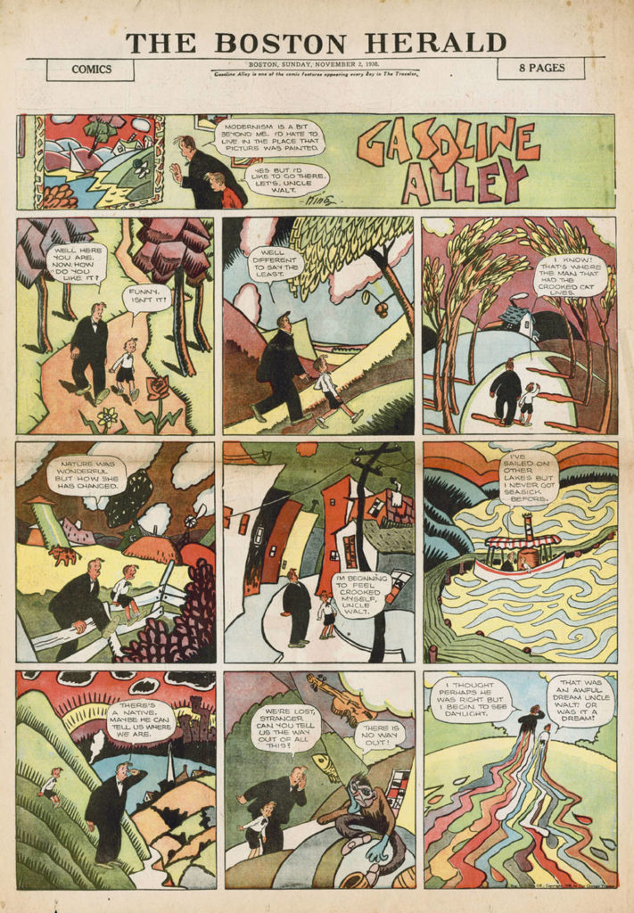
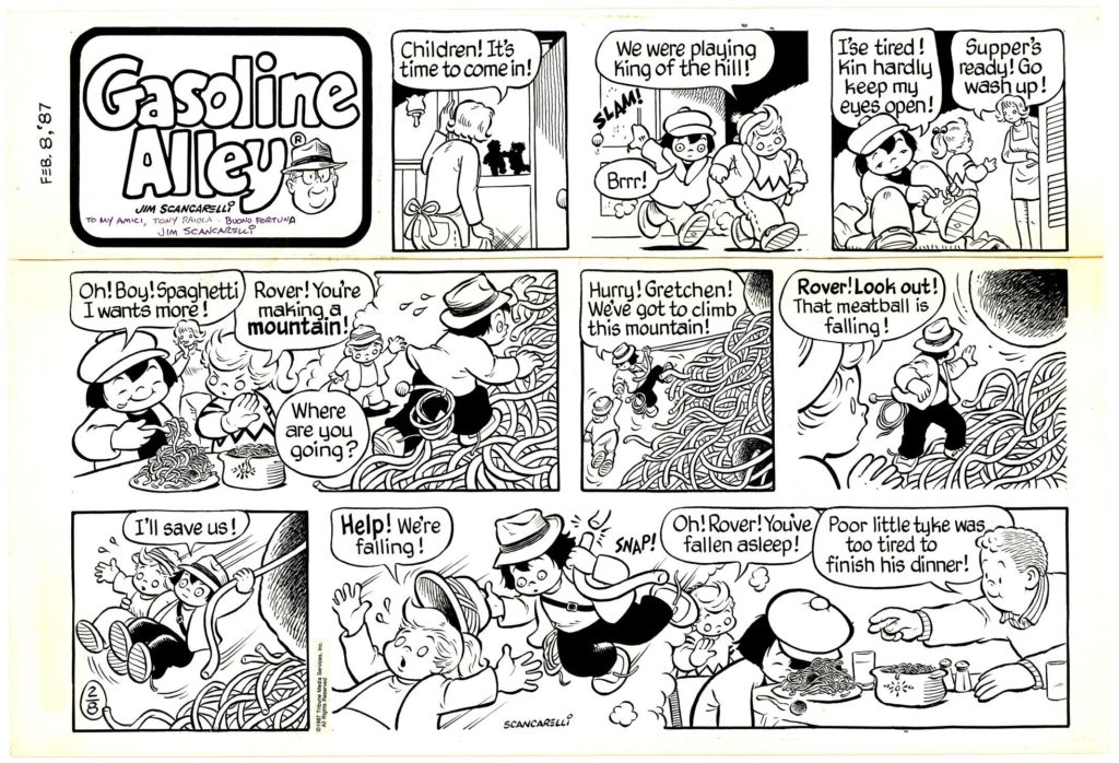
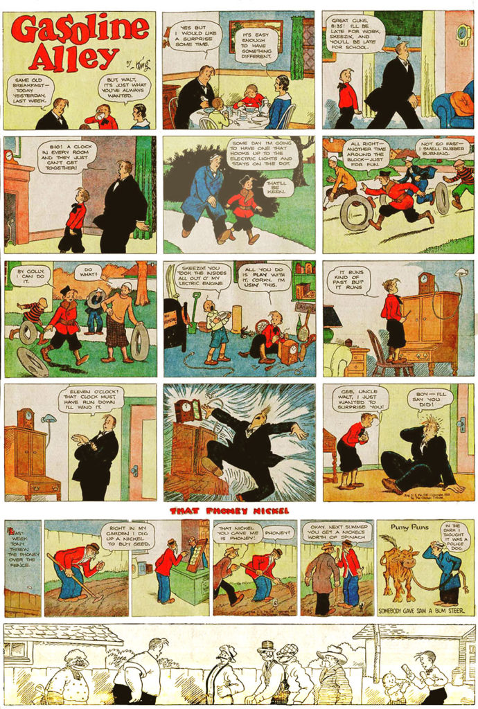
Frank King – Gasoline Alley – made significant improvements in page design (utilization of grid systems), and color.. This strip utilized the concept of continuity: the first strip to show characters aging.
It is the second longest running strip in the United States, having begun in 1918 and is still running today.
The core concept of the strip is reflecting family values.
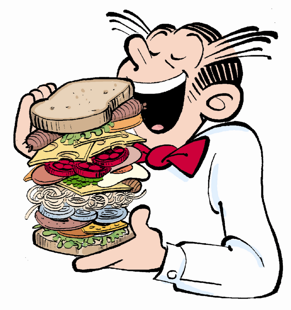
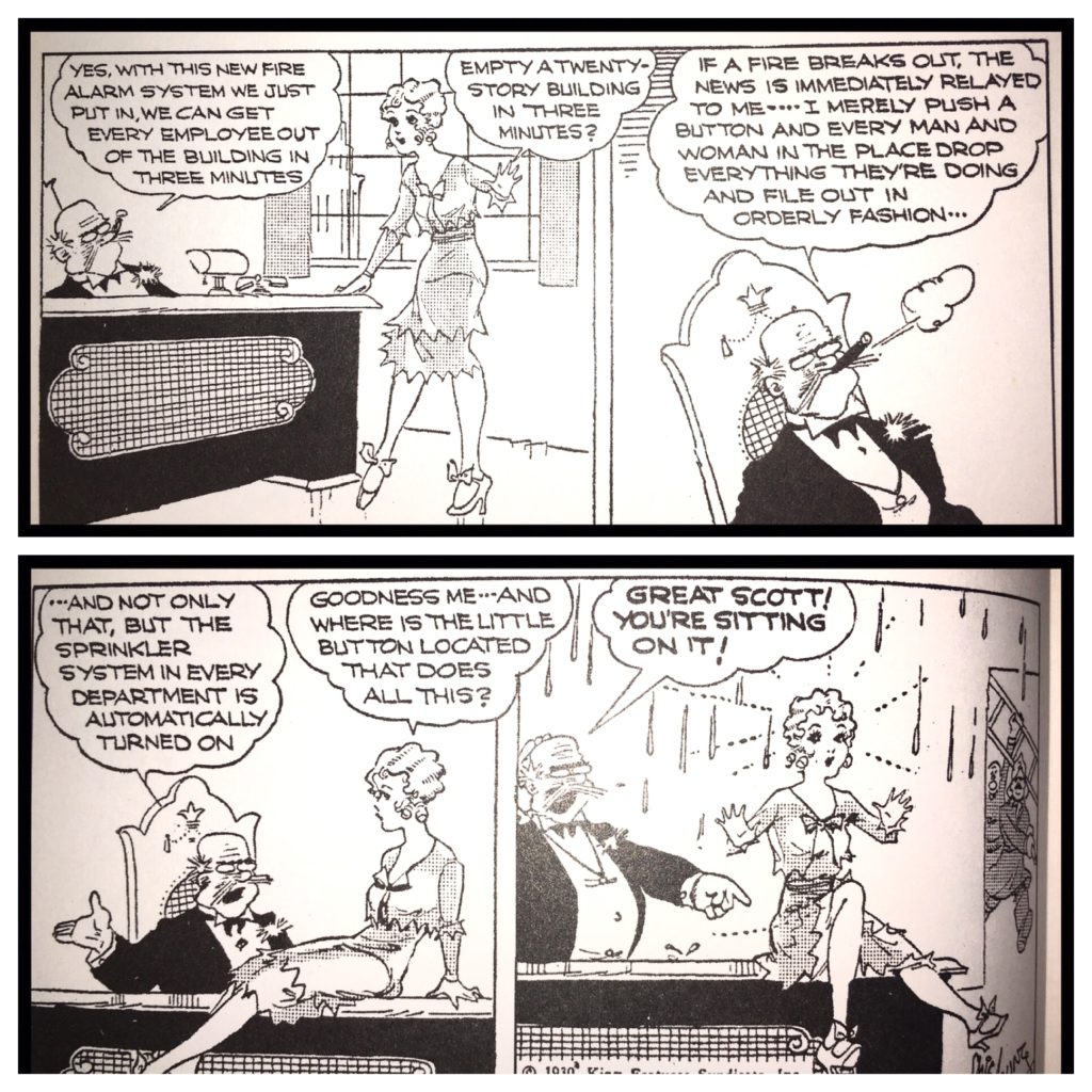
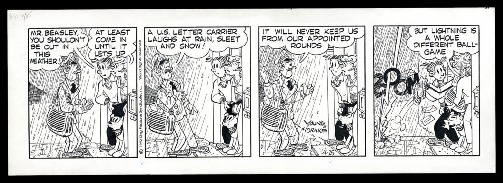
Chic Young – Blondie – boasted a readership of 52 million readers at its height. He was a “rock star” in 1930. Blondie was originally a carefree flapper girl, and Dagwood Bumstead was her sandwich loving husband (they married in the strip in 1933). After their marriage, Blondie’s personality gradually changed as she became the sensible head of the Bumstead household.

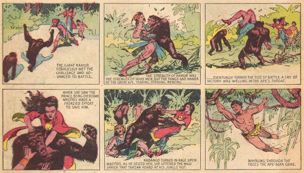
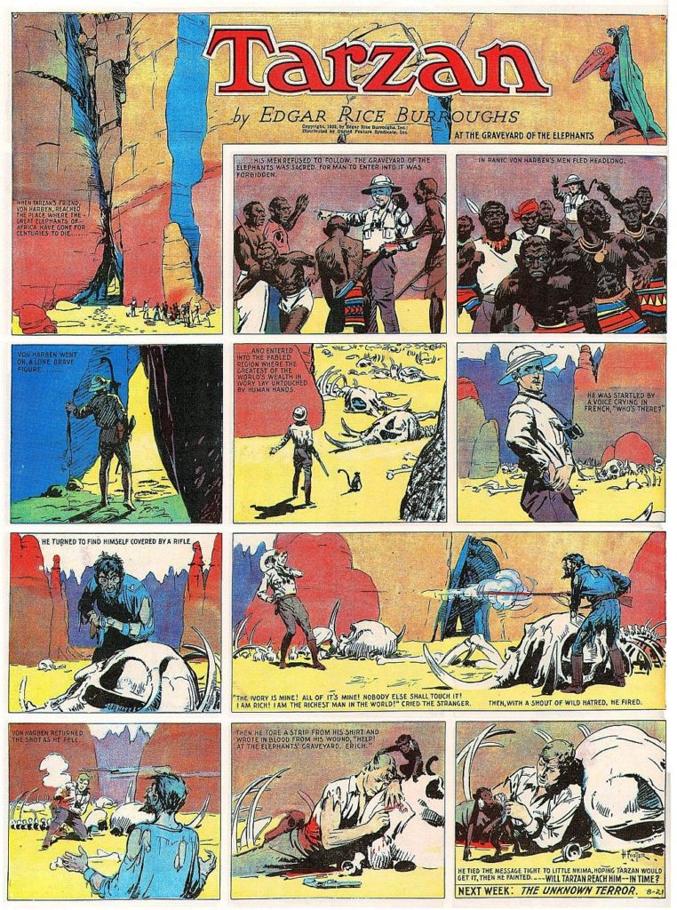
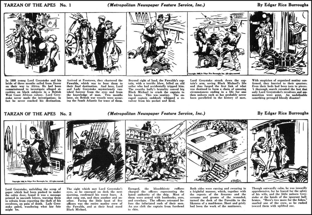
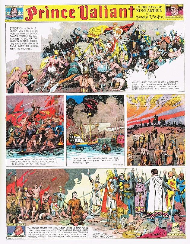
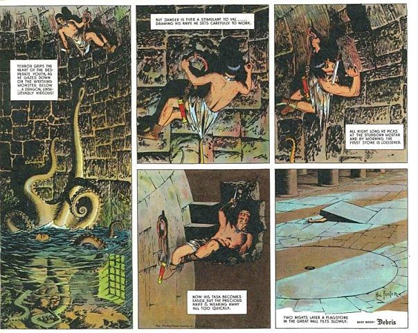
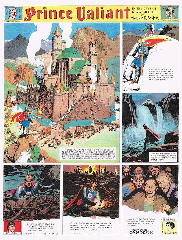
Hal Foster – Tarzan, Prince Valiant – known for a more illustrative style. Here is a good, if hyperbolic, article about Foster.
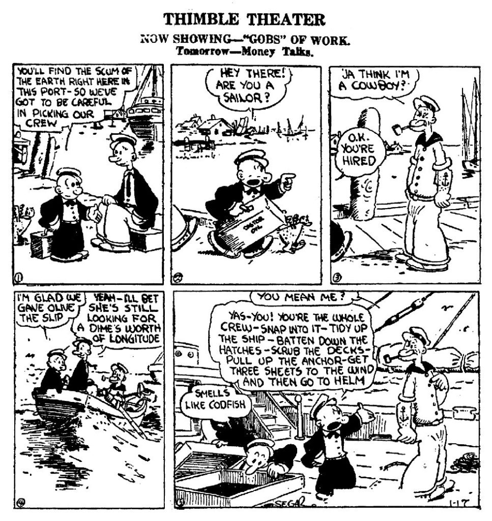
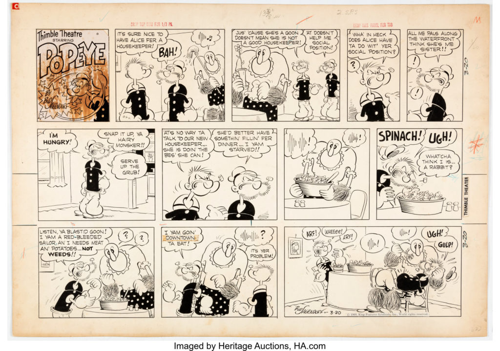
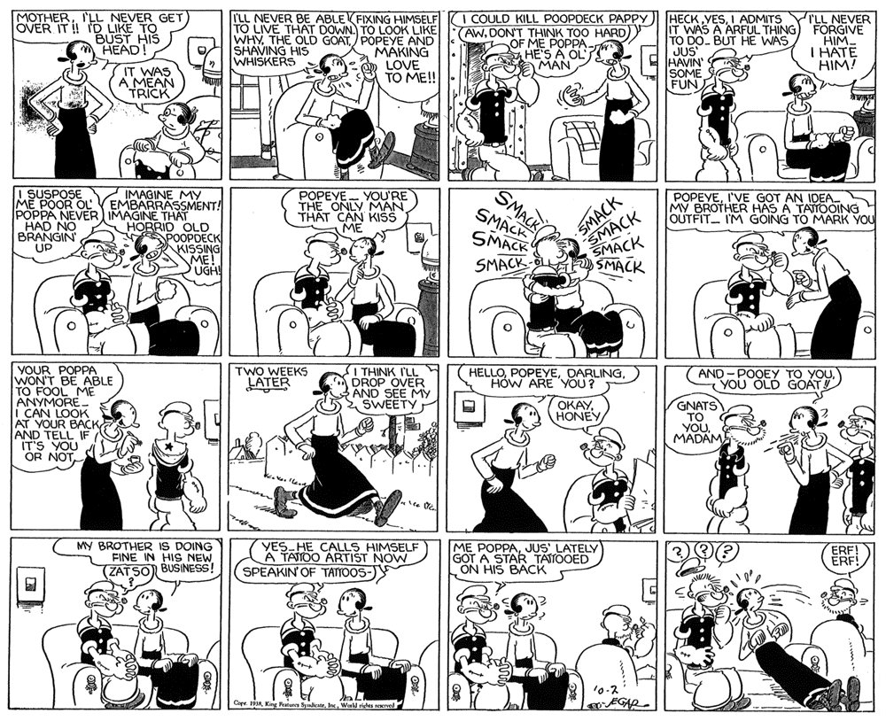
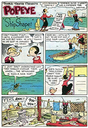
E.C. Segar – Creator of Thimble Theater, and therefore: Popeye, one of the most popular cartoon characters of all time.
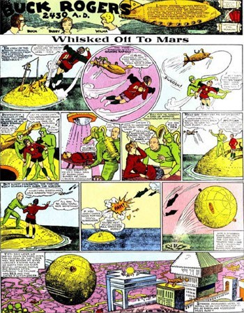
Philip Francis Nowlan – Buck Rogers – the most popular of the early science fiction serialized comic strips. Another article about it here.
Because Nowlan died in 1940, Buck Rogers is one of the few popular early comic strips that falls in public domain.

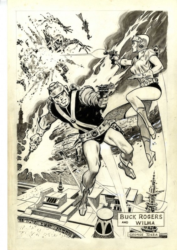
George Tuska drew the strip beginning in the 1950s.
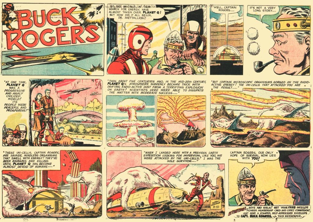
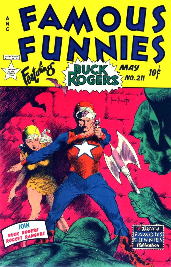
This is a comic book about Rogers also from the 1950s. I included it because the cover was drawn by Frank Frazetta, who we will discuss later.
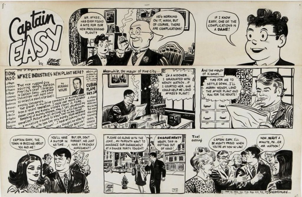
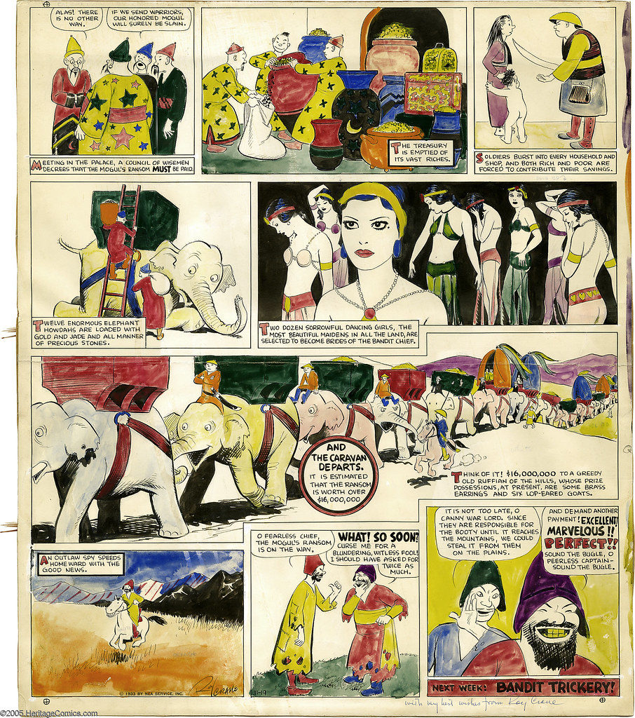
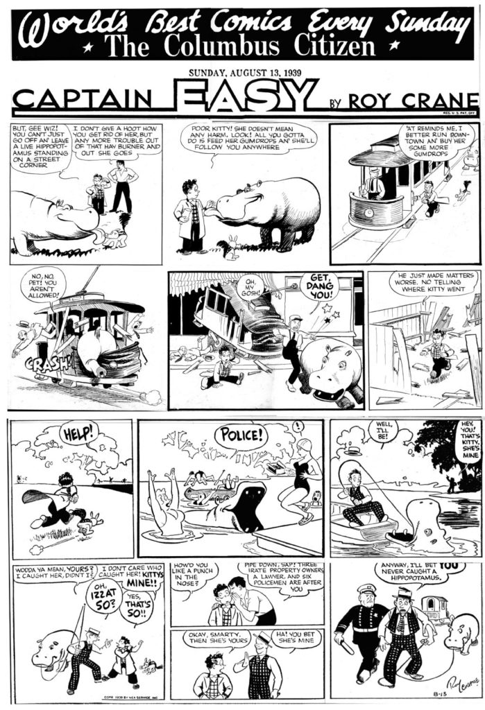
Roy Crane – Captain Easy – another of the most popular serialized action/adventure strips. The prototype for Han Solo and Indiana Jones.
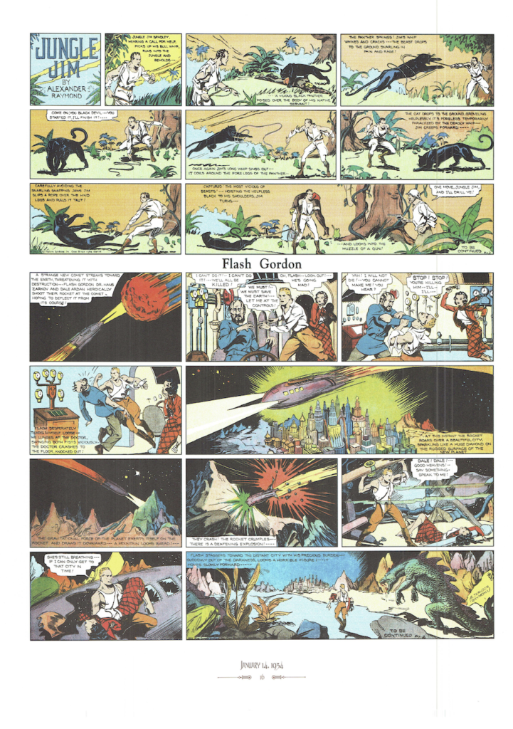
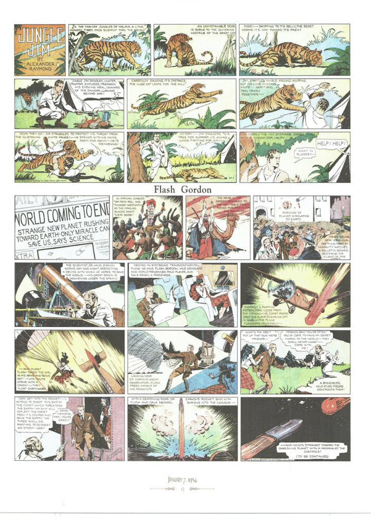
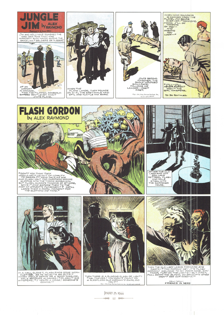
Alex Raymond – Flash Gordon – another of the most popular serialized action/adventure/science fiction strips. most notable because Raymond was the first cartoonist to really use “cross contour” lines in his cartooning. It was only created because of the popularity of Buck Rogers. Flash Gordon was produced by a rival distributor. Famously, George Lucas created Star Wars because he could not afford the rights to Flash Gordon. But you can really see the influences. Gordon goes from realm to realm within the planet Mongo. Each realm is based on an archetypical environment. There is a desert realm, a forest realm, a realm in the sky, etc. Also, Flash has a feisty brunette girlfriend, as well as an older, wiser mentor. Star Wars is a conversation for another day, but it is worth remembering that this is an influence.
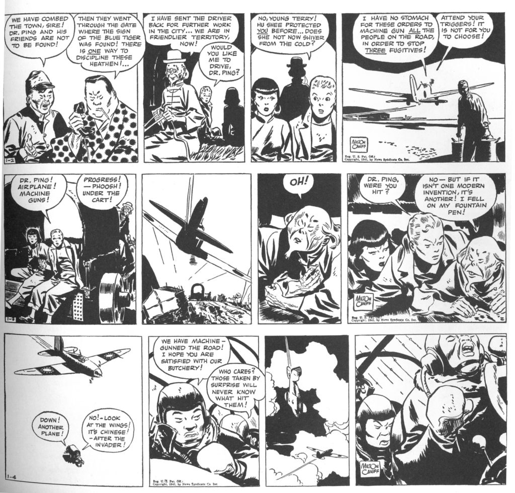
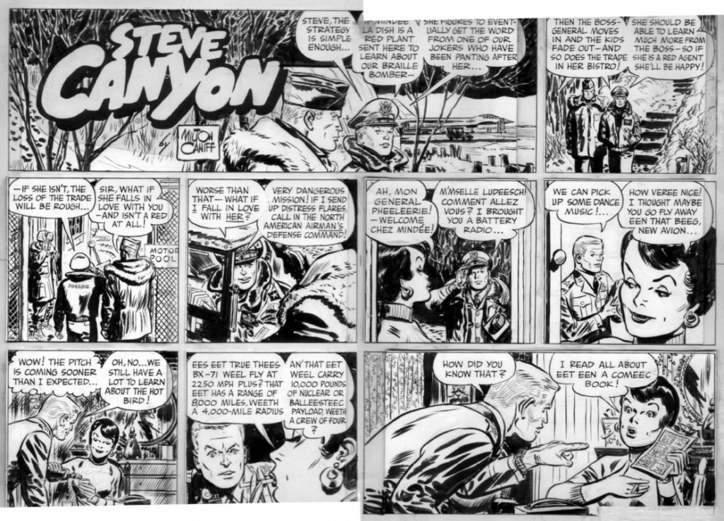
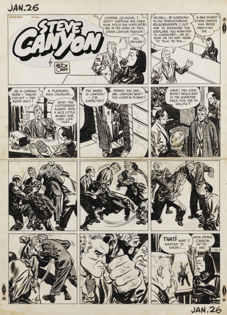
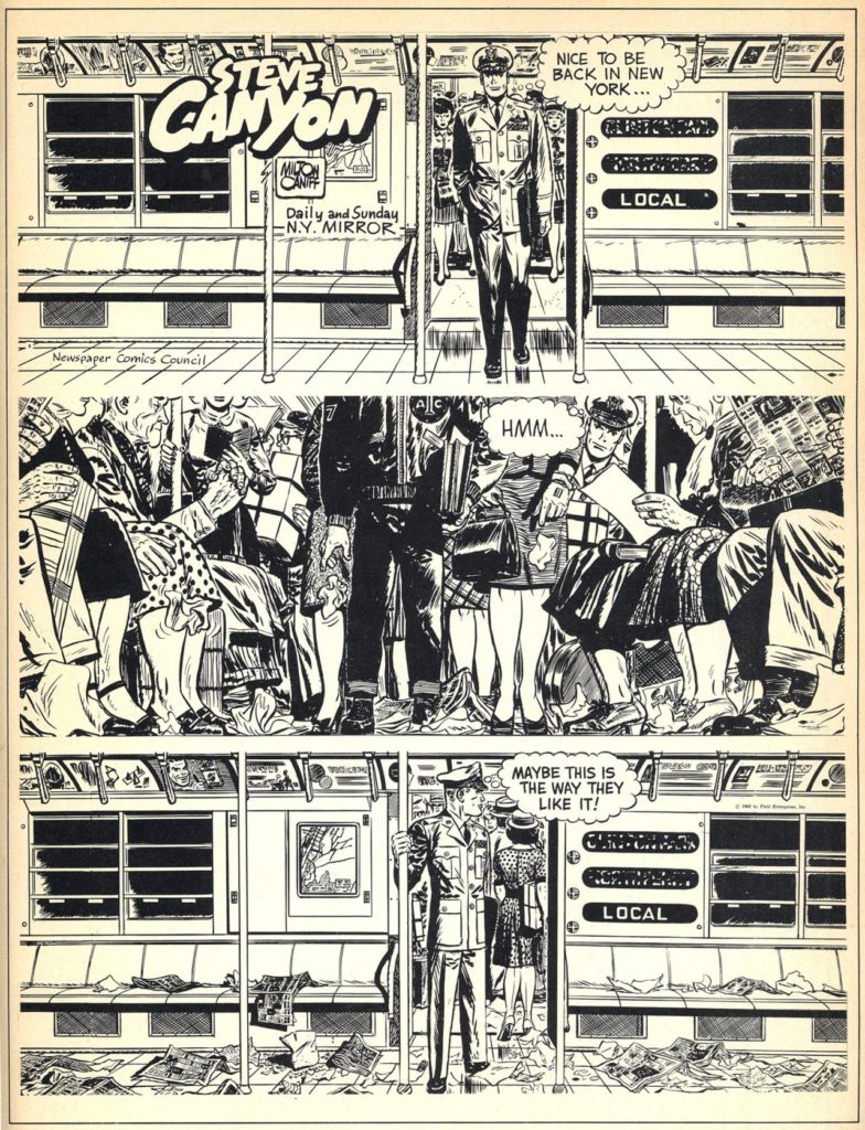
Milton Caniff – Terry and the Pirates – Steve Canyon – another of the most popular serialized action/adventure strips. Most notable because of the continuous experimentation in drawing/art technique by Caniff who set the standard many comic book artists would later try to attain. Terry and the Pirates copyright was owned by the syndicate. In 1947 he started Steve Canyon so he could retain creative and financial control of his work.
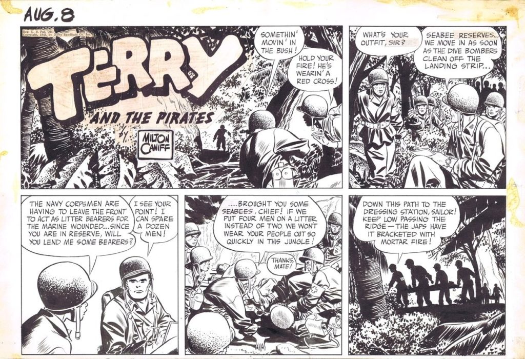
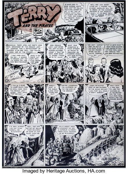
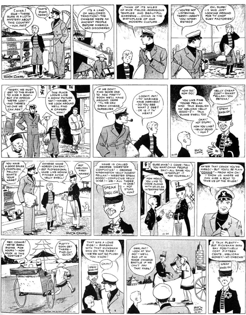
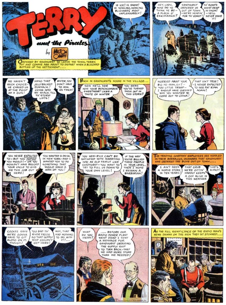
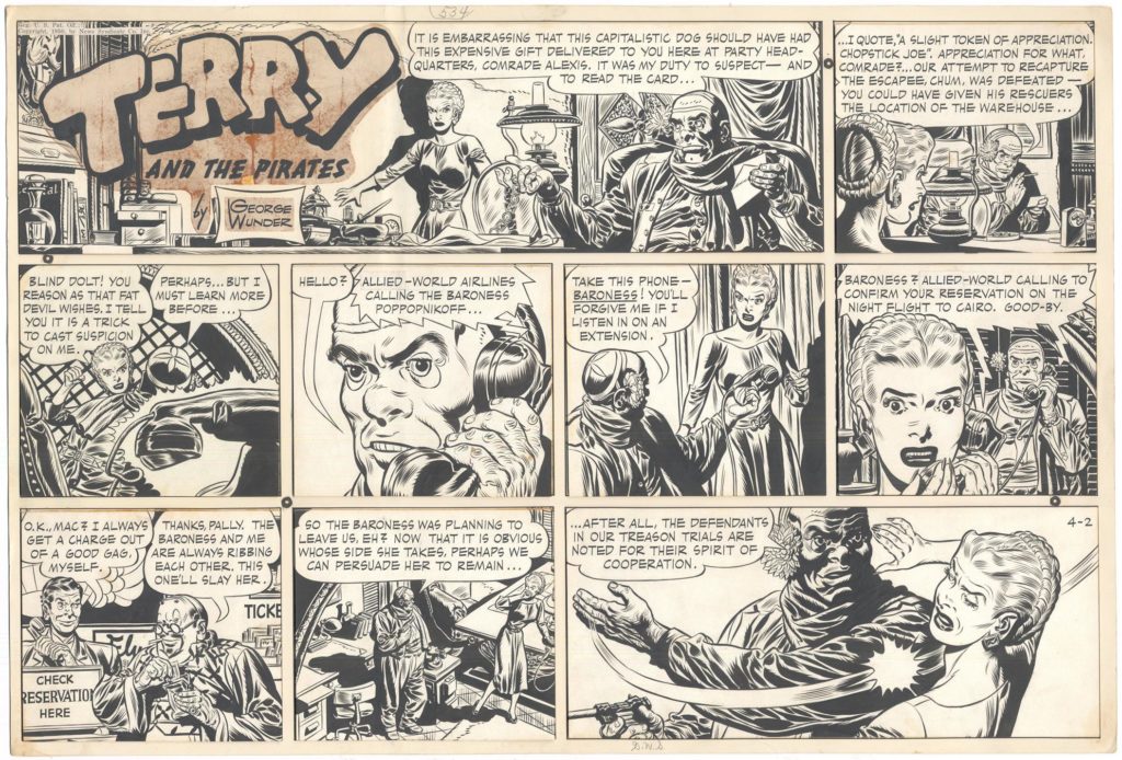
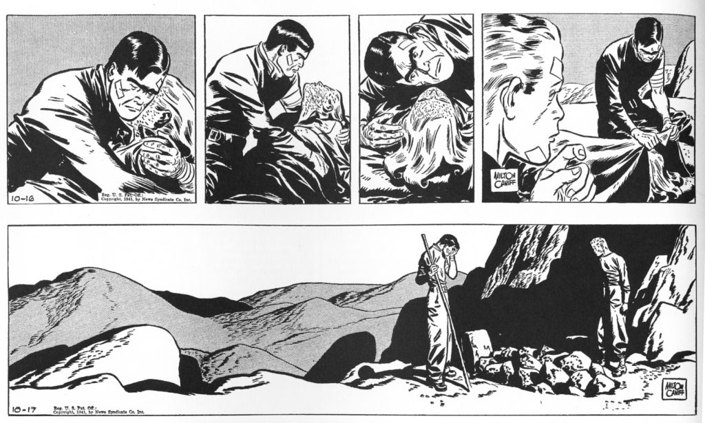
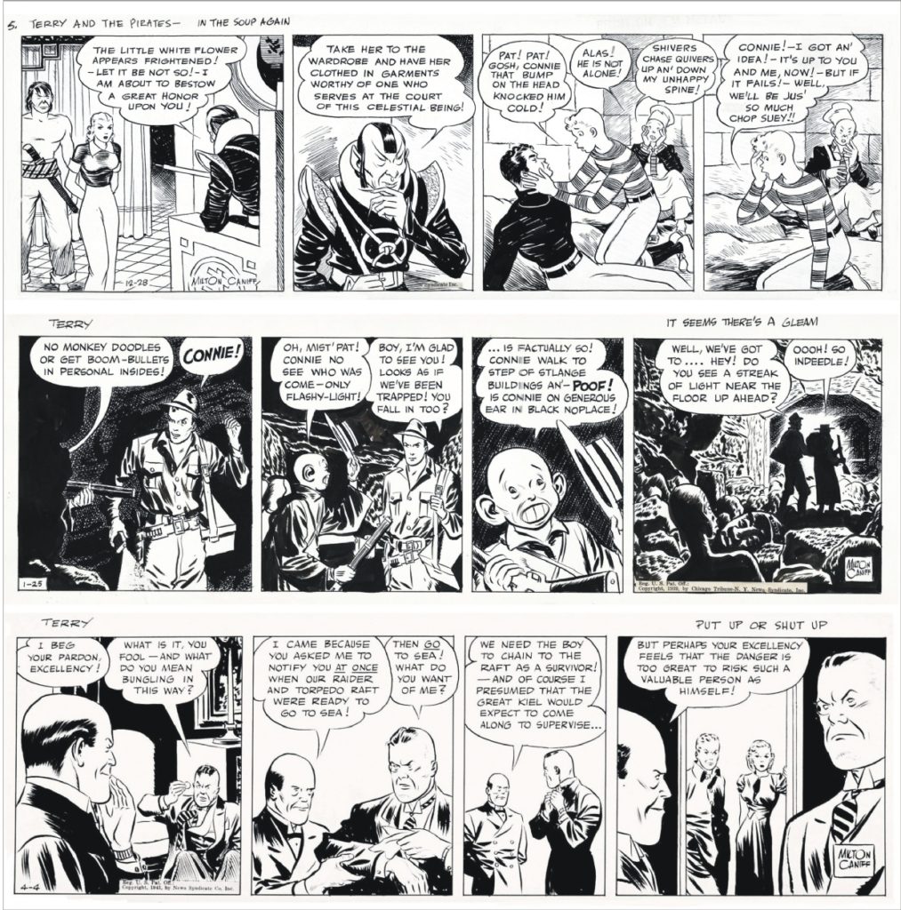
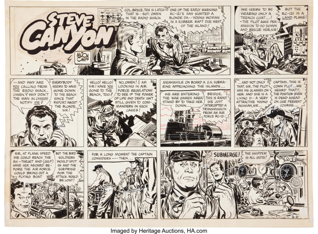
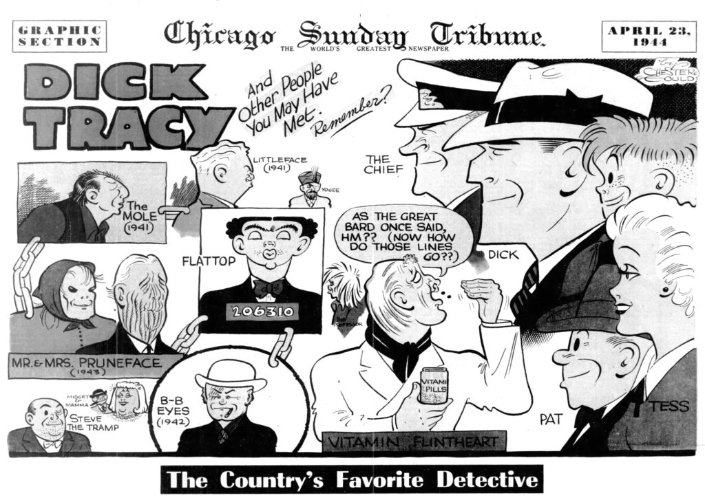
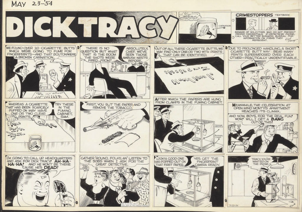
Chester Gould – Dick Tracy another of the most popular serialized action/adventure strips. Most notable because of character design
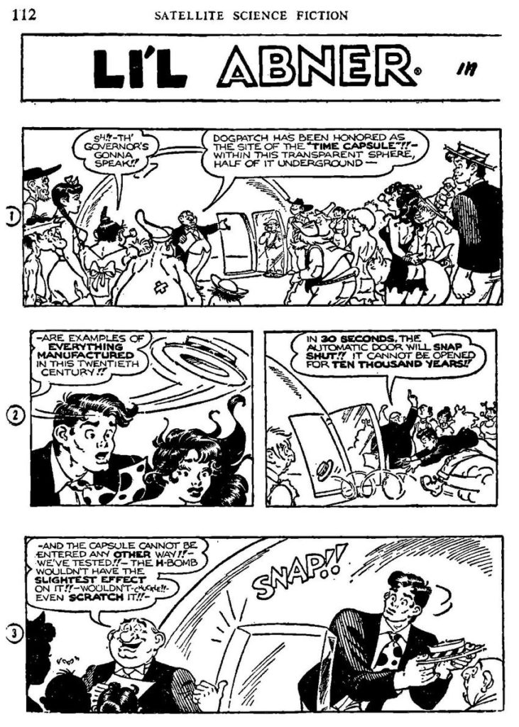
Al Capp – Li’l Abner was a satirical comic strip set in the south. boasted 60 million readers in 1935.
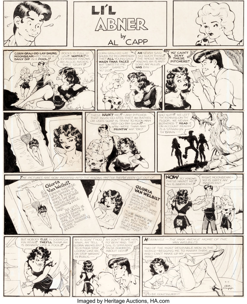
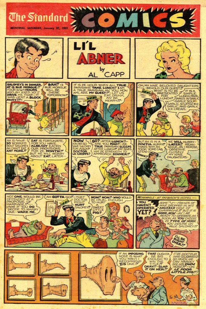
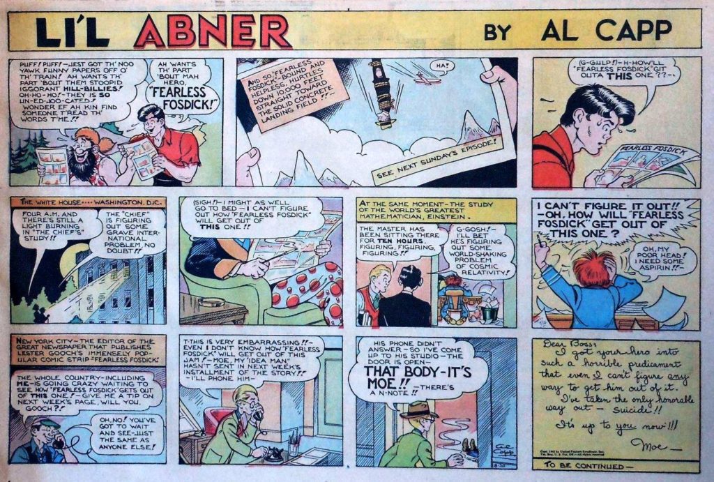
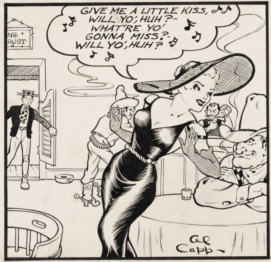
Allen Saunders – Mary Worth – first significant soap-opera-style strip. The idea was to create an “open ended novel”
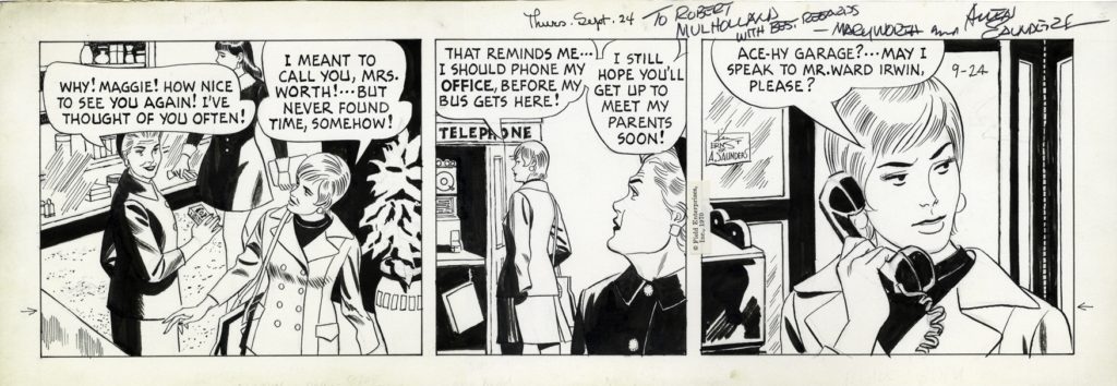
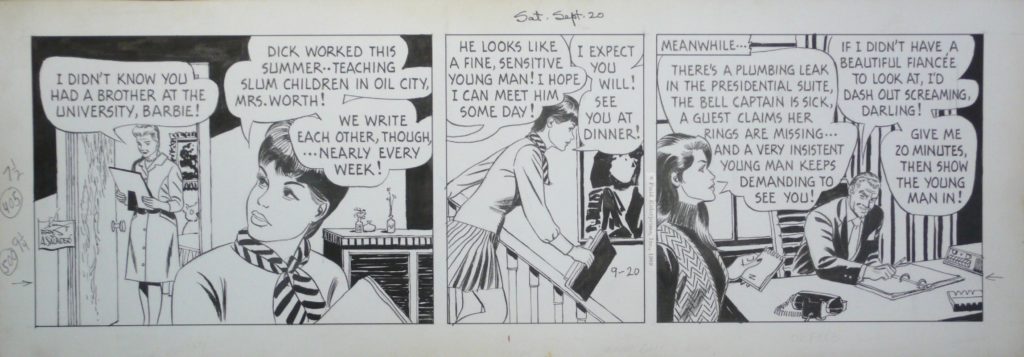
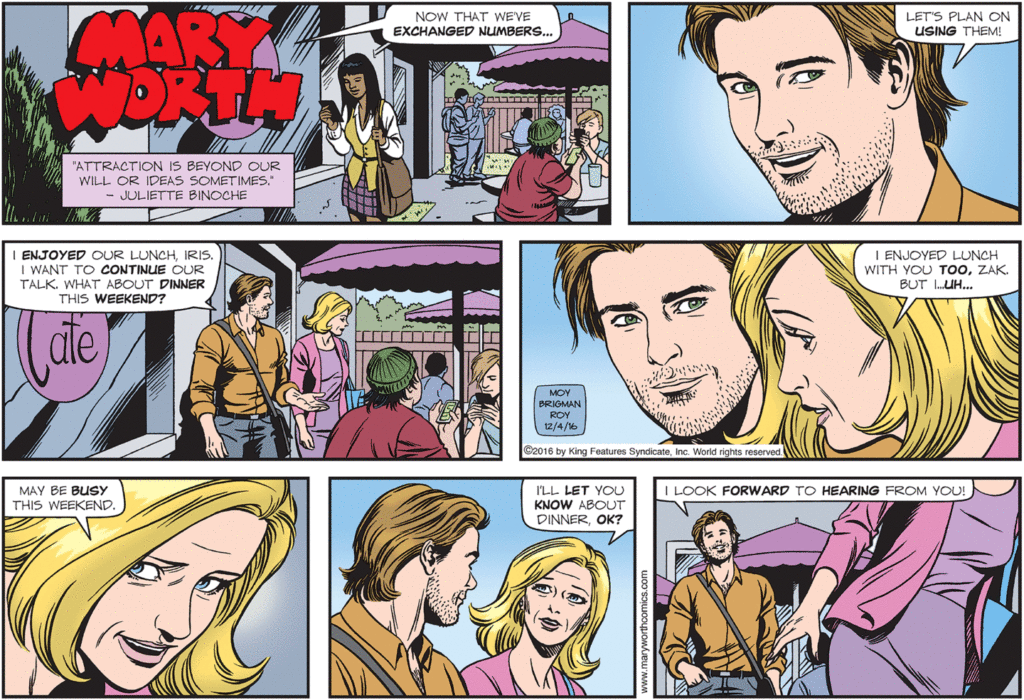
The last image from Mary Worth is pretty recent. This strip still runs today and is drawn by my dear friends, June Brigman and Roy Richardson. We’ll talk a lot more about June when we get to the 80s, and we’ll talk a bit about Roy when we get to the 90s.
Nicholas P Dallis – Rex Morgan, M.D. – another significant soap-opera-style strip.
Elliot Caplin – The Heart of Juliet Jones – as the younger brother of Al Capp he worked on several iconic comic strips. The Heart of Juliet Jones is his most successful personal creation, though the first several strips were based on a treatment by Margaret Mitchell, of Gone with the Wind fame.
Dale Messick – Brenda Starr is significant because it was the first ongoing “serious” adventure strip staring a female protagonist.
Mort Walker – Beetle Bailey – by 1954 boasted a readership of 200 million people daily.
Walt Kelly – Pogo – most notable for the extreme draftsmanship of Kelly (check out the backgrounds)…he started out as a storyboard artist for Disney.
