Compiling graphic design for the 1950s, the ’60s, the ’70s and the ’80s was easy. Just mention any of those decades, and iconic images pop into your head: cartoon-style housewives, bell bottoms, blocky, disco typography and neon lettering. But when it came to coming up with graphic design representative of the 1990’s, I was at a loss – nothing came to mind.
It took a few friends to remind me of grunge music, whose flannel, Seattle style influenced everything from fashion to design that is still popular today. Though one blog, while reviewing an exhibition of rave flyers, dubbed it one of the “least subtle eras in graphic design history,” the ’90s, I think, have now had time to settle in as a comforting time of experimentation with design. After all, 1990 saw the birth of Photoshop 1.0, exclusively for Macintosh. Thus, graphic design was never the same again.
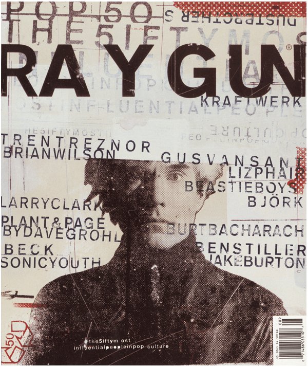
Could any magazine have been more important to graphic designers than Ray Gun, founded by art director David Carson?
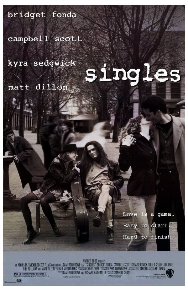
Flannel, long hair, grunge music, Seattle – the 1992 film “Singles” covered it all.
Rave flyer from 1995.
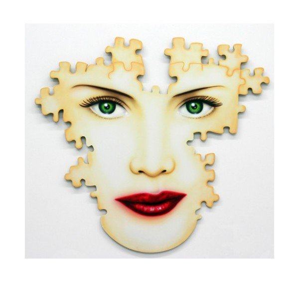
The Starbucks mermaid grew modest in 1992, covering her breasts and navel.

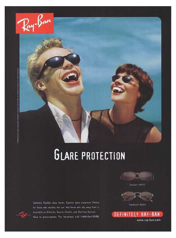
Ray-Ban ad from the ’90s. Vampires were big even then, when I was catching up with Anne Rice.
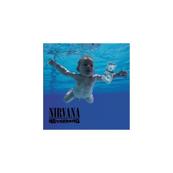
Nirvana’s “Nevermind” exploded onto the grunge scene in 1991. I remember controversy over the underwater baby in Robert Fisher’s album design.
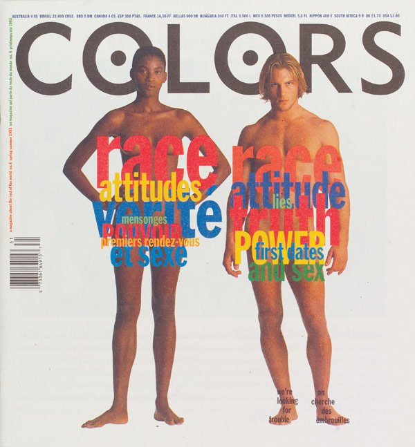
Colors magazine, funded by Benetton of Italy, debuted in 1991.
Google evolved quickly, cycling through three logos during 1998 and ’99.

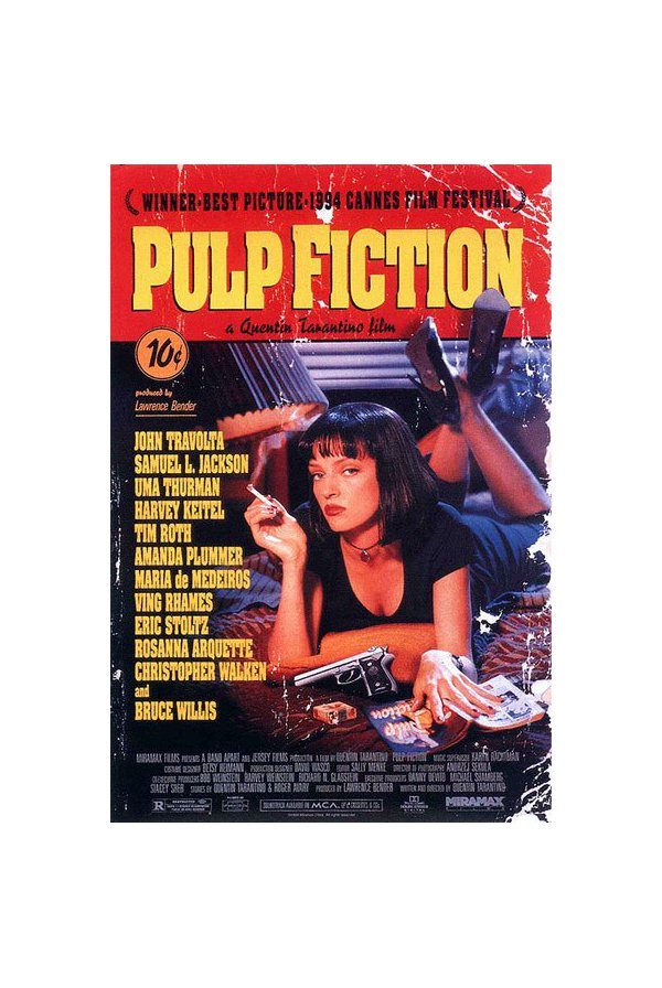
Director Quentin Tarantino has never been shy about paying homage – the poster for his 1994 movie “Pulp Fiction” does just that.
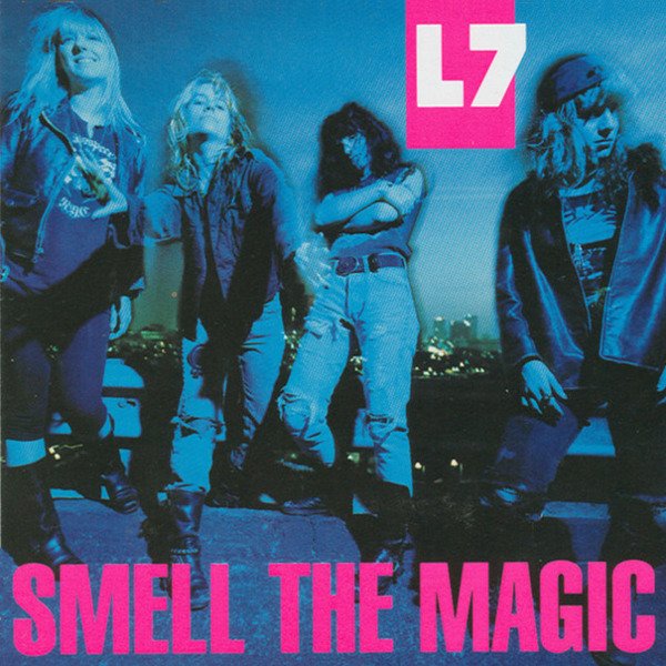
Grunge emerged in the ’90s with bands such as Mudhoney, Tad and L7 on the Sub Pop label.
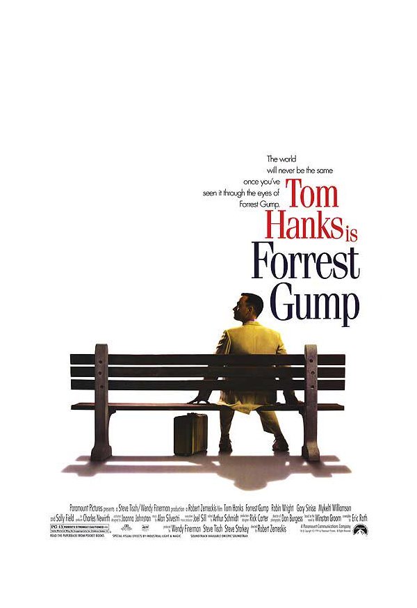
Love or hate “Forrest Gump” (I fall in the latter), you can’t deny the poster is iconic.
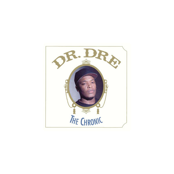
Dr. Dre’s 1992 album, “The Chronic,” pays homage to Zig-Zag rolling papers packaging.
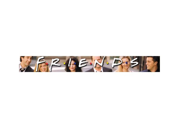
The “Friends” TV show logo had the same scroll-y, handwritten font style that was big in the ’90s.
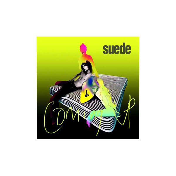
A commenter on my ’80s post said I should have included Peter Saville’s “brilliant” designs. “Shame the ’90s saw him ending up designing the awful cover for Suede’s ‘Coming Up’ album.”
“In Living Color” first aired in 1990. According to Wikipedia, the logo was derivative of the Memphis Movement art style.
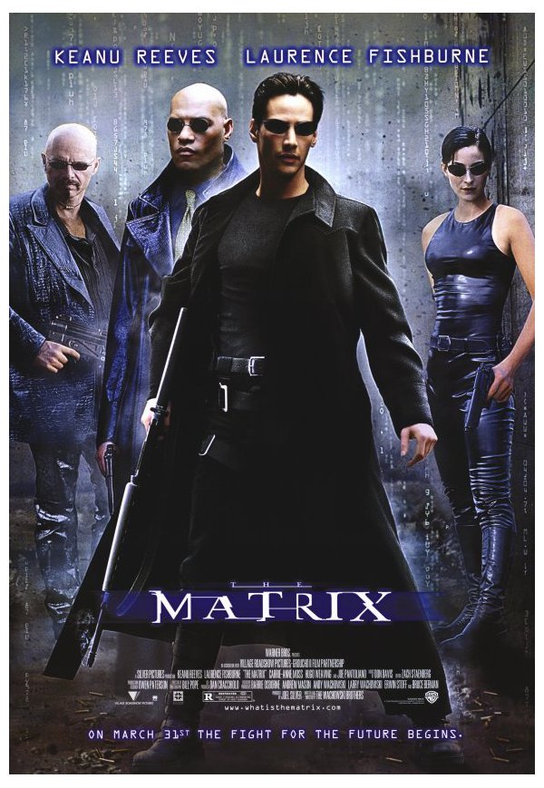
Everything about the poster for 1999’s “The Matrix” was so cool. Like the subtle, vertically scrolling numbers in the background.
The opening title sequence of “The X-Files,” which premiered in 1993, remained unchanged the first seven seasons.
The Shell logo has undergone many redesigns – some major, some subtle. This is the version unveiled in 1995.

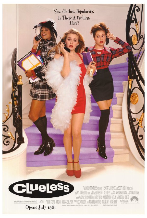
The whimsical font for the movie poster for 1995’s “Clueless” is girlie yet classic, which pays homage to the fact that the film is based on Jane Austen’s “Emma,” published in 1815.
I like the blend of amusement park style with ancient feel in the poster for 1993’s “Jurassic Park.”
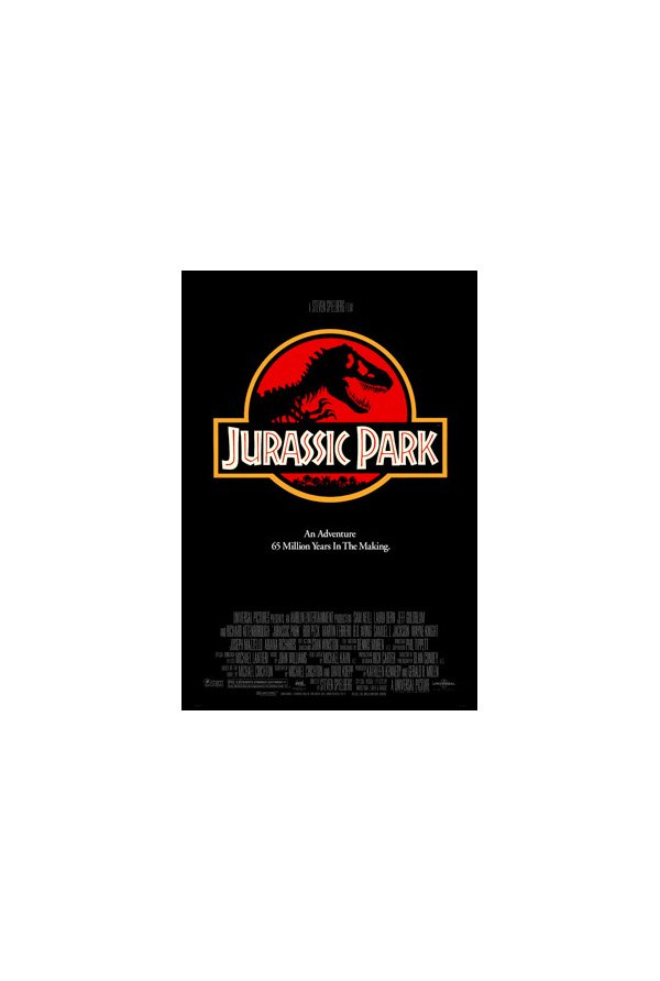
The Magic Eye series, first released in the early ’90s, features autostereograms, which lets people see 3-D images by focusing on 2-D patterns.
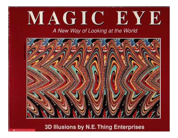
The greatest show ever made, “Twin Peaks” debuted in 1990, with its neon logo and iconic theme song.
This current MasterCard logo has been used on credit cards since 1990.

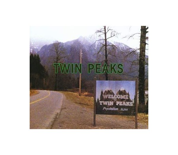
The British TV show “Absolutely Fabulous” premiered in 1992, and the jumble of serif letters is reminiscent of the crazy characters on the show.
Sonic the Hedgehog 2 videogame cover.

Upon releasing the new iMac in 1998, Apple began using a monochromatic logo that had the same contours as the rainbow silhouette logo of 1976.

Poster by Keiji Itoh for “Life” exhibition in 1994.
Another article:
Post-nostalgia stress syndrome for the 1990s—a curious love/hate relationship with grunge type—is finally kicking in just as the first decade of 2000 is coming to a close. Nostalgia is so last century. It is time for design pundits to start looking forward, but not before looking back at the past 10 years in order to neatly categorize and define the design aesthetic of the era (assuming this can be labeled an era). Actually, I’m putting my dibs in to be the first to offer some viable categorization. I know it is cheating to do so before 2009 is officially over.. What’s more I hold that fairness is not an issue when staking out one’s pundit-turf. So let’s begin….
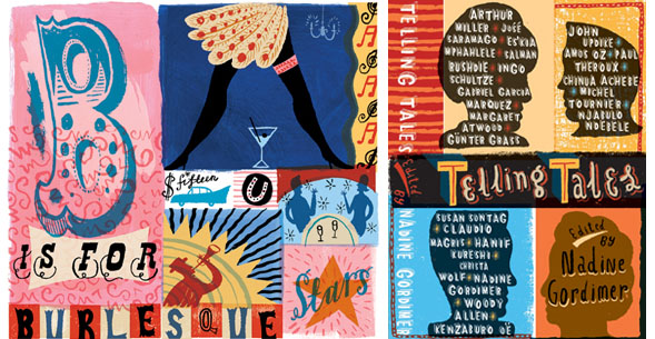
Jonny Hannah’s hand-lettered aesthetic.
The millennium began tumultuously with the contested election of George W. Bush. The nation was in fairly good economic health when Clinton left the White House, and graphic design was rolling merrily along with plenty of work for everyone. Stylistically, designers had just emerged from a period of hyper-experimentation that pitted old modernist verities, such as order and clarity, against computer-driven chaos, which some called postmodern and others (myself included) sarcastically referred to as “ugly.” Yet from a more sympathetic and reasoned perspective “The early ’90s was an extraordinarily fertile period,” wrote Ellen Lupton in a recent article on printmag.com. It continues: “In the U.S., a far-flung vanguard had spread out from Cranbrook and CalArts, where several generations of designers—from Ed Fella to Elliott Earls—had embraced formal experimentation as a mode of critical inquiry. Emigré magazine, edited and art directed by Rudy VanderLans, provided an over-scaled paper canvas for experimental layout, writing and typeface design.” And let’s not forget David Carson’s stinging jabs at typographic propriety. He significantly influenced a generation to embrace typography as an expressive medium.

Designs for AIGA by Ed Fella.
No matter which side of the aesthetic or philosophical divide one was on, this was a critically exciting time to be a graphic designer. Although the computer was the dominant medium, during the early ’90s designers were transitioning from the hand to the pixel, experiencing all the visual quirks and anomalies that came with technological unease. By the end of the decade and the beginning of the 21st century, despite the Y2K-end-of-civilization hoopla, the computer was firmly entrenched in the lives of designers, and not only was there an aesthetic calming down, but a frenetic media migration. Designers were relying on the computer not only for clean, crisp and flaw-free print work, they were turning from the printed page to video, audio and other motion and sound formats. Mastery of the computer’s options meant that by the end of the 20th century a new generation of designers were commanding much more than merely Illustrator, Quark and Photoshop programs—they had figured out how to wed technique to concept, and produce design that often had an exterior life other than the client’s message. The earlier grungy experimentation gave way to a new clarity and rationalism—even a new minimalism began to take hold with the return to Helvetica and other emblematic sans serif faces.
So, arguably neo-modernism of the kind practiced in, say, Wallpaper* magazine, which launched in 1996, was the defining style of the decade. But actually that was not the case. Eclecticism was still in force, and while some designers were out-of-the-closet modernists, others followed an expressionist model. (You want names? Just look at the AIGA Design Archives for the evidence). But eclecticism is too broad a notion to be a decade-defining style. The ’90s were clearly the digital decade with all that that represents—an evolution from embracing digital mistakes to practicing digital precision. Axiomatically, generations challenge one another. If the ’90s were devoutly digital then, the 2000s should be the “anti-digital” decade.
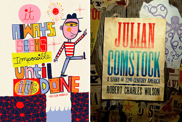
Poster by Nate Williams (left) and book cover by Ross MacDonald (right).
Where’s the proof, Mr. Pundit? Anecdotally, I draw the rationales from students entering the MFA Designer as Author program I co-chair (with Lita Talarico). When asked why the first wave of students entered from late ’90s through mid-2000s, the answer was, “To get back to the hand.” Now, this does not mean a total rejection of the computer (for that would be professional suicide), but it does mean that the craft aspect of design was lacking in their formal educations and practices. With the increase of the D.I.Y. sensibility, with renewed emphasis on “making things from scratch,” designers were feeling a need to make physical (not virtual) contact with their materials and outcomes. It is no surprise that sewing and scrapbooking emerged as popular hobbies, but it was somewhat novel that they were integrated into the graphic design practice.
Over the past five years I co-authored three books that support this “anti-digital” claim: Handwritten (with Mirko Ilic) and New Vintage Type and New Ornamental Type (with Gail Anderson). The first is totally focused on typography done by the original 10 digits (although unavoidably scanned for the computer). The other two books revisit older styles and eras, and a good amount of the material is generated by hand with a D.I.Y. underpinning. Consistent with this assertion, hand typesetting, letterpress printing and silkscreen techniques are on the rise in schools and workshops. And speaking of workshops, as a thesis one former MFA Designer as Author student established the Dirty Weekend, a series of three weekend sessions that focus exclusively on painting, carving, cutting and printing by hand. Recent turnouts at the Art Directors Club in New York have also proved that the hand is at least as mighty as the pixel.
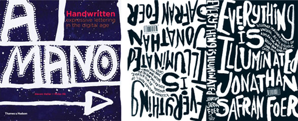
Handwritten book cover by Steven Heller and Mirko Ilic (left) and John Gray’s cover for Everything Is Illuminated (right).
Why call this trend anti-digital? Isn’t it just an alternative to the dominant medium, but certainly not a substitute for it? Perhaps. But since pundits like to sum up moments—especially decades—for purposes of further debate, I will refer to the early Oughts as “The Decade of Dirty Design” until someone proves otherwise.